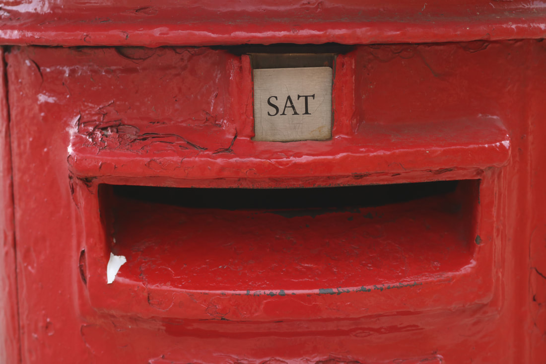
Montage theoryThe montage theory is an editing style that is assembled of different shots, resulting in addition of a new sophisticated element to cinematic language. It is also knows as soviet montage. This originated in Russia in 1917 when during the war, they turned to film as a mass communication medium. Headed by Lenin's wife, there was a founding of a school to train new film makers in 1919 by the cinema committee. It was the UGIK; all union institute of cinematography, it is now known as the Moscow film school and was the world's 1st film school. Lev Kuleshov found the theory of film through his own study group outside of the school, where they made films without celluloid. 'Intolerance' became the most influencial film for 10 years in Russia, which was deconstructed of shots and the reassembaling of them in 100s of ways, so they could examine the impact that different edits had on the audience. There became an availability of New film stock in 1922 because of the Soviet-German trade, which allowed Kuleshov to experiment. He did 2 experiments; one was the 'Kuleshov effect', where he took a shot of expressionless face and created 3 different short films. He edited the face with a bowl of soup, girl in the coffin, the seductive woman on the couch. This film was shown to an audience and he raved about the range of emotion that the actor was able to portray. In another experiment, he took 3 shots, an actor smiling, a revolver and the actor looking frightened. The practice of the editing lead to Kuleshov being the first to put it in theory meaning the film was not only in spacial composition but an arrangement of shots. The experiments were created with artificial landscapes through 'creative geography'. This was the process of cutting together of pieces of film captured in totally different locations. He believed that film can transcend space and time. A film was born during this edit that the soviets called montage from the french.
|
Montage came from the French verb monter: to assemble
The montage theory would see greater refinement by one of the most Russians most famous silent film makers and also a student of Kuleshov. D.W Griffiths developed continuity, editing through practice, whereas Sergei Eisenstein developed montage through theory which broke the confines of space and time to result in a film as a unique language. D.W Griffiths filmed as enhanced theatre within real space and time. Montage was seen the same was as Marxist dialect, which is way of looking at history. As a result of the process, Sergei Eisenstein set 5 methods of montage:
|
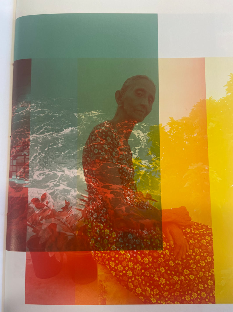
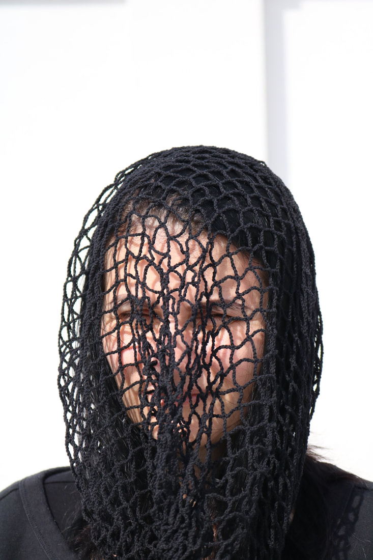
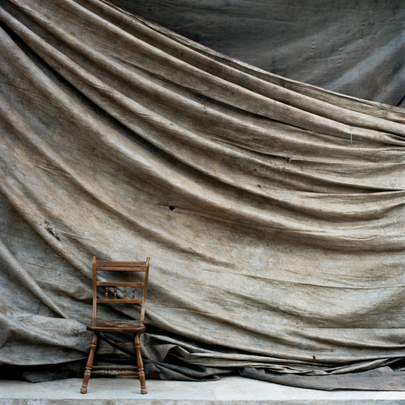
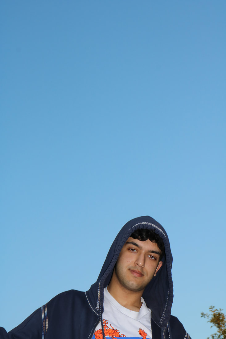
LUKE FOWLER: TWO FRAME FILMS
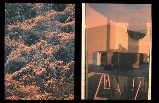
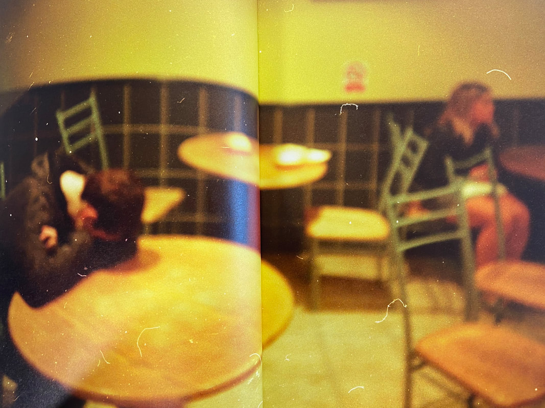
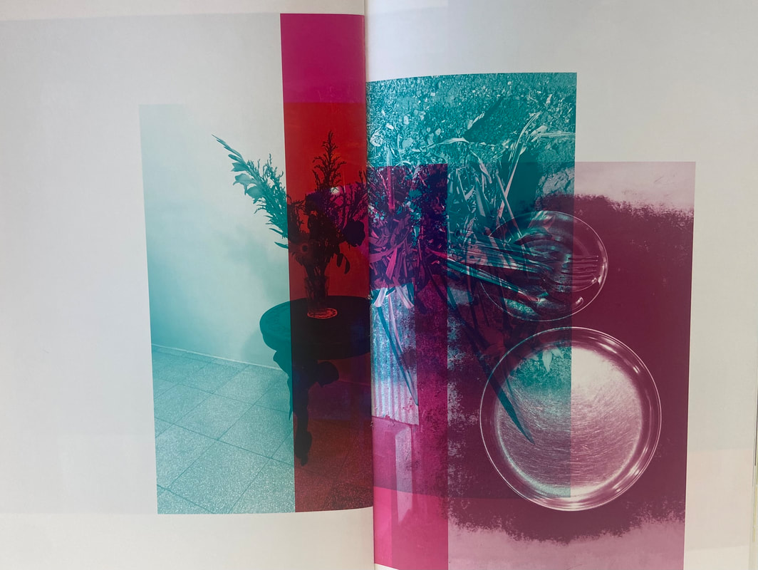
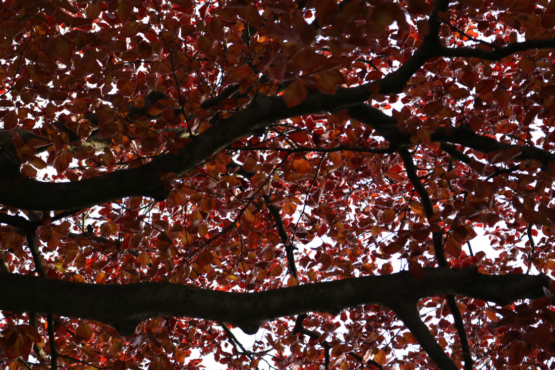
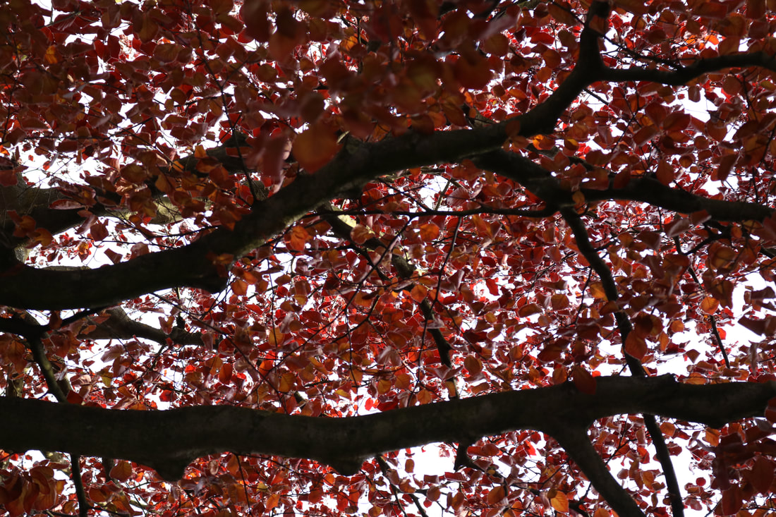
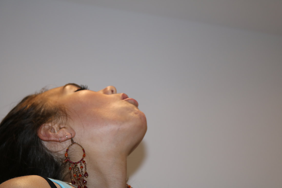
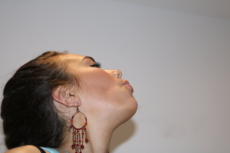
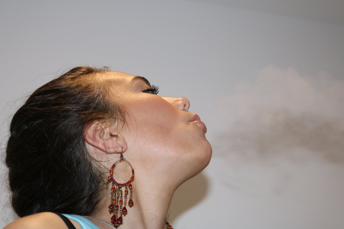
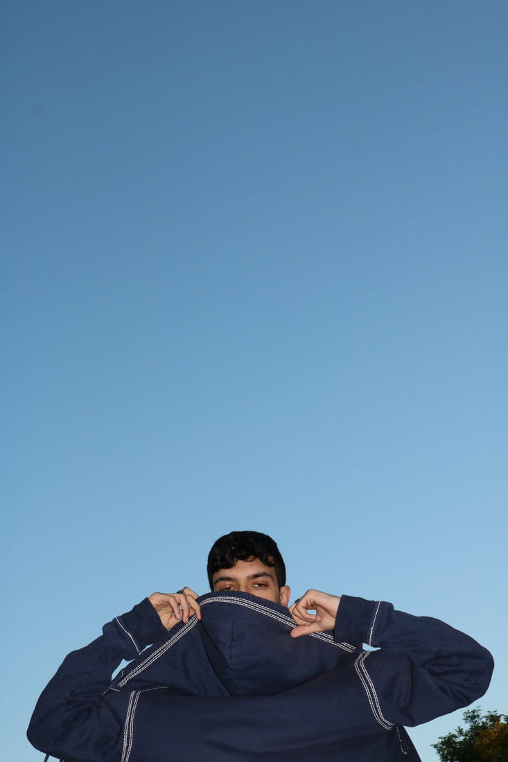
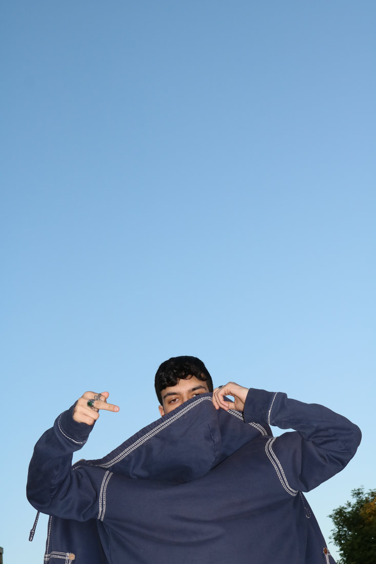
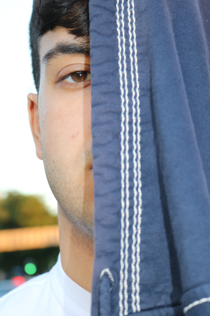
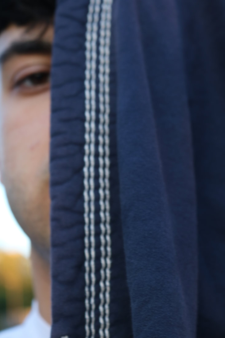
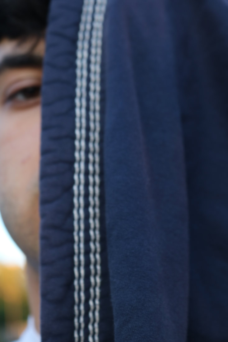
Luke Fowler is a Scottish artist, photographer, filmaker and also a musician. His work often emphasises the sense of community and a take on a historical atmosphere as well. He tells stories of alternative movements in Britain through his 16mm films. Fowler is originally more recognised for the work he does in Film, although he created a series called 'Two Frame Films', where he used a half frame camera. He developed this book whilst he was on residency in Bamberg, Germany in 2006. He used the camera to create a range of diptychs in a 35mm film frame. The camera creates a roll of 36 exposures, which produces a final of 72 images in pairs. He took portraits of some residents when in Germany and filled the rest of his shots of a parade celebrating a traditional catholic ritual. When he got his images back from the photolab, he was surprised yet it really interested him, because of the two images, the white space around the images and also some frame lines that he found were always slightly different. The diptychs are a result of still images, although also interlinks with the montage theory. The groups of diptychs creates proximity , and we as audience can explore the narrative of them and see how they work together.
|
This is one of Fowler's diptychs, in both images, there is a common denominator of the colours in both images. The colours are quite pink/red, rosy with some dull green. In the left image, there is an image of trees and the braches have some gaps which creates the link with the right image, as the circular gaps of the trees, connect with the circle mirror in the right image. Also, the branches have a sort of horizontal line shape, again linking the images together in through shapes, as the right image also has horizontal lines from the shadows from the sun. The sun in the right image creates a rosy tone in the colours of the room which as i mentioned, link in with the trees as there is a pink tint on that image, and the dark green, dull coloured table links with the green in the leaves. I notice a sort of ombre through both images, being the same as there is that rose colour at the top, the green and then a more beige colour at the bottom, and in the right image we find this from the legs of the table. I think this diptych is mostly connected through colour and also shape, and I do think they go together very well as even though one image is a natural landscape image and the other is a manmade still life, they reflect how natural reasources lead us to manmade.
|
|
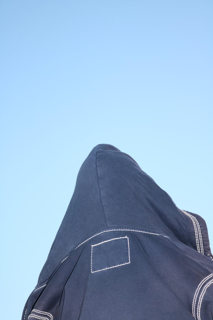
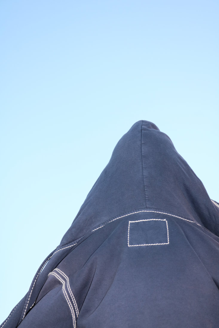
Creating my own diptychs
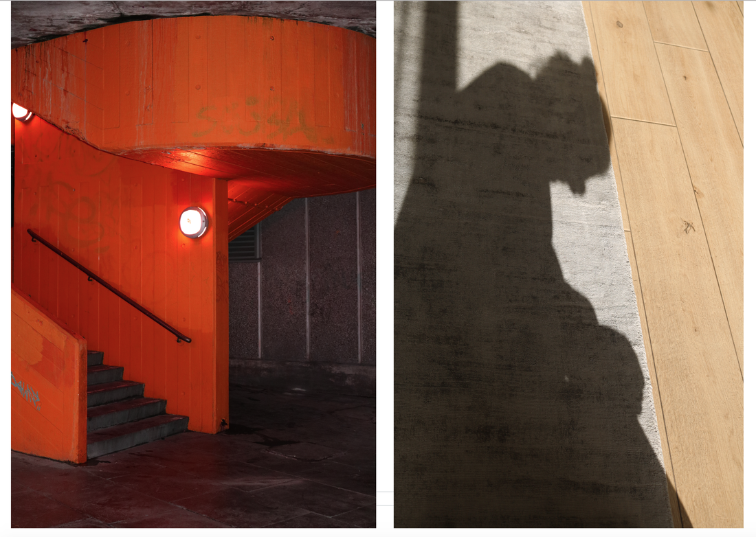
The first diptych I like because I linked them together because of the big block of shapes on the same left side , I like how the similarity between them is not exactly the same, the stairs allow some space at the bottom, whereas the image on the right has the shadow filling the frame from bottom to top. Also the colour of the floor and walls is quite similar to the colouring of the shadow.
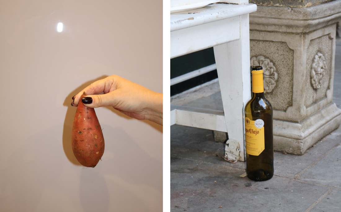
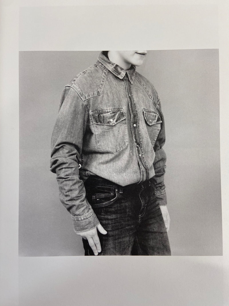
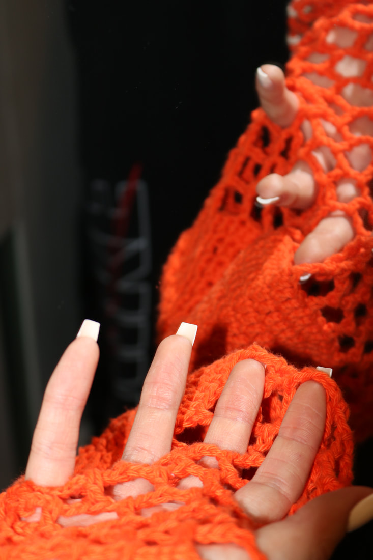
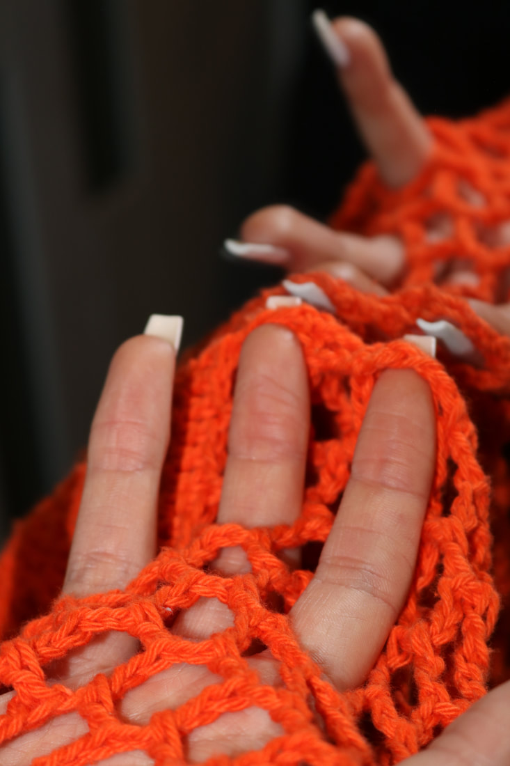
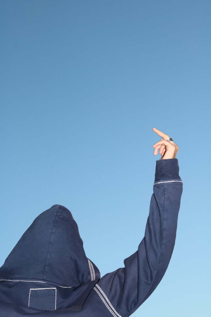
For the second diptych, I focused on the isolation of the main objects, although i liked how there was a contrast as there is a more busy background in the right side image, compared to the image on the left. Also, the colour of the arm is giving off a yellow tone. Both images have a slight shadow behind the main object too. Overall I like these diptychs because they did not focus on something really obvious or basic, that can be noticed straight away, allowing for an audience to take time to really look into the images.
For the second diptych, I focused on the isolation of the main objects, although i liked how there was a contrast as there is a more busy background in the right side image, compared to the image on the left. Also, the colour of the arm is giving off a yellow tone. Both images have a slight shadow behind the main object too. Overall I like these diptychs because they did not focus on something really obvious or basic, that can be noticed straight away, allowing for an audience to take time to really look into the images.
Other experiments:
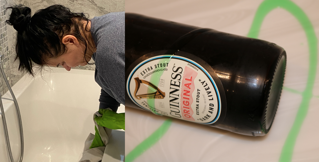
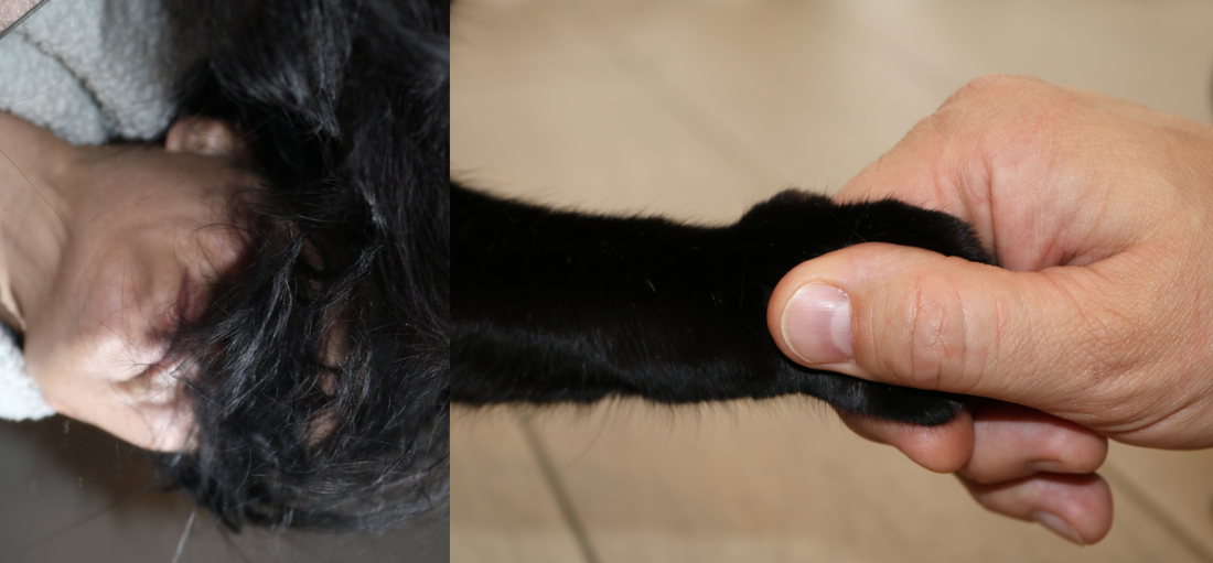
These are two more diptychs which I created. The first one I based of the angles of the image, as my mum was bent over cleaning the bath, which was a similar angle of the bottle. Also the shower heads tube, matched to the shape of the washing up liquid in the second image. The second diptych is my favourite as I focused on movement and colour. My mums black hair, matched my cats black arm, which in this diptych creates the illusion that the cat;s arm is being pulled out from the hair. This arising my idea of movement. These diptychs are different because I did not use a border between the two images, and this is because I wanted to create some humour through my work as it allows a better envisioning of my ideas and concepts.
An introduction to Photopoetry
Photopoetry is a form of art where poetry and photography are combined together and both provide their unique qualities. They work together to provide a narrative, yet also allow interpretation. Photographs are can be seen to have poetic qualities, in addition, poetry allows allows room to create images based of the words.
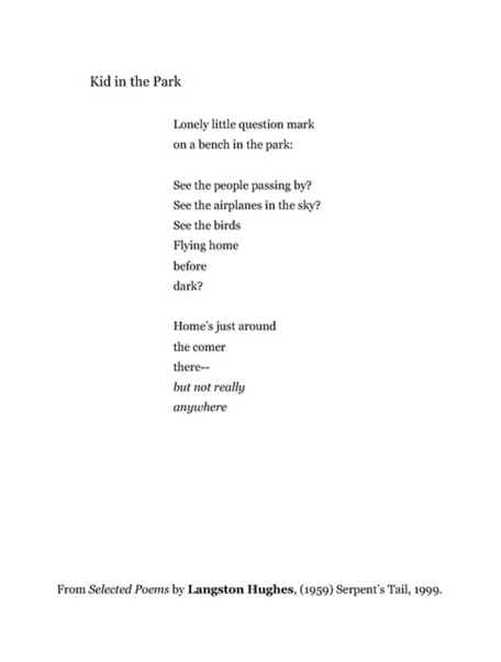
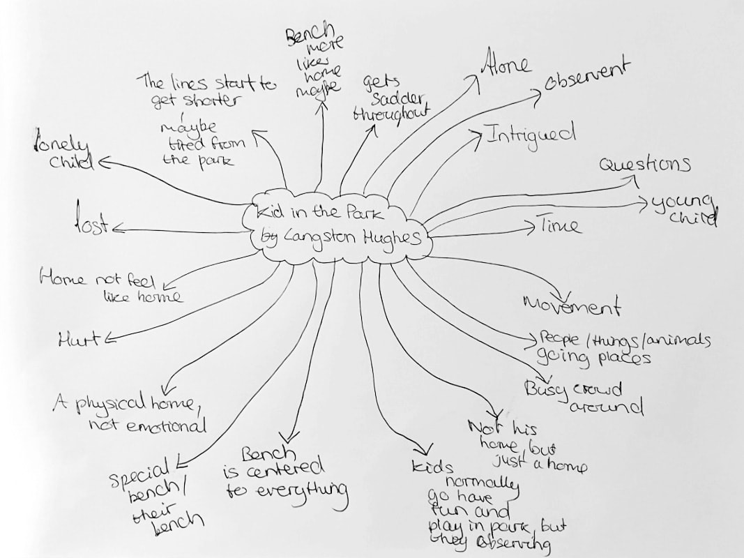
Kid in the Park
|
|
After reading this poem, I used a plain piece of paper to brainstorm what ideas I drew from it. The idea that this kid did not feel like they had a home, stuck with me the most and the idea of this bench. I started to think that the bench, and the park that was being spoken about could be what feels like home to them. I took a few images and then used the advantage of the snowy day that we had, to take some images in my local park. I chose this image because I like how one of the main ideas of the bench is blurred and the beautiful branches of the tree are overtaking the framing and in focus, which hides stuff, reflecting secrets. The secrets are like the questions we have about this kid.
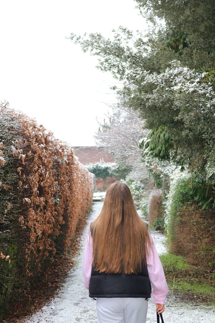
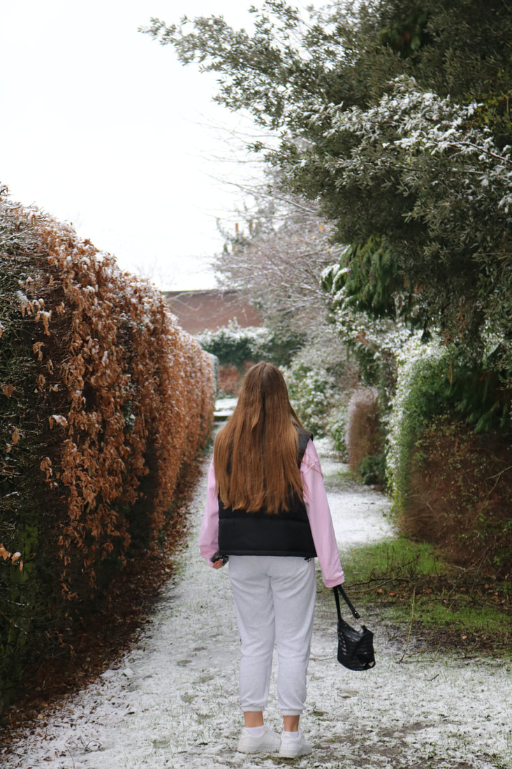
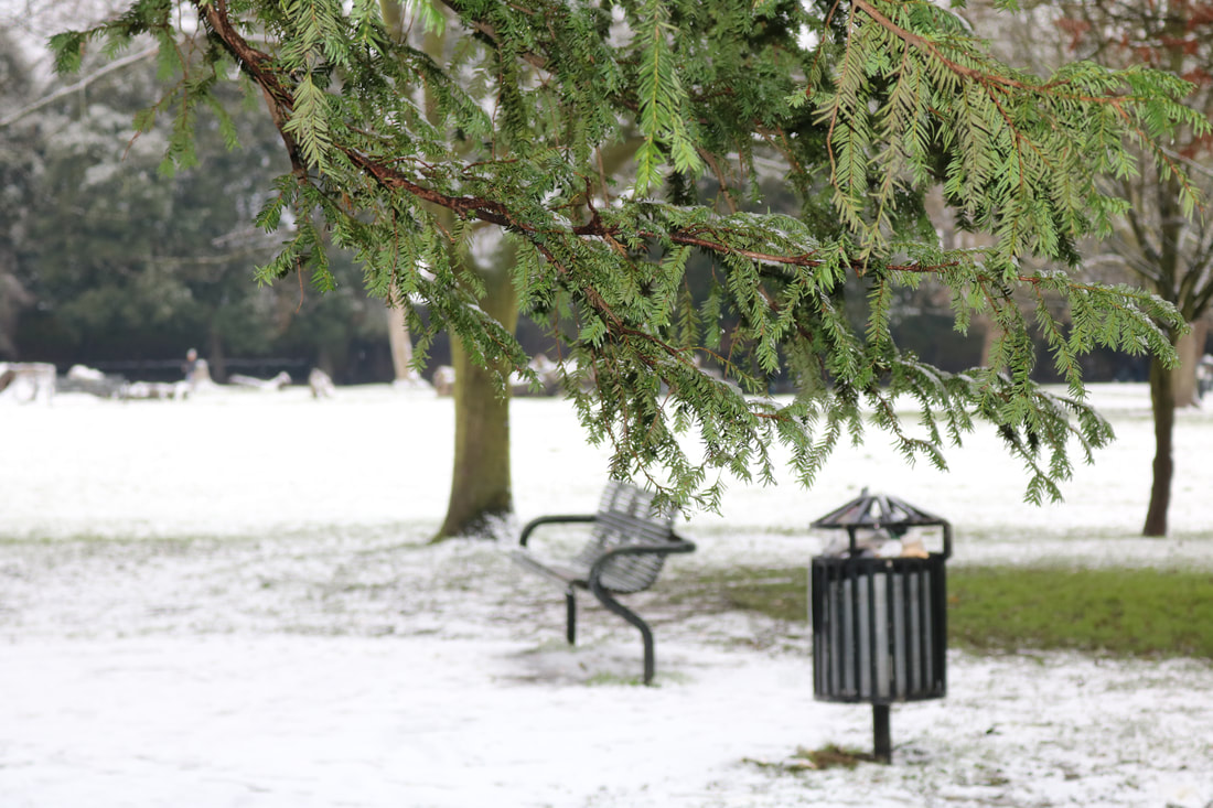
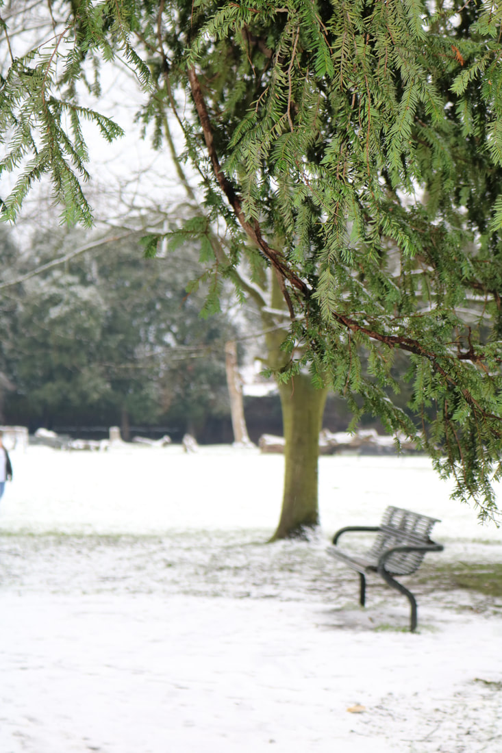
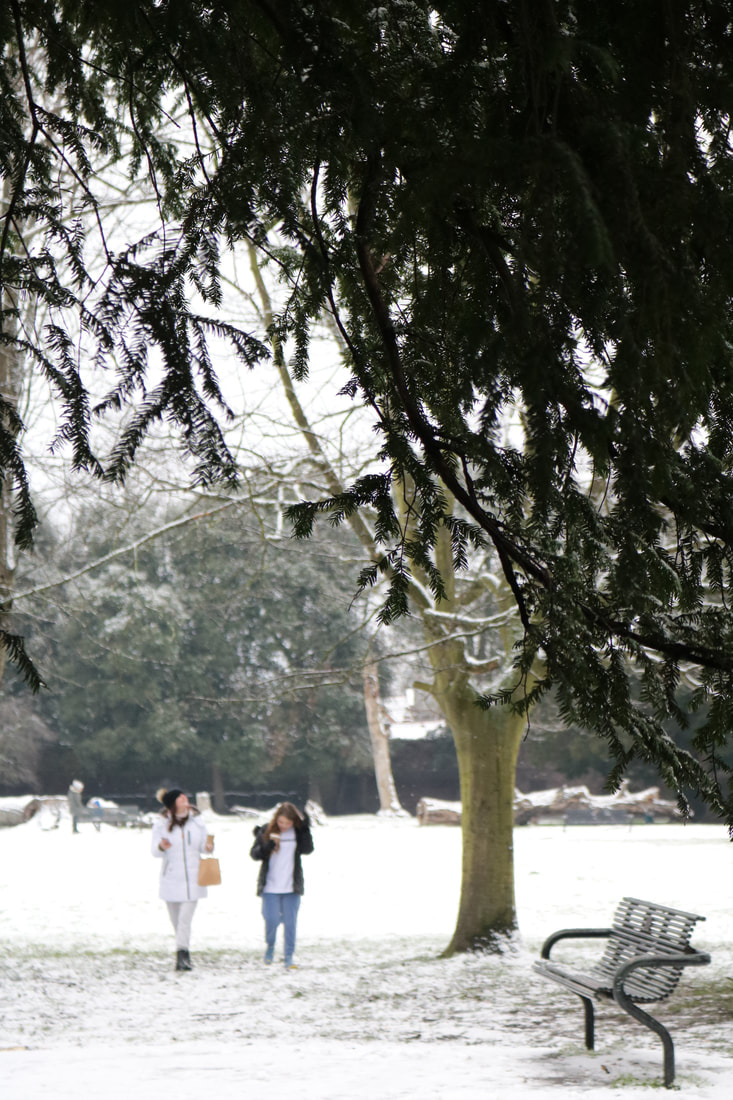
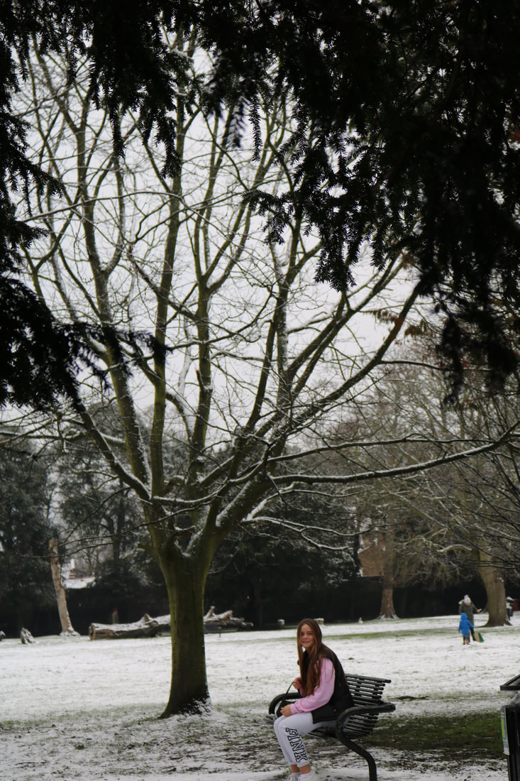
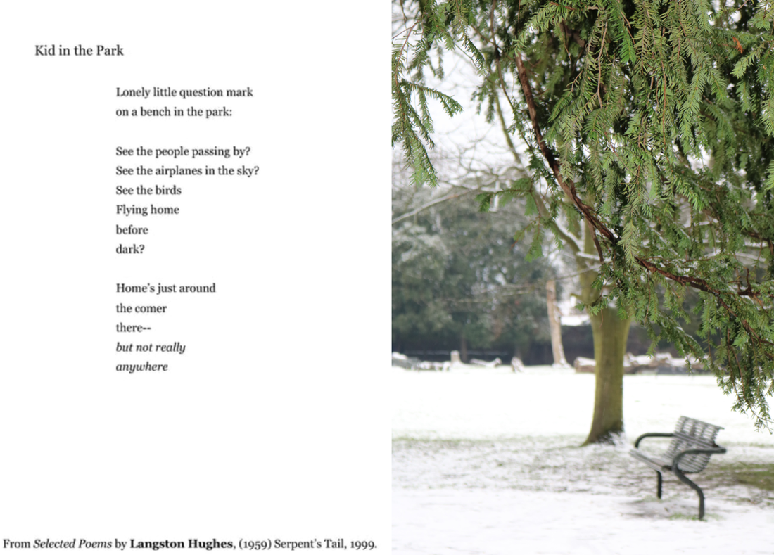
I chose this image as the final response for this poem, because I liked that it had no people in it. This is because, in the image there is snow and when thinking of snow I personally connote that with kids playing, happiness and excitement. However, this image has no people, just the setting and bench, which relates with the bench that the kid speaks about, and the loneliness in the image reflects the sadness of the child feeling alone and lost. This contrasts with our initial thoughts of snow and snow days. I really like that the trees are more in focus, because in the poem, I feel as if the kid is distracting his own sadness, with the questions 'see the people..?', ' see the birds..?, and blurring his problems, which I feel can be reflected through best in the final image I chose.
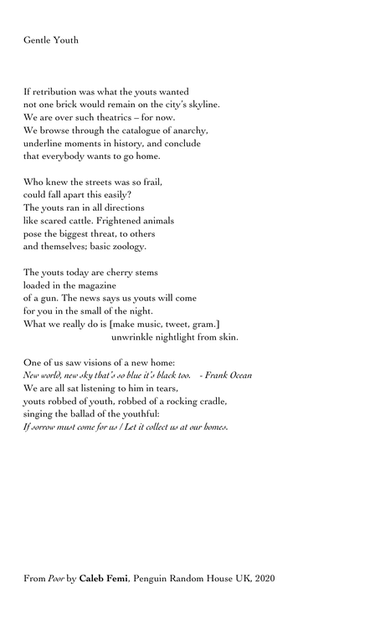
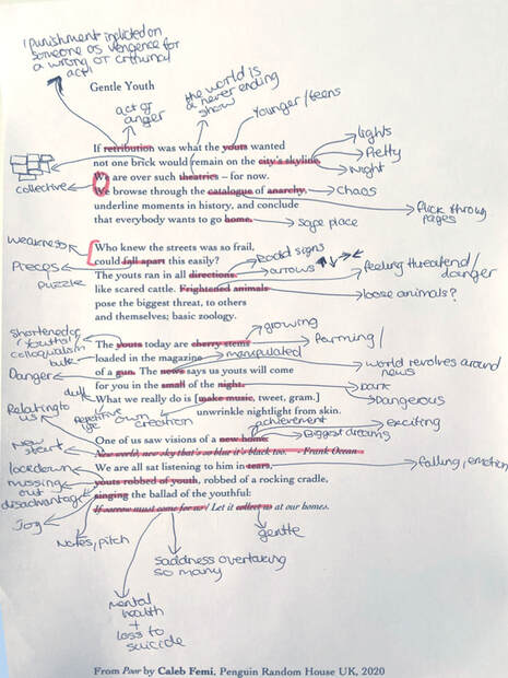
Gentle Youth
|
|
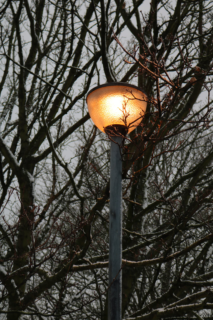
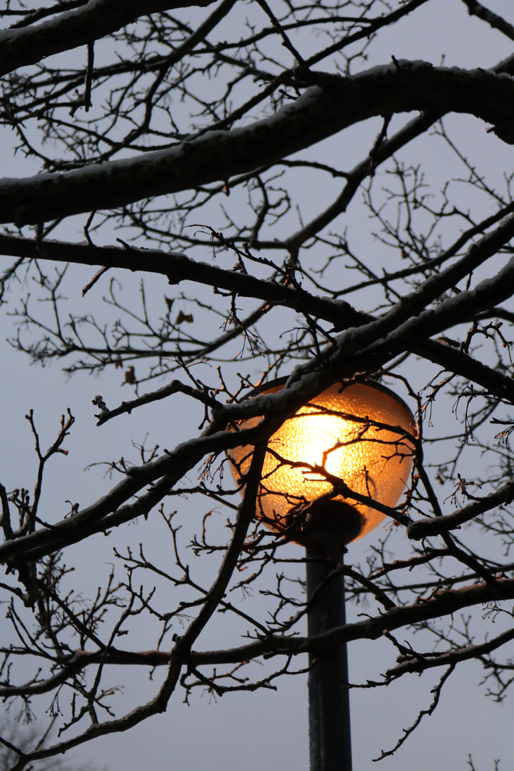
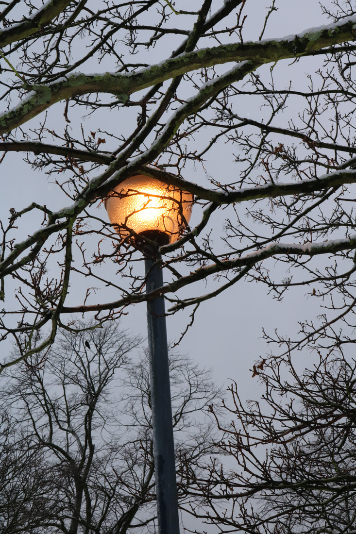
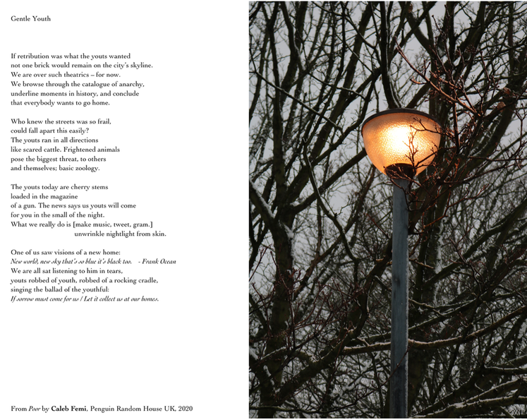
I was walking down my local park on the day it snowed, and there is a pathway, which was empty in the evening and full of bare trees with snow on them. This one light, was surrounded by these bare branches and I thought it was perfect for this poem and so took images of it. I like how the lamp sort of represents our youth and the branches are all the issues and stress that surround us, the right side of the image, has some of the branches creeping onto the side of the lamp, as if trying to invade on the hope we get from the left side of the image as the branches are behind the lights.
Choosing an image and poem-
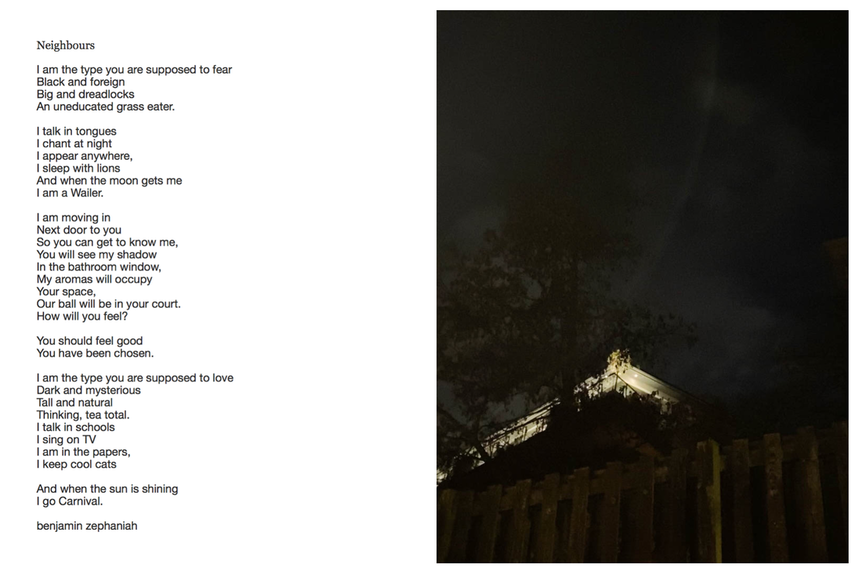
For this project, I started with the picture and then looked for a poem to go with it. I took two of these photographs while out for a walk in Blackheath in the evening and saw this view. This image turned out perfectly and was very fortunate because it was taken at random, with no intention of being my chosen image for this homework. I really like the image because of the angle of the building being above on a hill, seeming as if the viewer is prying into that terrotory, creating an eerie feeling as it is so dark and mysterious. I personally love the shapes created in the sky being very low capacity, again building on the eeriness of the image. I chose this poem because i wanted a poem that was mysterious and quite creepy. I looked through a few books and actually found this poem in one of my old GCSE English revision guides for unseen poetry. It was this poem and another called 'sleeping' that I was choosing between. I chose this poem in the end because when I read it I was felt quite unsettled by some of the words such as; 'chants at night', 'dark and mysterious' , 'you will see my shadow'. All these lines in the poem just made me think of when i am home alone, and quite scared or when you watch movies of people being watched and stalked. The angle of the image, of the view being of the building but from below, made me connote it to this idea of being watched and so creates a sort of storyline of this new 'neighbour' watching people. I really like how in the image the tree top starts to blend in with the sky, sort of reflecting a horrifying end. I know the poem is actually about discrimination in society and even so i think the image is still suitable, as the 'main character' in the poem is the ones shut out in the scary dark on his own, looking in on the society shutting him out.
Other text and image experimentations
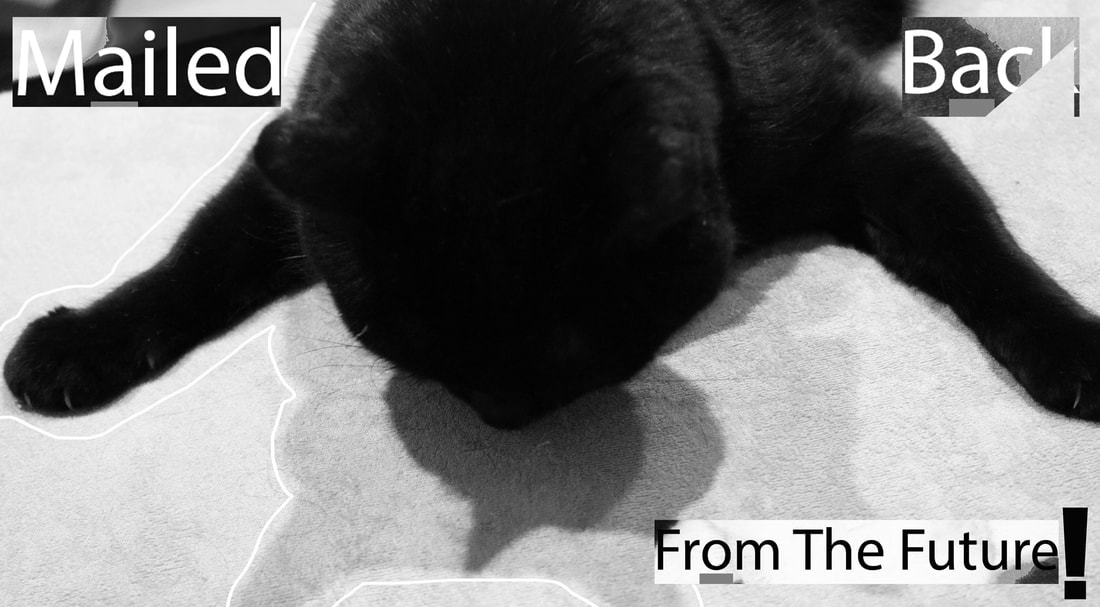
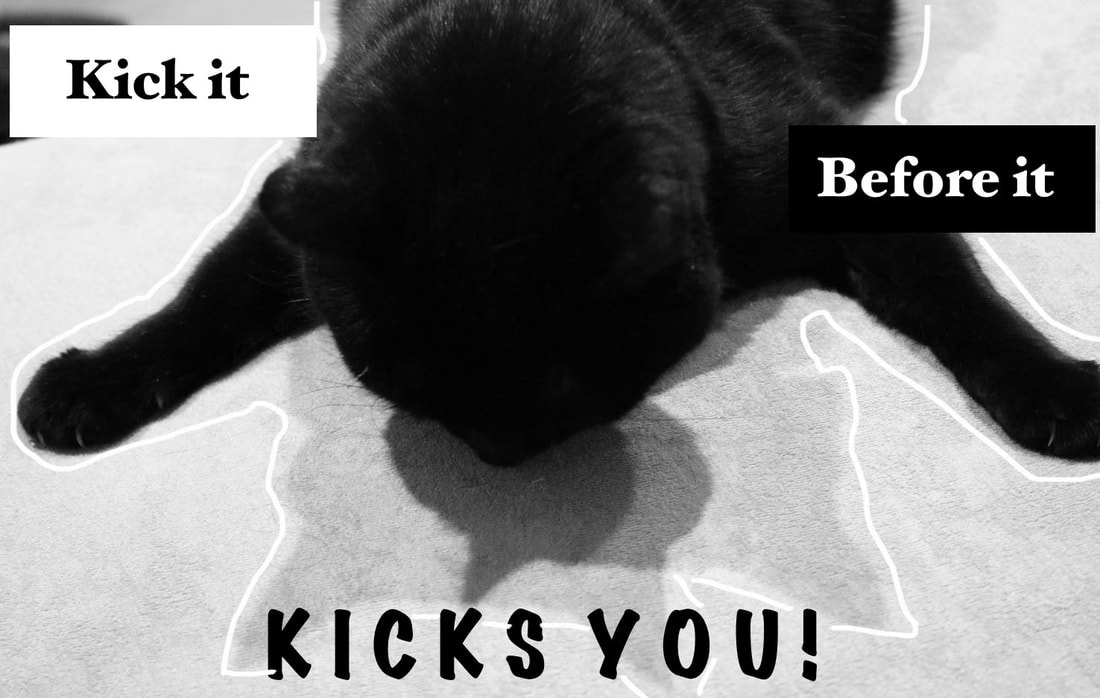
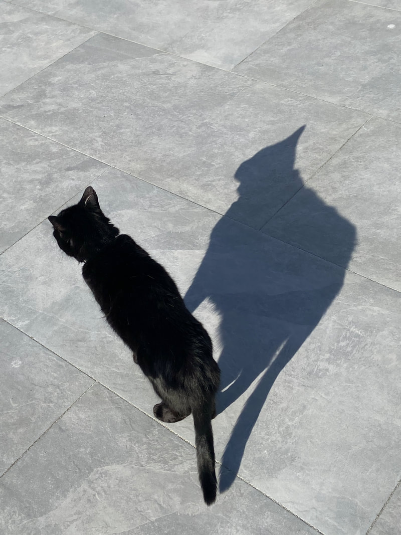
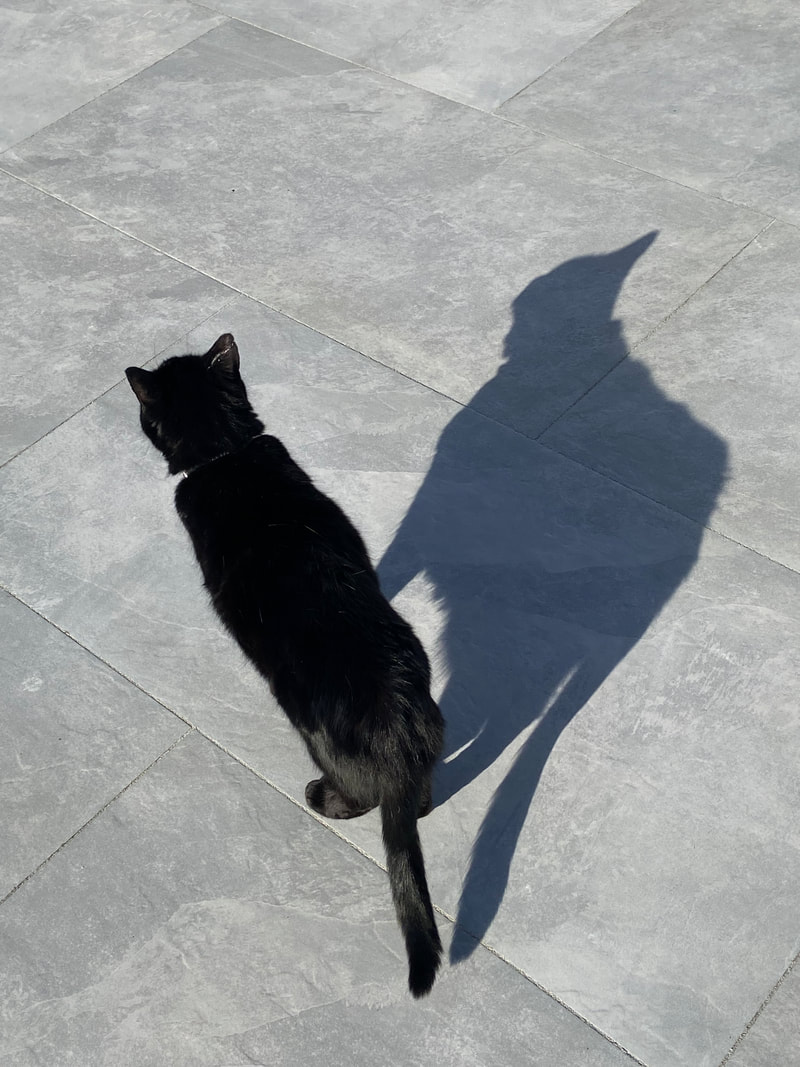
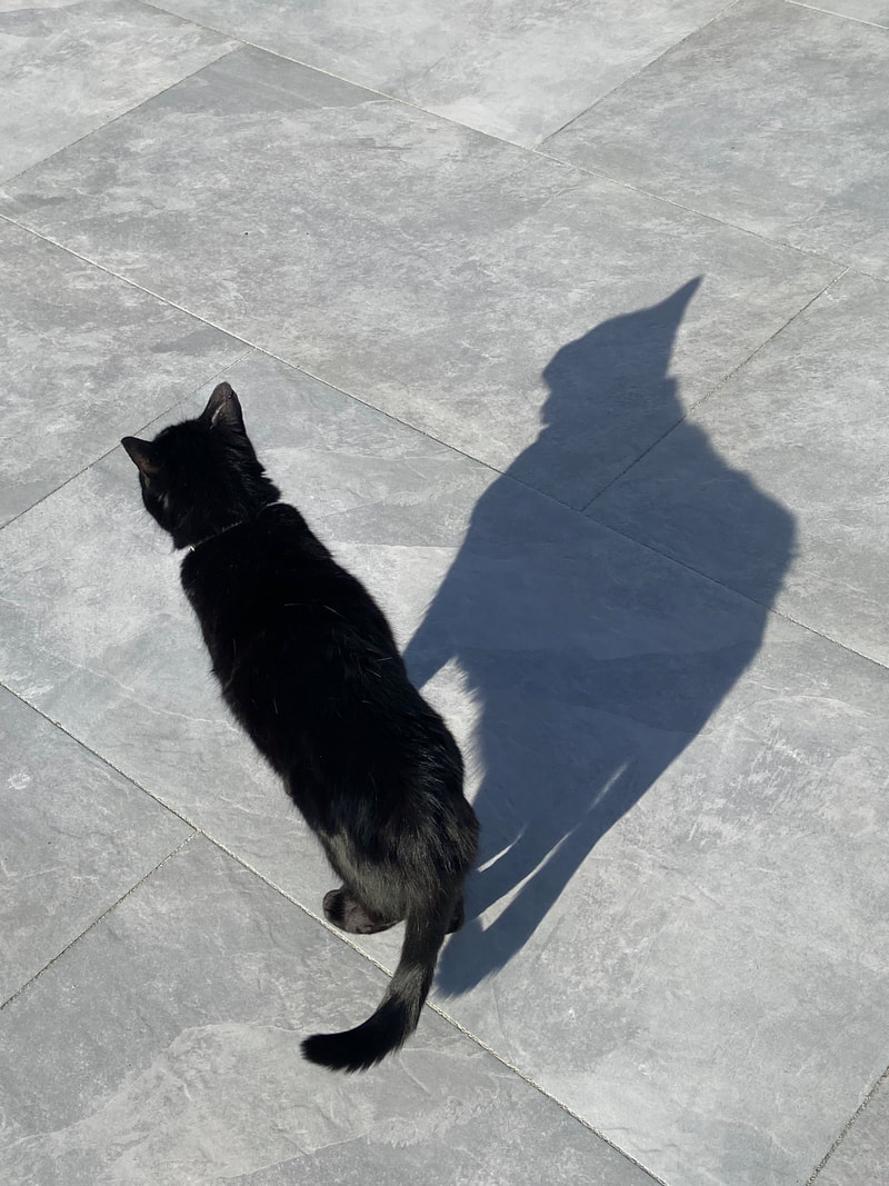
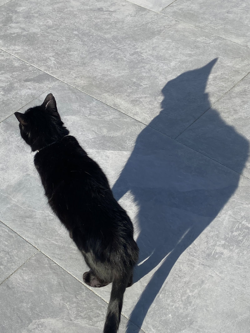
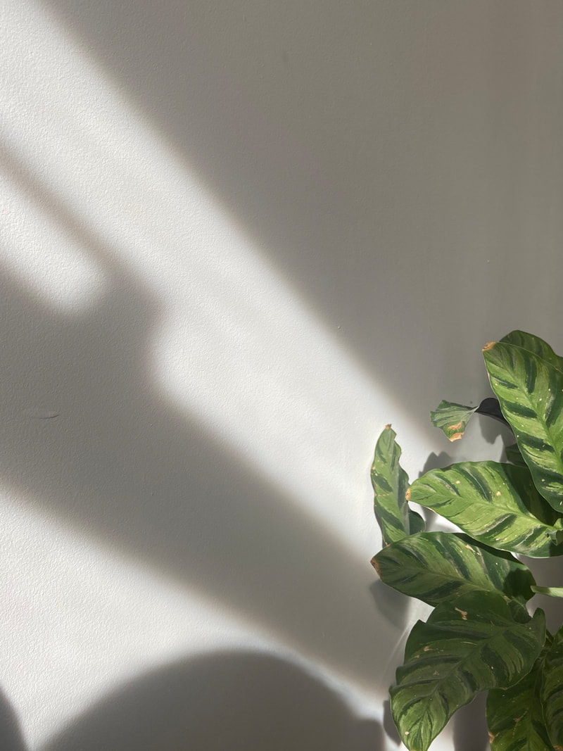
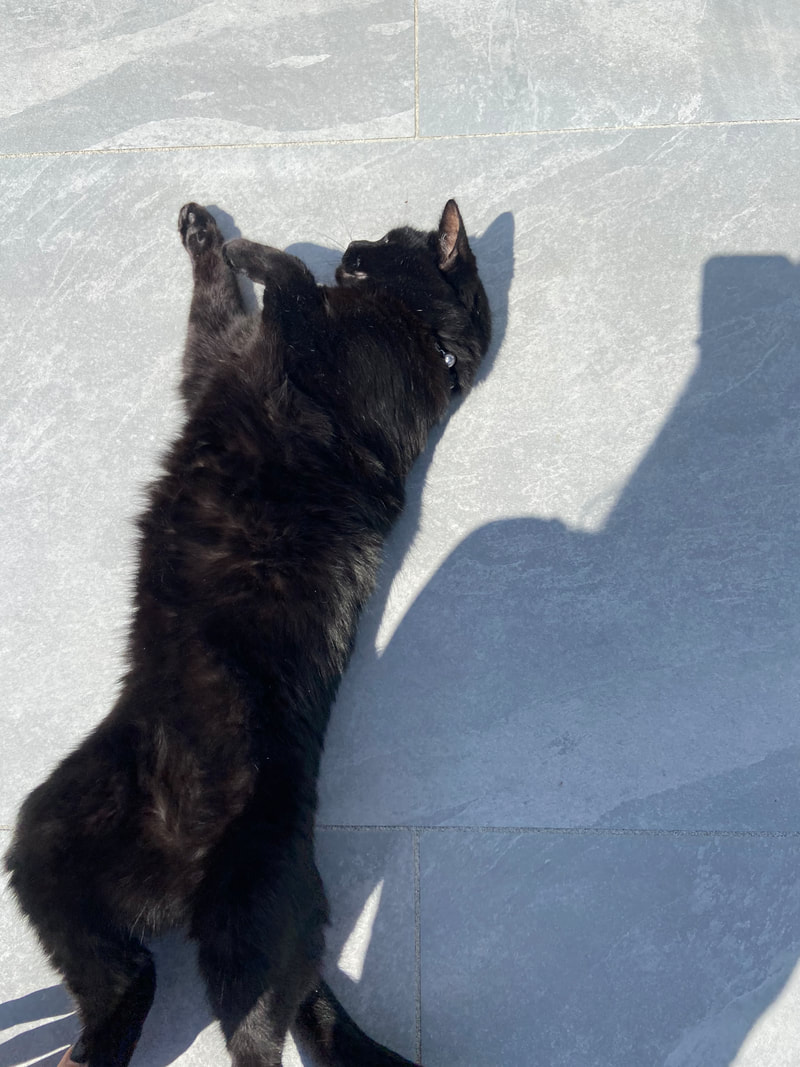
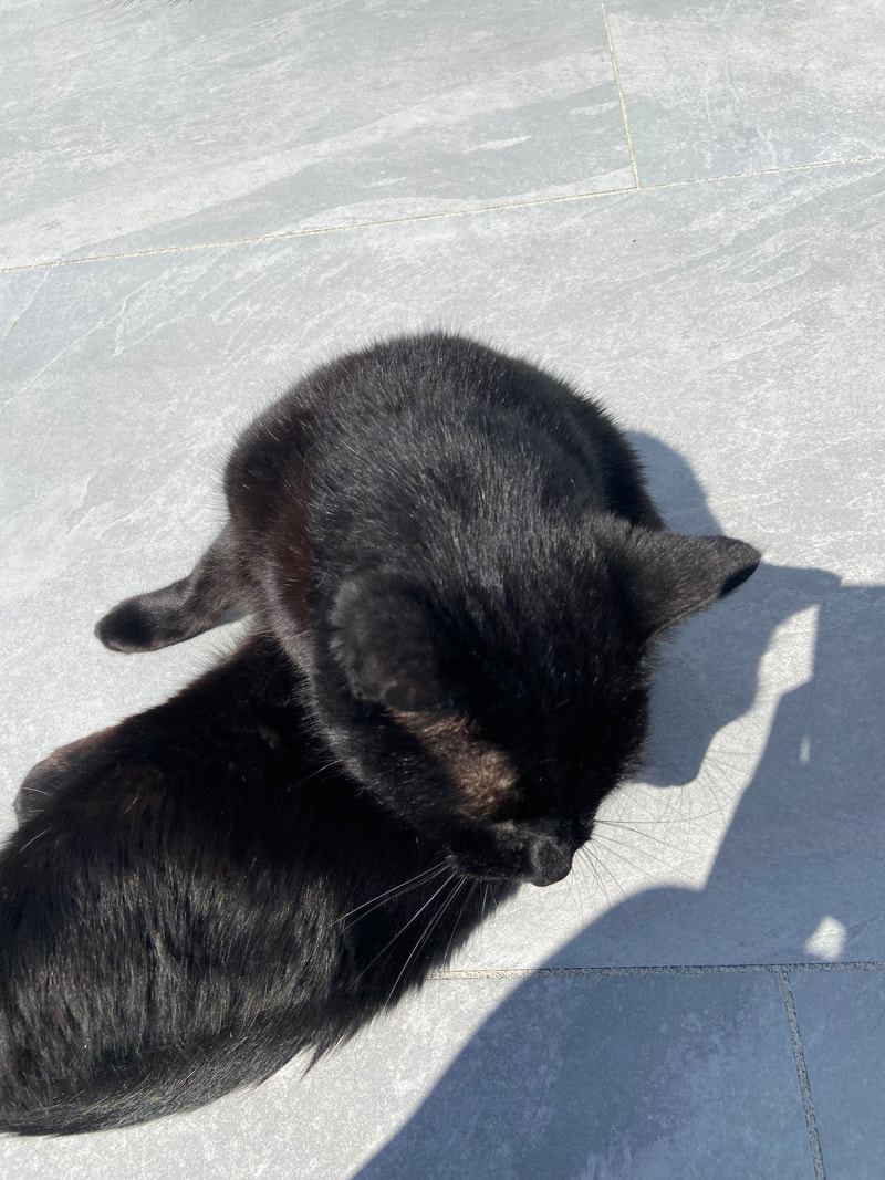
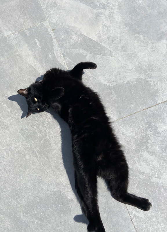
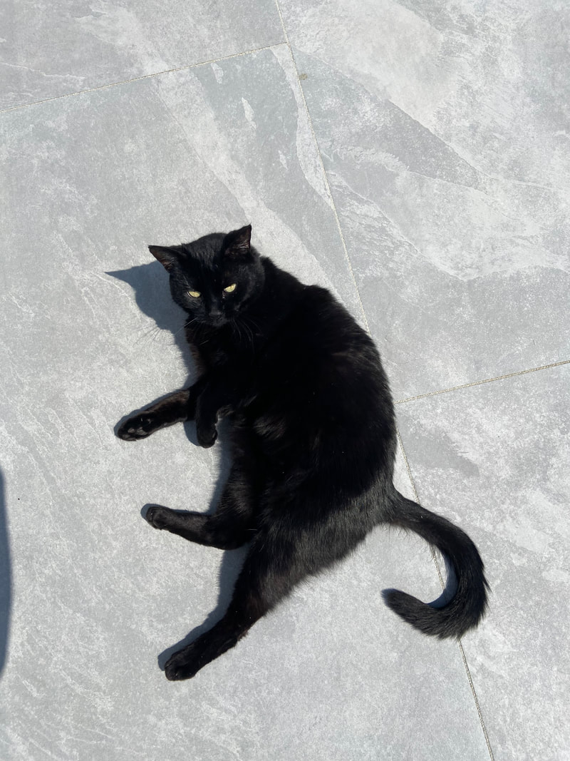
I chose the text from a weird magazine slogan that I found online. I was a bit unsure on how to find a piece of text from cityscape, as when looking in a physical magazine, nothing really popped out to me. Therefore, I decided to take my images first and then based finding the text off of the image. I took this image of my cat, when he was being quite funny, and staring at his own shadows when lying down. He was doing this because my mum sprayed catnip spray on her bed and so he was being quite funny. I love how the image turned out as it is quite humorous. I looked up some slogans used in newspapers about drug abuse, and one I used was 'kick it before it kicks you', as I liked how it would be quite an abstract pairing, rising questions to an audience about the context, as the text is paired with an image of a cat. I then used a website that had many newspaper slogans/headlines, and i found 'mailed from the future'. I really liked this one as in the image my cat looks very confused and as if he had just fallen and landed in this situation, therefore fitting well with the text as he gathers his surroundings.
Chance pairing zine
|
Chance Associations from Jon Nicholls on Vimeo. |
|
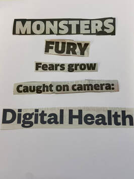
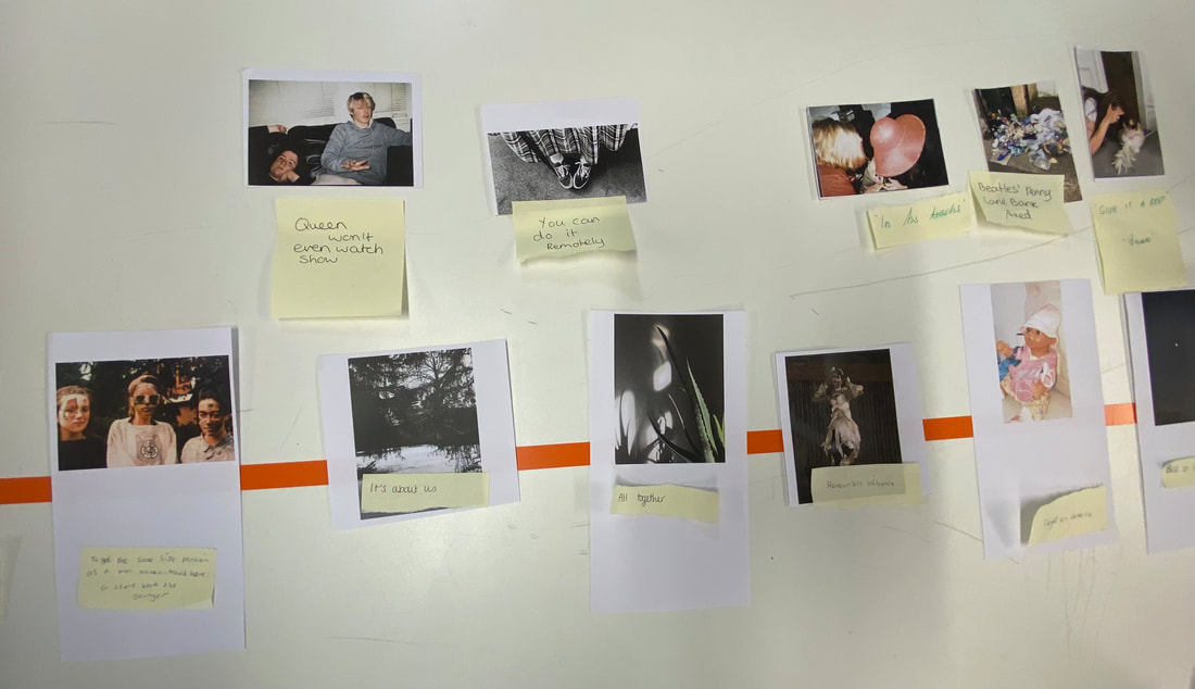
We began this process by selecting text which we cut out of newspapers, where we got to cut out 5 pieces of text each. It could have been a sentence or just a single word. I trimmed out anything that caught my attention, which was mostly the bigger sections of text (in letter size). As a lot of the publications were focused on the news of world gossip and problems at the time, which was Harry and Meghan, I was more interested in picking amusing and intriguing bits of text. Therefore I chose words that were different to the norm in each newspaper and also ones that could bring some humour. However, I thought it would be fun to cut out some controversial bits because I knew we'd be mixing words and images in the lessons, and a very funny picture paired with a controversial title might have made the pairings more adventurous and fascinating. Although, we really had no idea what images we would actually get, as we hadn't even seen the images everyone sent in. In the above picture, were my final selection of words that I chose to cut out.
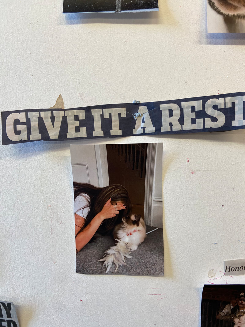
Miss took all of our words and shuffled them together before randomly distributing them, and she did the same with the pictures. We then had a random selection of words and pictures, which we hung on the wall backwards so we couldn't see the image or the text, randomly pairing an image and text without seeing it. We were then able to turn it all around and reveal what we got. The first surprise for the group was seeing the variety of images we received, which included landscapes, portraits, still lifes, and photographs of cats, among other things, as well as seeing what text was paired with each image. It was inconvenient not to be able to move pictures around to match other pieces of text during this process.
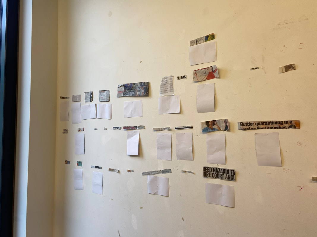
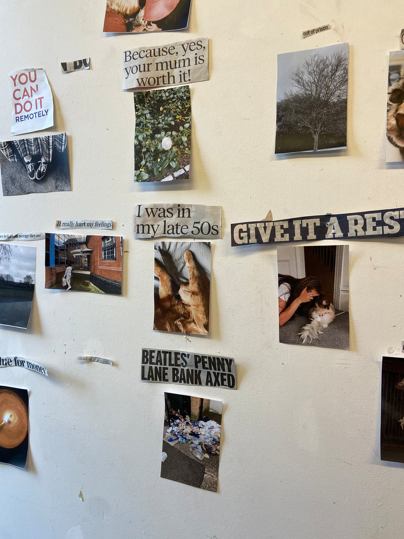
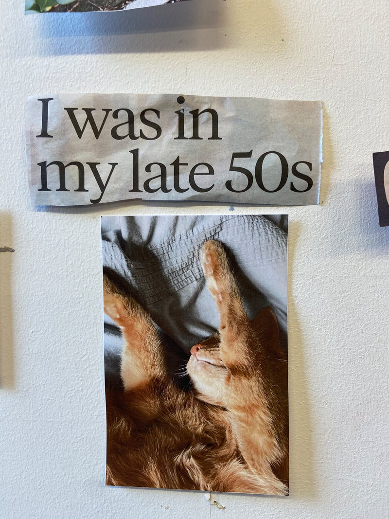
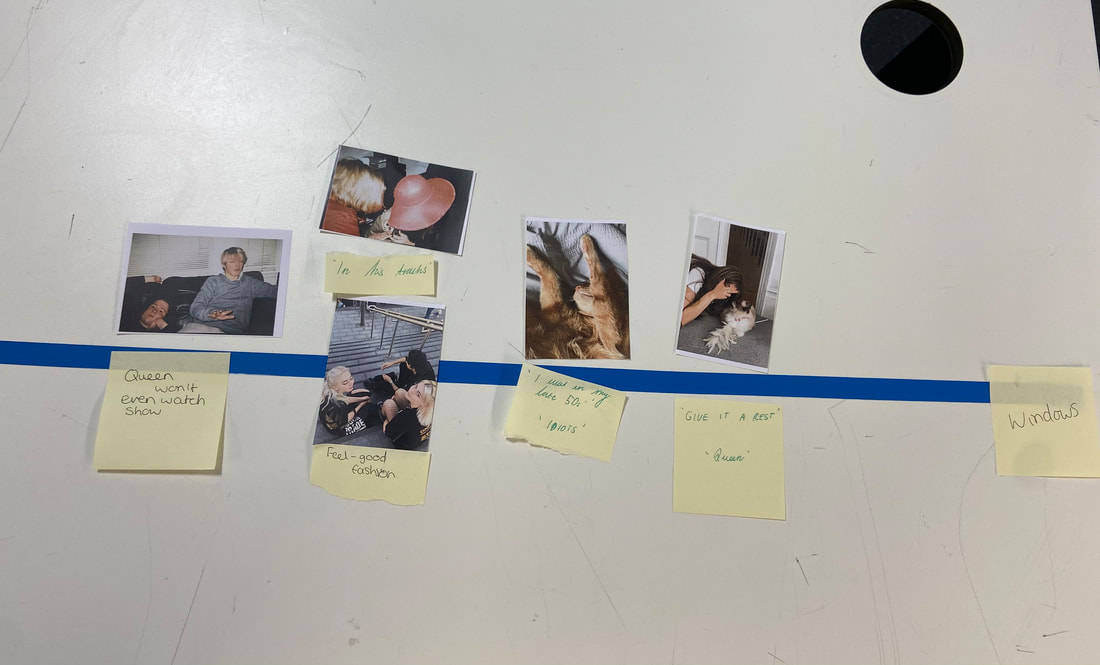
The girls sitting down with the caption 'feel-good fashion' was, in my opinion, the most effective pairing. I think this one was effective because the image itself appears to be similar to something from a fashion magazine, as the girls are dressed youthfully and the image appears to have been captured by chance (as one girl has her eyes closed). The pairing, along with the caption, reminds me of a skater image/magazine from the 1980s/90s. The term 'fashion' refers to the clothes that the girls wear and how similar they are. They seem to be having a good time, and photographs of people wearing the clothing advertised in magazines are used to promote the product. Another one of my favourites is the cat stretching with the caption "I was in my late 50s." I like this one because it is quite amusing because it is attached to an image of a cat, but you would expect an older adult, making it humourous because cats are considered to be very prestigious and lazy, which ironically fits the text. This one is also one of my favourites because it reminds me of my own photographic style, which can be very humorous at times.
I didn't mind giving up my own images (we all sent Miss 5 each) for others to use because I was curious to see what text people would get with it and how they would lay it out, as well as what new context the image would receive. Also, I'm glad we didn't just use our own photos because that meant I was less biassed. We have an emotional connection to our own images, so we may have purposefully played it safe and chosen to work with our own images rather than others'. Furthermore, since we took our own photos, we are familiar with the context, and I would find it difficult to attach a random new sentence to one that made no sense in the original context. We have no relationships, interpretations, or stories when we work with each other's images, allowing a more open mind and freedom to explore the context provided by the attached text. It was fascinating to see what text was associated with my own image, which I did not choose because it allowed the images to take on new meanings. However, it was perplexing at times to see texts that didn't belong on some of the images because they didn't make sense or added nothing to the picture, and we couldn't change them.
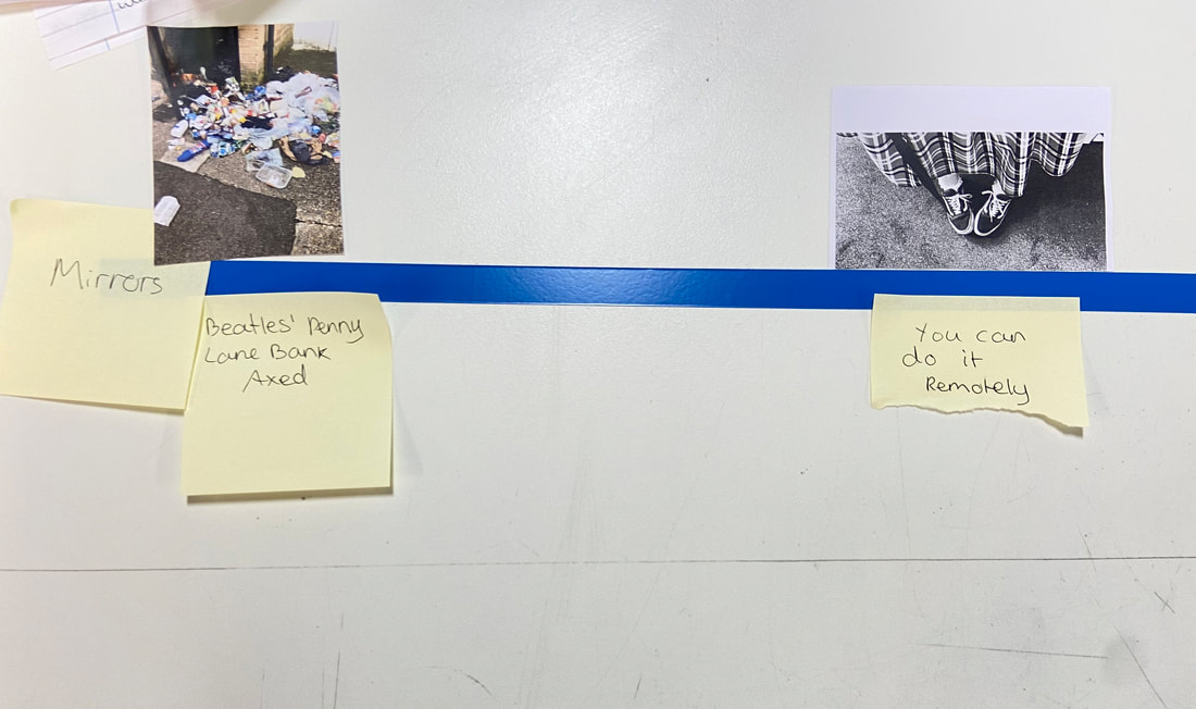
We had a thinner version of the magazine to ourselves when inserting photos into the layouts of the zine before merging them all into our group one. When I was making my own, I considered subtly shifting the placement of each pair to give the layout some context. This was accomplished by distributing the more amusing pairs among the less amusing ones that I disliked. This seemed clever to me because the best pairs were not all in one place when I was flicking through the magazine, which meant the magazine wasn't just getting worse as I continued to flick through it, as the good ones would pop up. However, I was aware that we would be randomly inserting the other members of my group's pages, causing some of the layout to be changed. This shifted my magazine's initial objectives. Overall, I'm pleased with the majority of the magazine my group produced, especially given how limited we were in terms of what we could pair and alter. Naturally, there are parts of the zine that I dislike because the picture and text don't make sense to me and appear to be very dull. The image of the trash on the floor with the text 'Beatles' penny lane bank axed' was an example of a pair that I didn't like. I just don't think the rubbish in the picture has anything to do with a bank being shut down. I believe another of the reasons I struggled with this activity is that I am not used to not having complete control over my photography; however, this demonstrates that you cannot always get what you want. This is also a reflection of opportunities and failures in photography. If I were to do this again, I think the activity would be better if we were able to have the rule of changing 2 things from our sets. This would improve it because there were a few things I would have liked to change around to make a better pairing but couldn't, meaning I wasn't completely satisfied with the zine. I think the magazine would have turned out better if we had more control over which pictures went with which texts.
Our groupes magazine-
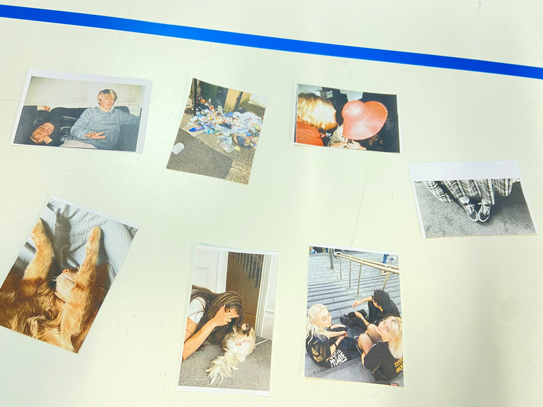
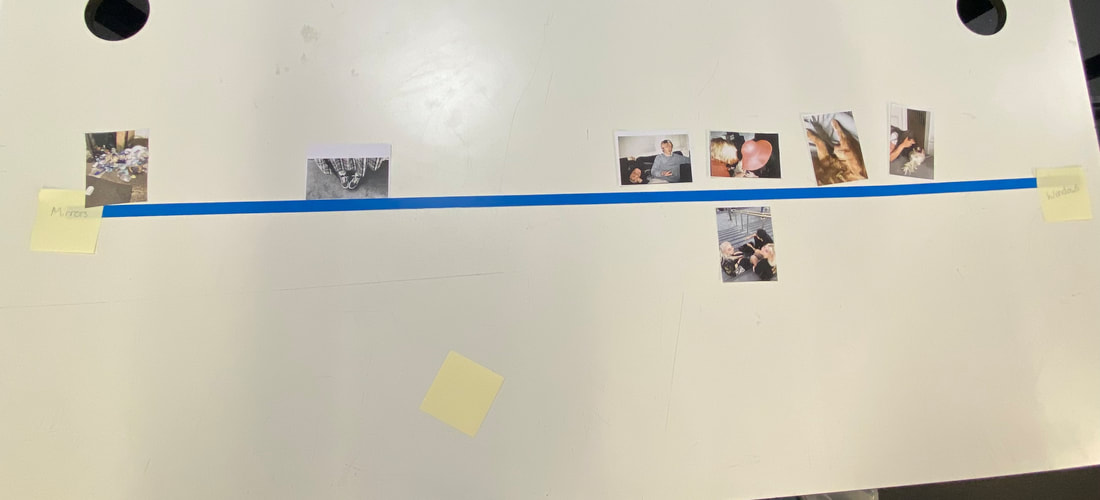
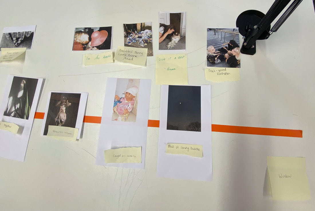
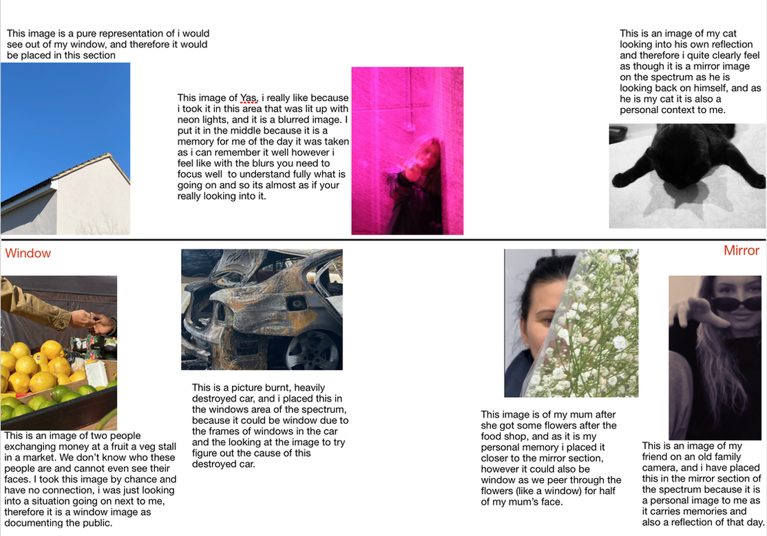
Then we had an activity where we used the photos from our magazine, and placed them on a window-mirror scale. We started by having the photos split and doing it in pairs, rather then group of four. This is linked to Szarkowski's concepts of mirror; subjective, generalised, reflective, artistic, synthetic, psychological, manipulated, personal, suggestive and of window; objective, specific, observed, documentary, real, optical, straight, public, descriptive. I did not find this too hard as a lot of the images were of other people and i did see that more as window as it is a look into somebody elses life. However, we then had to attatch the text, the image is paired with in our magazine, and re-scale our ideas. This definetly changed our ideas, as it gave more context to the picture and weather it is more mirror or window like.
'Unphotographable' project
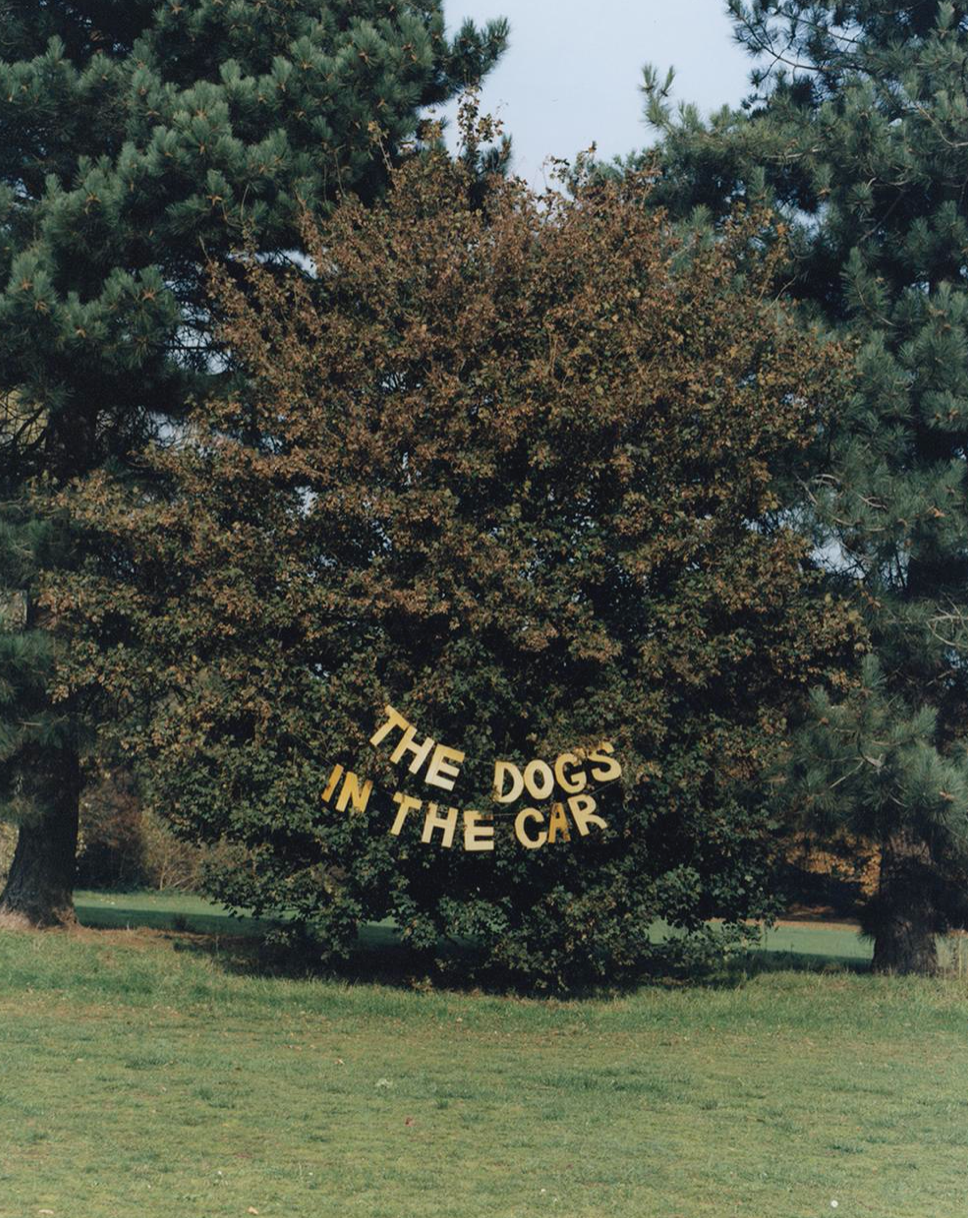
Tami Aftab - 'The dog's in the car'
|
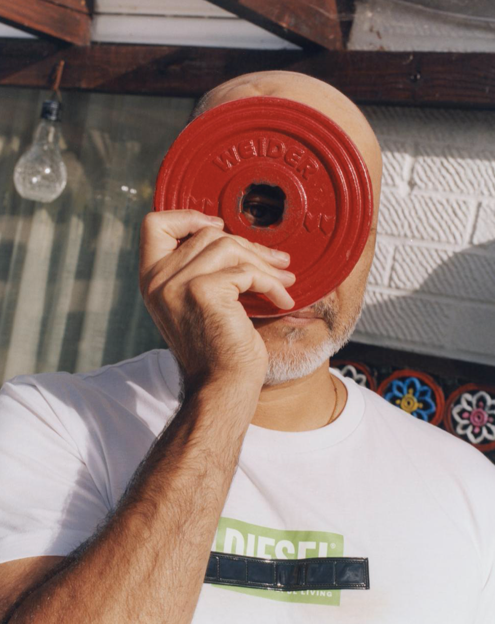
Tami Aftab is a London born and based Photographer who studied BA photography at London College of Communication, UAL. Her
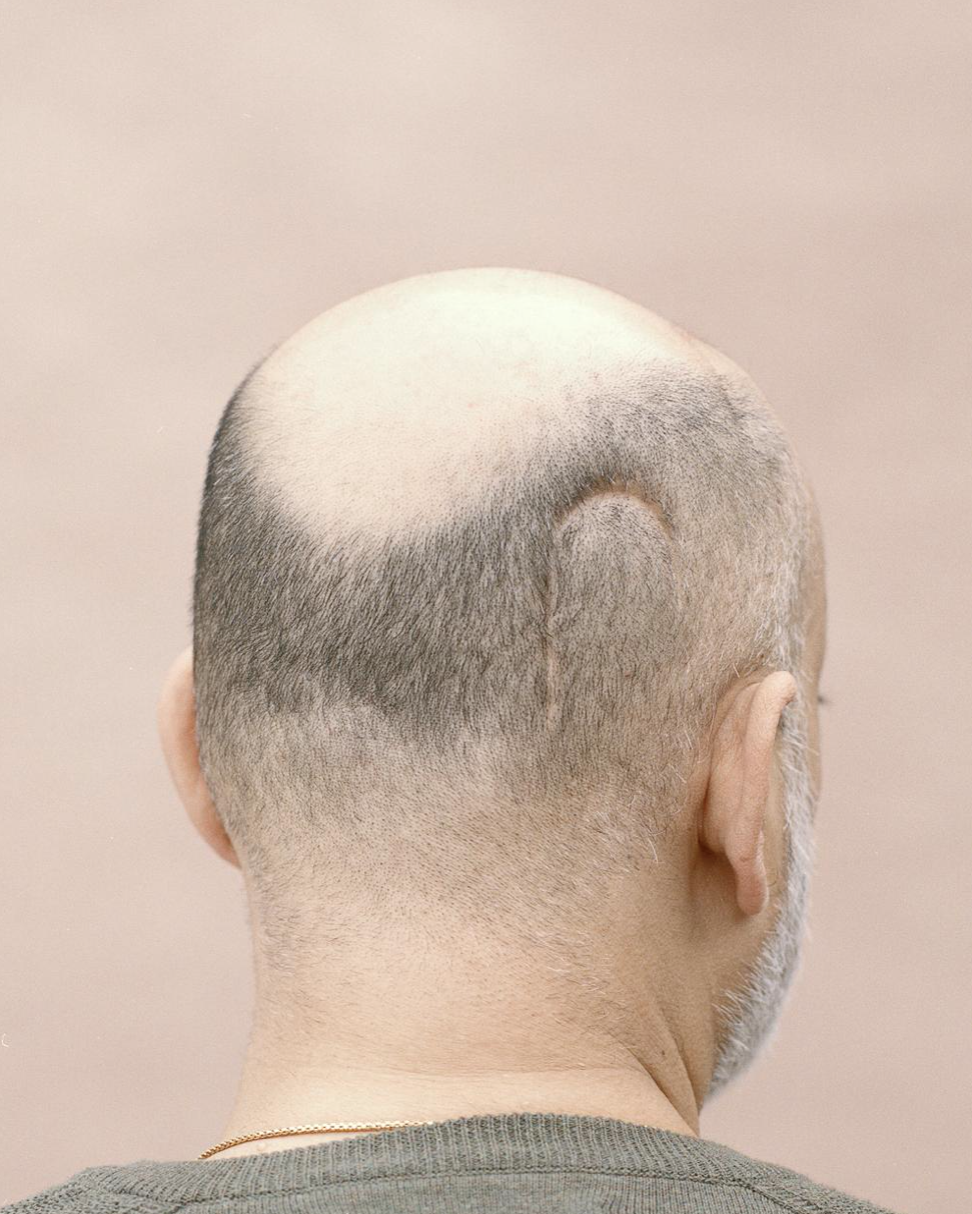
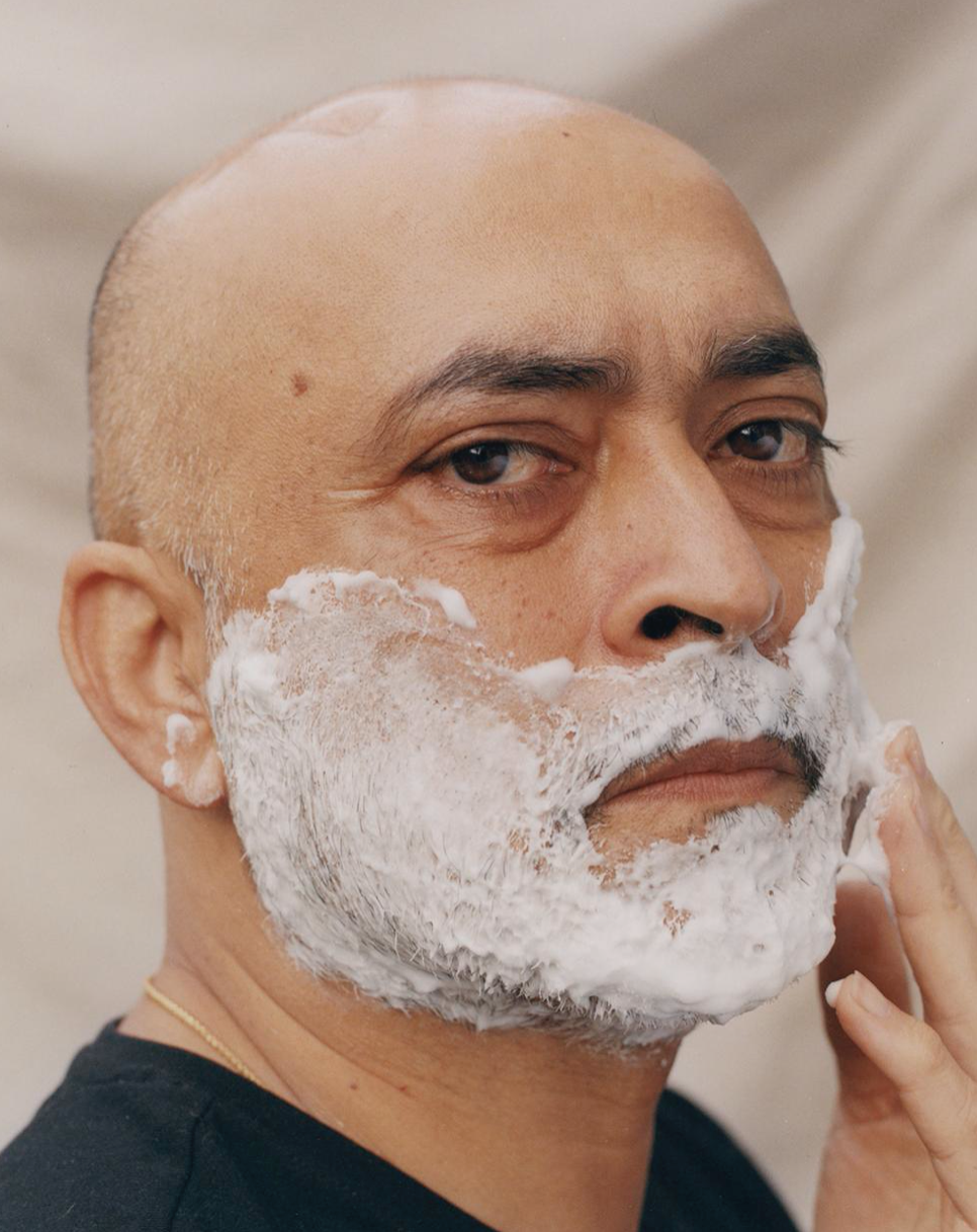
work touches on subjects of reflecting intimacy, performance and playfulness through the form of portraiture. One of her projects was based around her dad, Tony, who sadly suffers with hydracephalus, which is an abnormal build up of cerebral fluid in the ventricles of the brain. During an operation he had, to bypass blockages, an internal bleed occurred, which resulted in permanent damage to his short term memory. 'The dog's in the car' is a project about her father and his day-to-day life as a result of this major change in his life. Tony forgets and continues to believe he has lost their dog after a dog walk, as Aftab's mother cries, 'the dog's in the car,' while Tony forgets and continues to believe he had lost the dog while inside the home. Since this is a recurring occurrence, she came up with the concept for the project. Her series of portraits uses a lighthearted tone to reflect issues such as sickness, family, partnership, and consent. Portraits of her father bathing, grooming, and wearing his new hats are among her photographs. I like the photographs of the hook-shaped things that represent her father's scar on his head, which are paralleled with an actual representation of the scar in the collection of images, because it adds so much more emotion into the story being told through her images. |
|
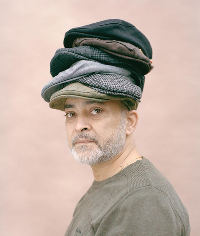
This is my favourite image from her project. She took this image to represent her dad's love for buying new hats at the charity shop, often coming back with an exact same one he already owns, but not remembering this. I love that she has used a light pink background for this portrait image, because it blends well with her dad's skin tone, allowing the stack of hats to stand out, letting them be the centre piece for the image, allowing the to story stand out and highlight the struggles with such an illness. However I also like how the angle of the image is straight on and the dad is turned facing the audience, almost as if looking at us, as it makes me as an audience of this image feel so much emotion as I feel as though I am meeting him through the image.
|
|
|
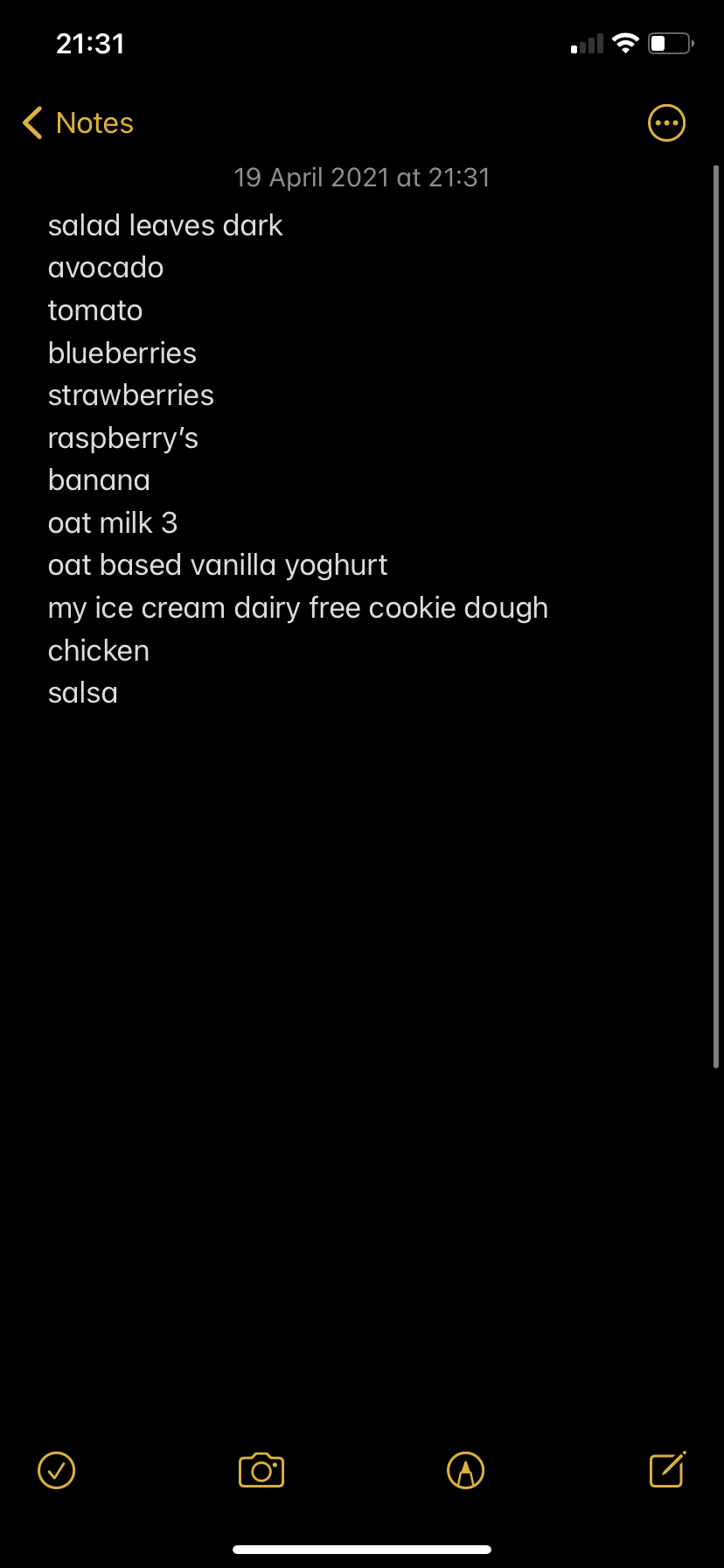
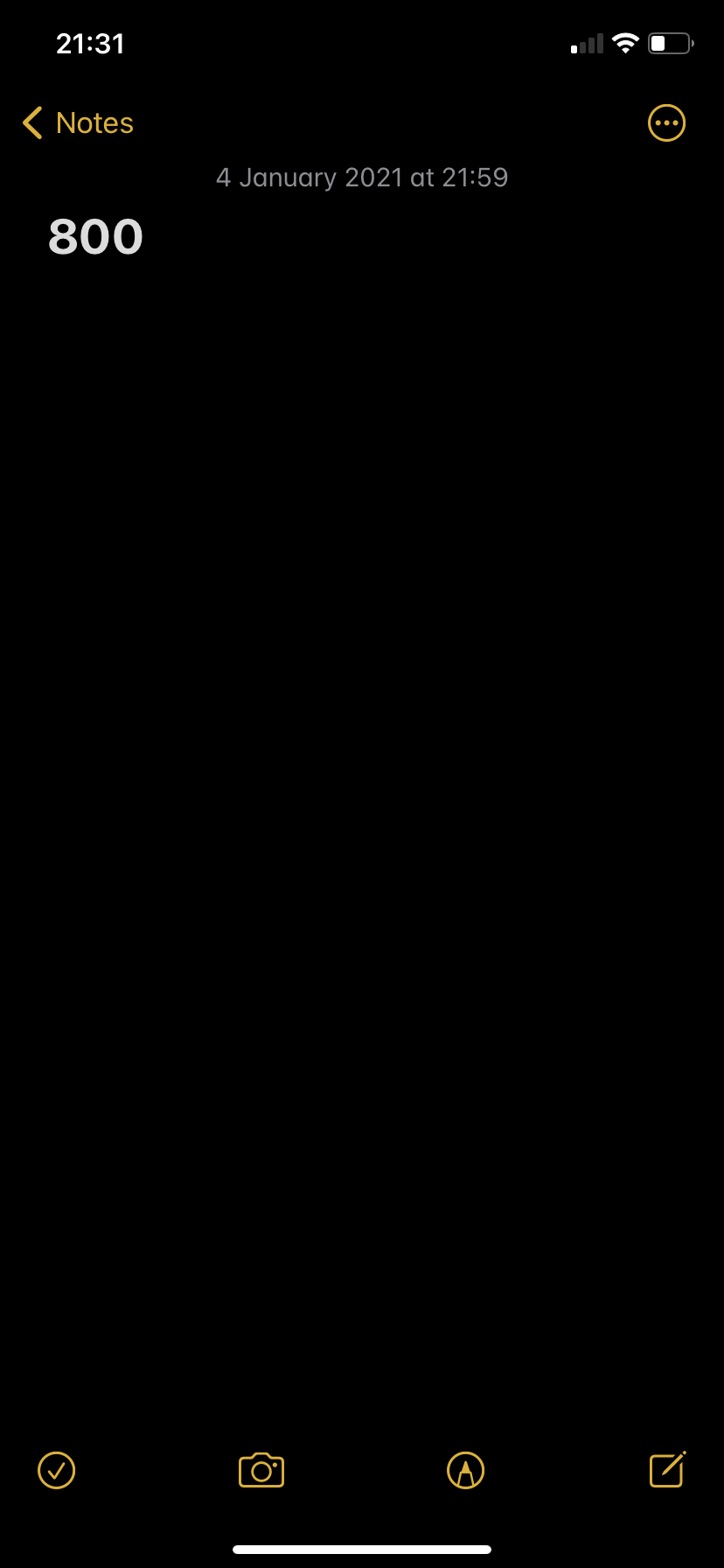
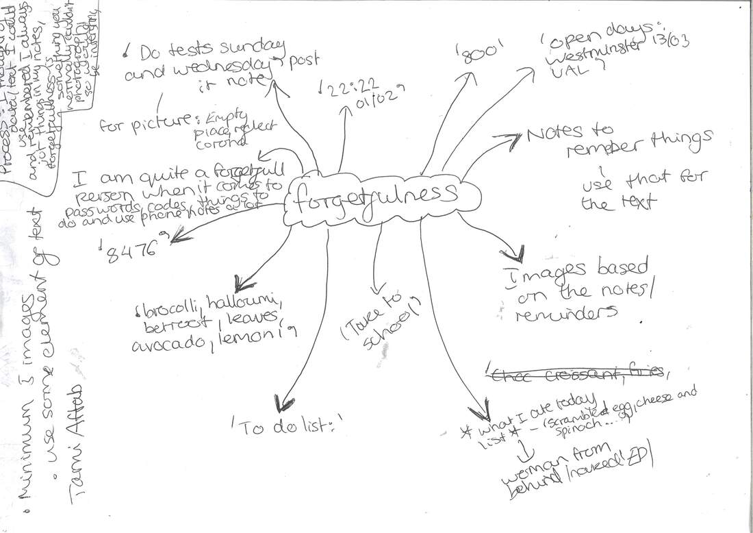
When finding out about this project, i thought about a few ideas such as dreams, romantic relationship, days being just a concept. However, when I was told there will have to be text involved, I wanted to include actual, already existing text, and thought of the notes section on my phone. I use notes religiously, and jot everything I need to remember down as I am quite forgetful, so I decided to look back in, to see how they could develop my ideas. It was quite interesting as a lot of the notes were very random and I could not remember at all what they were for. Which made my idea to do forgetfulness even more interesting as those notes were open to be interpreted ideas to expand into images. I used a piece of paper to mind-map my ideas and some of the text/notes I would use in my set of images but to also spark inspiration for the images. I also screen-shotted some of the notes.
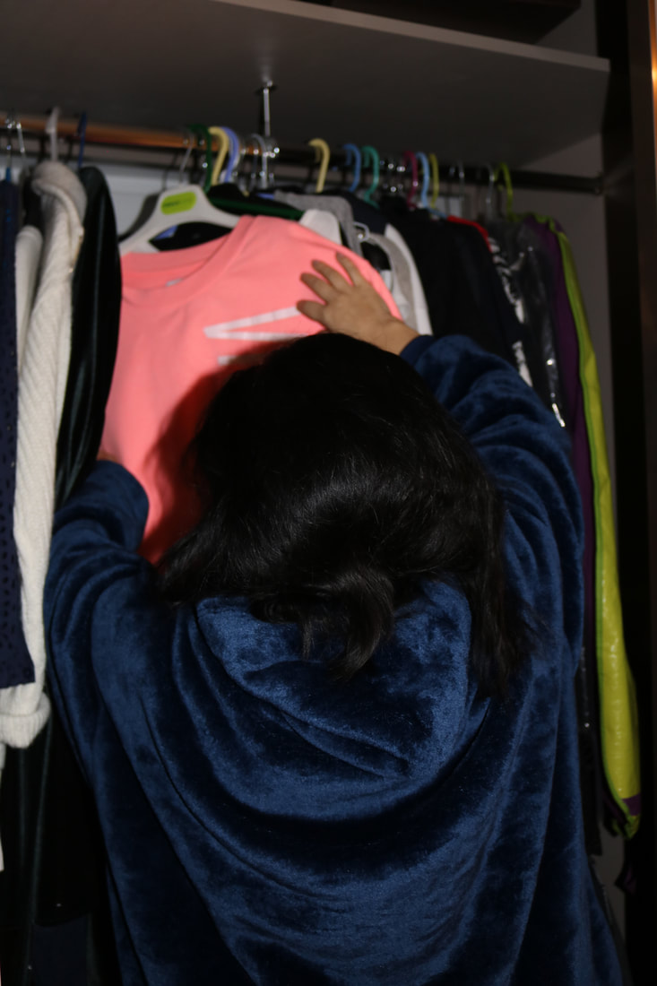
This is my last collection of photographs, which I took at various times. I did this because I wasn't sure what motif I wanted my photographs to take on, and I figured that a random range from a variety of images would help represent the notion of 'forgetfulness' as the idea comes back. Originally, miss had requested us to also incorporate text with the images, however, my ideas for my images were all based on my notes. Therefore, I conveyed text from my project idea through the images themselves and I also included images into this set, with random numbers in the images, which reflect the kind of text I would have included myself. This helped me to decide it was more effective to not include extra text, as it would make the set of images look messier and more confusing. Overall I am happy with my set of images, for this project, as I met my target to reflect forgetfulness and randomness of thoughts, at random moments, as the selection has no particular flow of images. One thing that I would do to improve this set of images maybe includes some still life images of objects, like keys, etc, abstractly, as with my set of images I like that the idea of my project is not majorly obvious, as I wanted to approach it abstractly.
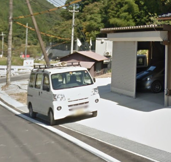
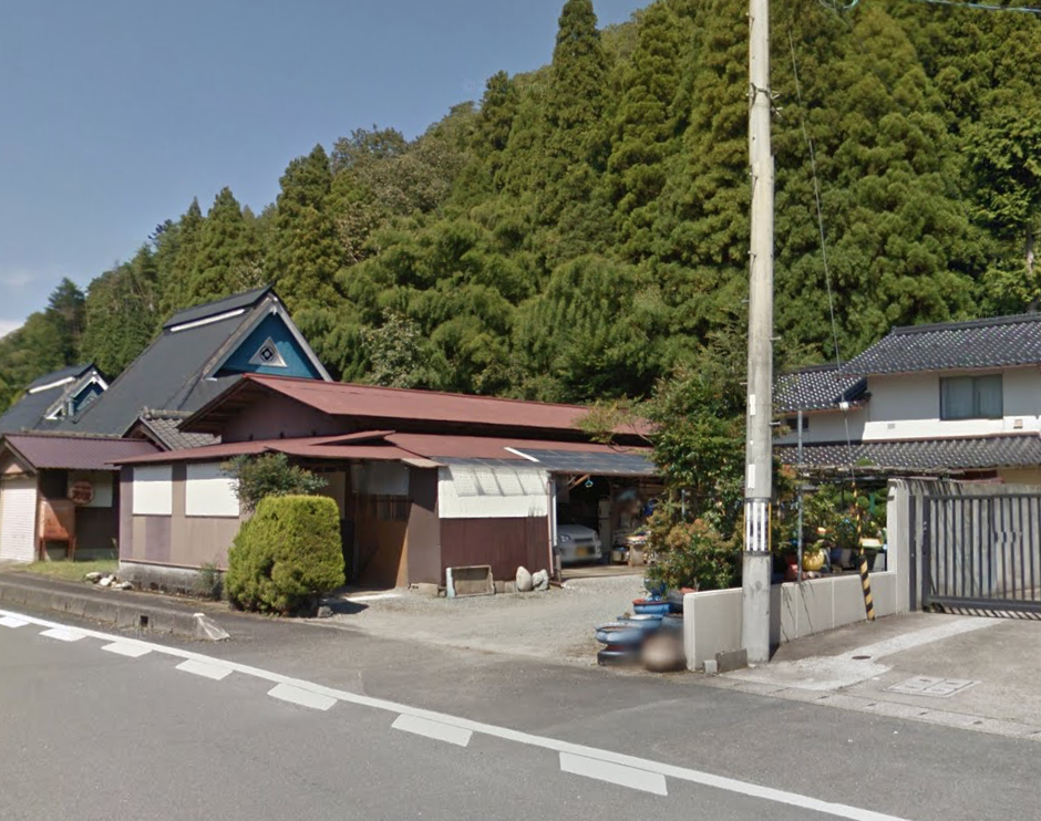
Google Street View Photography-
Google street view photography is photography in the form of screenshots that the phtographer takes when using google street view to be anywhere in the world. This new discovery of photography allows a lot of creative freedom for the photographer as there is no restrictions.
DOUG RICKARD -' A NEW AMERICAN PICTURE'
Rickard is an American photographer and also an artist that is quite well known for the project 'A new American picture', wherein this project he takes images on Google Street View. These pictures then provided him with a clear depiction of the forgotten, desolate, and deserted backroads of the American landscape. He used a camera on a tripod to take his images, which he had projected onto his computer screen. He was able to liberate the picture from its mechanical roots as a result of this. He did this over four years. He was left with low-resolution photographs that he had to work with. Rickard liked the low-resolution photos have because they have a painterly quality to them. His images occasionally feature people who recognize the camera but identities are obscured by blurred faces. As a result, the photos have a surreal quality to them, which highlights the implications of an increasingly stratified American social system.
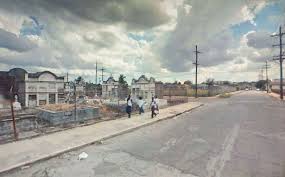
I do admire his work as it does represent to me this idea of isolated America, which is so different as I always think of America as very busy and populated. Also, it allows us as an audience for his work to open our eyes to parts of America that we would not think of, as typically we think of tourist sights like Times square, etc. One thing that draws me to Rickard's work, is the colors of the images. They are quite bright colors, although dulled down, giving this vintage, retro feel to the image, which I have been interested in recently, when looking at photographs, or trying to take them myself on disposable cameras. The images sort of reminds me of video games like GTA, as the people seem illustrated, rather than real. Therefore, I conclude that the work is much more valuable because it is original and exposes the mysteries of America's back alleys. His work reveals a new tale about the people we encounter in the images and their daily lives on the streets of America. I also caught how he tried to include a wider variety of angles, rather than keep his work all at eyesight angle, and I know there are restrictions to moving about on google maps, therefore him capturing higher angles, allows better framings, with more to tell.
Michael wolf- A series of unfortunate events
Michael Wolf is a photographer whose work defies categorisation; he was born in Germany, educated in the United States and Canada, then returned to Germany to study photography before spending the rest of his career in Asia. What sets him apart from others is his uncanny capacity to see the symbolic meaning of otherwise trivial information that goes overlooked all too much. Wolf began his career as a photojournalist and spent a long time working in Asia for the german magazine 'stern'. While he was shooting his final story for the magazine, “china: factory of the world,” it was then that he discovered the muse of his first major art project.
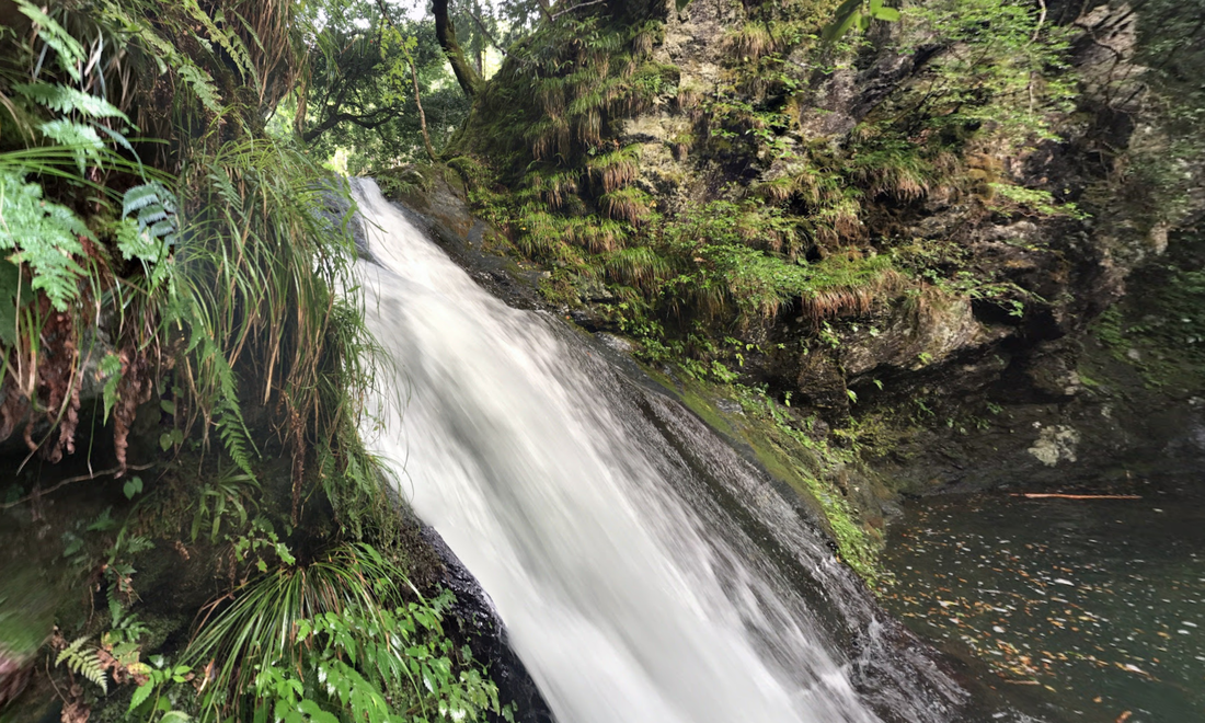
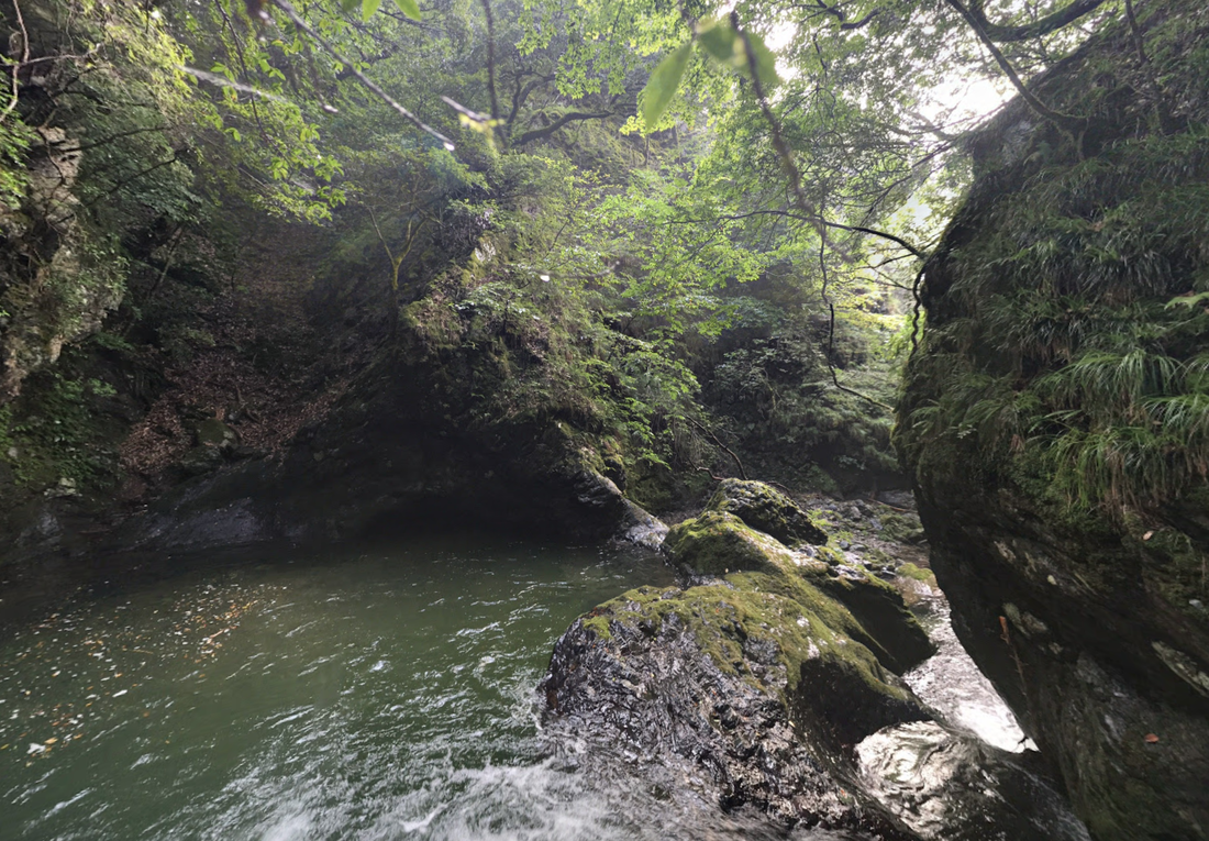
Trip to Kyoto
For one of our lessons, we had the amazing opportunity to visit Kyoto! Except, virtually! This is based on the work of, who uses google maps to visit any place in the world.....
I enjoyed the task as not only did I experience the streets of a whole new country, but we had so many opportunities for pictures, as in, sometimes you may not have the ability to see a waterfall or stand on the road, etc, but with this task, I had no limits to my photos. One disadvantage was some photos would come out a bit blurry because you could not be closer, or further away, as it was all through google maps. I like seeing a lot of square and rectangular buildings and catching some shadows of them on the floor. These images were my favourite as they were very simple yet artistic with the shapes created. I like that all the colours tie in, through my set of images I got, lots of neutrals and greens, which presents Kyoto as quite simplistic and also quite isolated in a way, not so busy and over the top. I saw a lot of greenery/ nature scenes that I liked as they were very beautiful.
I enjoyed the task as not only did I experience the streets of a whole new country, but we had so many opportunities for pictures, as in, sometimes you may not have the ability to see a waterfall or stand on the road, etc, but with this task, I had no limits to my photos. One disadvantage was some photos would come out a bit blurry because you could not be closer, or further away, as it was all through google maps. I like seeing a lot of square and rectangular buildings and catching some shadows of them on the floor. These images were my favourite as they were very simple yet artistic with the shapes created. I like that all the colours tie in, through my set of images I got, lots of neutrals and greens, which presents Kyoto as quite simplistic and also quite isolated in a way, not so busy and over the top. I saw a lot of greenery/ nature scenes that I liked as they were very beautiful.
Mirrors & Windows
MoMa exhibition of 'Mirrors and Windows'
The exhibition, Mirrors & Windows, at the Museum of Modern Art, curated by John Szarkowski in 1978, was organised based on the thesis that personal photographic visions take one of two forms. The two forms are that a photo is either seen as a mirror, a "romantic expression of the photographer's sensibility as it projects itself on things and sights of the world", or as a window, in which the exterior world is "explored in all its presence and reality". Source
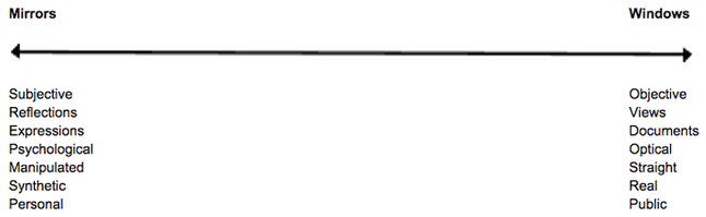
M I R R O R S section
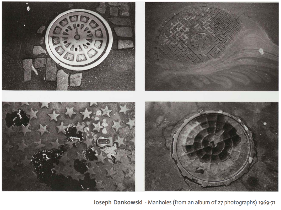
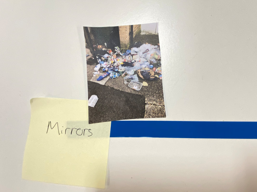
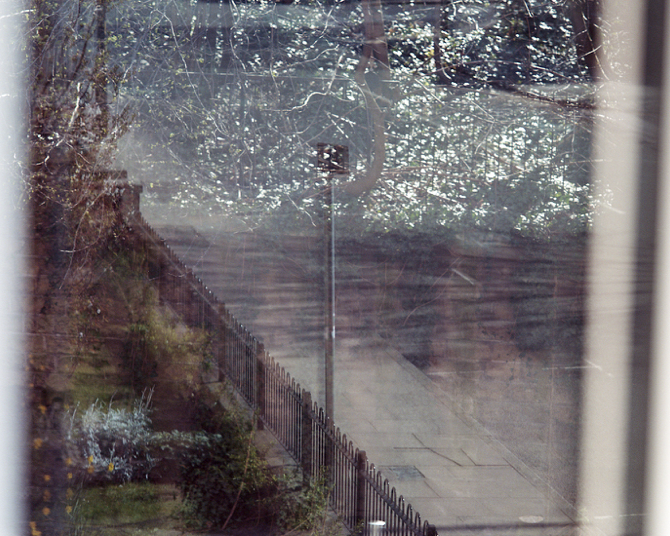
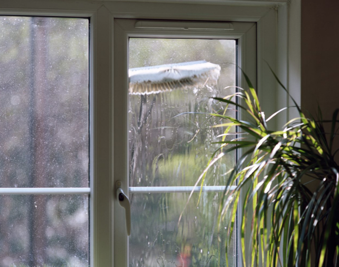
These photographs were located in the 'mirrors' section of the exhibition. I agree with these images being included here. The images of the drains are interesting as nothing is being reflected like a mirror would do. However, I think that the fact that you will never see inside the drains is a part of what will not fit them into the 'windows' section.
The drains project the view on the things of our world and reflect in an abstract sense to use something we will never get into. It is as if this mystery of what is underneath is what is being reflected us, like a mirror image. Their shapes of them remind me of clocks, and clocks reflect the time, so again linking this idea of the world being built upon mysteries. You will only see a mirror from one side, same with the drains as you will only see it from the top, or bottom if you are inside. The photographs of the drains are taken in great detail, as the images take a close-up of each drain, really looking close to the detail. The images make us feel as if we are looking through his eyes
The drains project the view on the things of our world and reflect in an abstract sense to use something we will never get into. It is as if this mystery of what is underneath is what is being reflected us, like a mirror image. Their shapes of them remind me of clocks, and clocks reflect the time, so again linking this idea of the world being built upon mysteries. You will only see a mirror from one side, same with the drains as you will only see it from the top, or bottom if you are inside. The photographs of the drains are taken in great detail, as the images take a close-up of each drain, really looking close to the detail. The images make us feel as if we are looking through his eyes
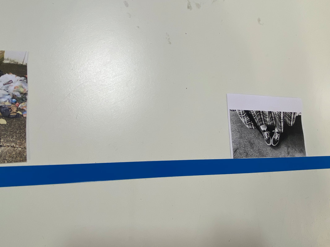
W I N D O W S section
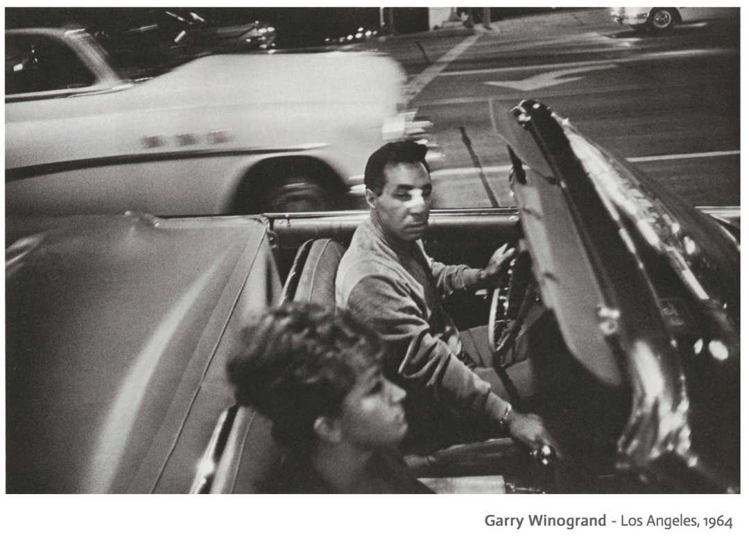
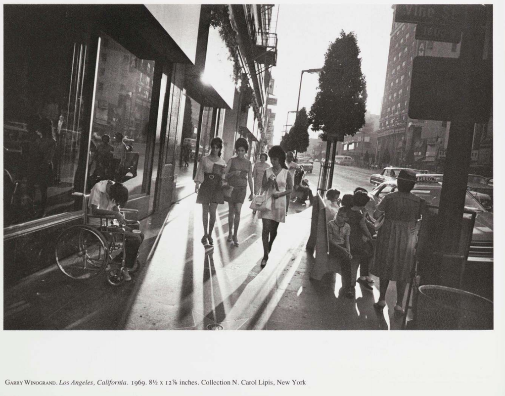
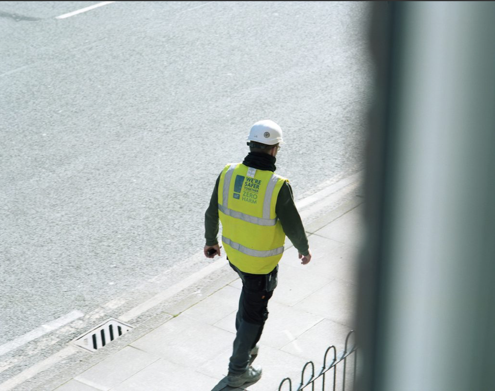
These images were placed in the 'windows' section of the exhibition. Winogrand's image I personally really like as it is a very good image to represent what I would place into 'windows' myself. The reason I agree with this placement is that it is a look into the people's stories. When we look through a normal window, we see so much as humans we are naturally so nosey and can learn so much about the things we accidentally see. In this image, we see the man has a broken nose as there is a bandage on it, this allows us into his story, how did he break his nose? we already have so many questions from this peek into these people. He is looking at the woman and we can try to assume it is his partner. This is all a look-through into people's personal lives as they do not think people are 'examining' in a way. The photo was taken randomly by Winogrand when the car was passing by, and by capturing it, he has allowed us to see these people.
|
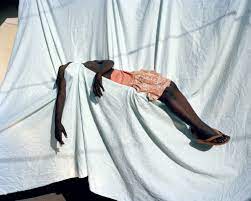
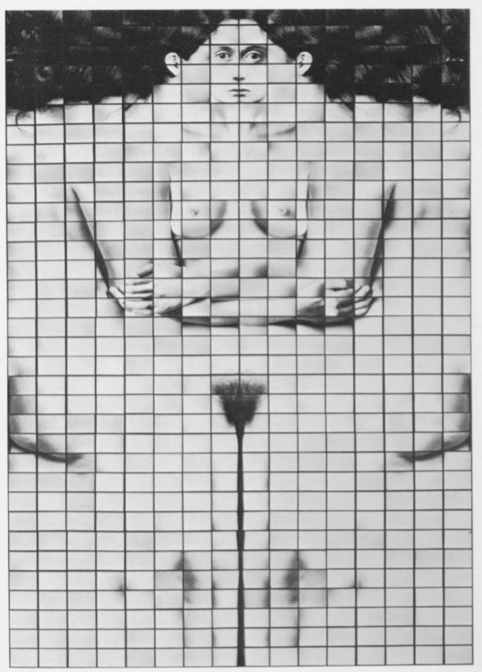
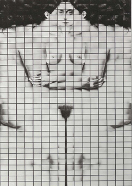
I think this image is very different and interesting, and when I first saw it I did not quite understand it. In the beginning, I did think this may be an image better suited to be in the mirrors section. This was because as it is a body, I originally thought of the fact the only way you see that would be in the mirror and a reflection of what you look like. However, I realised it was a lot of different parts put together and you would not see angles as such even in a mirror, so I started to see it as more of a window image, of how someone else can see you. It also is an idea of how people see each other differently, and as in that image, the bodies forming in a way are very abstract, and wouldn't be a reflection but instead a different person's view.
|
'Rear window'
|
|
We were set an independent task to watch this movie by Alfred Hitchcock, called 'rear window'. The movie is based around the character L.B. Jefferies and we learn he is a documentary photographer. In the opening sequence, the camera faces out into the neighbourhood, showing snippets of his neighbours, with the camera moving slowly. We see variations of framings of his neighbours, where the frame of it is exactly like a window and so it is as if the audience has their window to be looking out through. During the movie, we needed a piece of plain paper, and 2 colours of a pen; one colour for a window-like view and the other for mirror views. When watching the movie the camera frame would move and every time it moved we had to draw the movement, on a piece of paper. However, we were not allowed to look down at our hands, and also when we thought we were looking at a window like a view ( eg. when the camera looks out into the courtyard of the apartment building) we used one colour when drawing, and then when a mirror-like view was presented (e.g. when the camera looks back into L.B Jefferies room) the other colour was picked up.
|
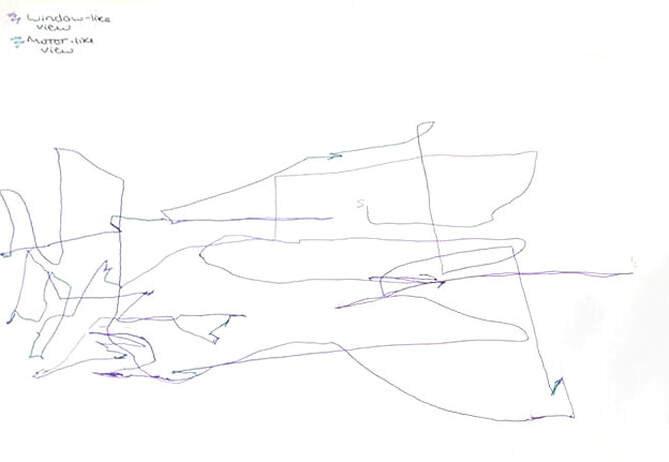
Here is my final product from this activity. I thought it looked quite peculiar and odd, as it is just a bunch of lines on a piece of paper, however it is interesting to see how much the camera's viewpoint moved about, throughout the time. I also found interesting how wide the range of the movement was as I even ran out of space on the left to keep going at one point. Also, this task made me think deeper about whether I thought I was looking at a window-like view or a mirror-like one, which normally I would not do when watching a movie or video. I did find it a bit more difficult to decide if something was mirror-like because scenes with Mr. L.B Jeffries and his nurse talking, seemed more window-view to me as looking in on a story rather than a reflection of something. I guess that is more on personal perception of the difference between window-like and mirror-like views. Also, I realised that when the camera was looking out through a window, a window frame is square, which is the same frame of a photograph, therefore proving the theory that when looking through a window, it is like an image already, as we are looking into an unknown.
The Mirrors and Windows spectrum
In this lesson, we had a activity in which we began with a selection of photos from the MoMa's 'Windows and Mirrors' exhibition, as well as a piece of tape across the table with a post it note at each end, one saying 'mirrors,' and the other saying 'windows.' The tape/line serves as a scale for determining whether an image is more window-like or mirror-like. We had to agree on where the photos should go on the scale as a team with Yasmine. Personally, I find determining what a mirror-like image is tricky, as I originally thought it would be something that says something about the person we are seeing in the photos, or the photographer. However, since the photographs are devoid of context, therefore making it more difficult to determine in what context we are seeing them. An example of this difficulty that i faced in this activity was the difficulty to determine if the bathroom images were truly a mirror image, as it may not be the photographers bathroom, and so if it is someone elses then it would be more a window-image, as it is looking into someone elses life, as says more about someone. After deciding our initial ideas, we spoke about ideas like this, and made a few changes to our scale selection.
My own photos among the Window & Mirrors spectrum-
Robert Parkinson- 'Rear window'
Robert Parkinson is a photographer, born in 1873, who went to the Manchester school of Art in the United Kingdom. At the start of the Covid-19 pandemic and during the worldwide lockdowns that followed, Robert Parkinson approached us with a project in which he confined himself in his work. Parkinson photographed what he saw of the outside world from only one window in his home from March to April 2020, resulting in the appropriately named publication Rear Window.
I like these images as some of them are quite abstract, like the one in his window, with the reflection in his house. This image arose questions about what is the reflection and is this a mirror or window image. If I had to put his images on a scale of window or mirror, there is a lean towards the window side, as they are original images taken from a window, and are showing views of the public, allowing us to pry on people's day and stories. However, I do also think it would be a mirror as well because there are some reflections created in the mirror, which reflect me as a mirror. Also, with some mirror images, they can be manipulated, and there are some which do, like the one of the window looking into the park, with the reflection of his room. Originally, when I looked at this image I did consider it to be manipulated on photoshop. I also leaned more towards his images being more window, because they are all taken in his home, and his area, therefore making the images more personal to him.
I like these images as some of them are quite abstract, like the one in his window, with the reflection in his house. This image arose questions about what is the reflection and is this a mirror or window image. If I had to put his images on a scale of window or mirror, there is a lean towards the window side, as they are original images taken from a window, and are showing views of the public, allowing us to pry on people's day and stories. However, I do also think it would be a mirror as well because there are some reflections created in the mirror, which reflect me as a mirror. Also, with some mirror images, they can be manipulated, and there are some which do, like the one of the window looking into the park, with the reflection of his room. Originally, when I looked at this image I did consider it to be manipulated on photoshop. I also leaned more towards his images being more window, because they are all taken in his home, and his area, therefore making the images more personal to him.
I think that Parkinson used the COVID-19 restrictions very well, as he used his everyday window to make the most of the sights he sees, to share his sights and create beautiful photographs. Most of my images are more mirror, on the scale as well, because most of my images are of my mum or in my favourite places, reflecting my personality and me as a photographer. When i am looking at photos, I tend to find that I like both mirror and window images, however I am more drawn to mirror photos, as I like abstract photos.
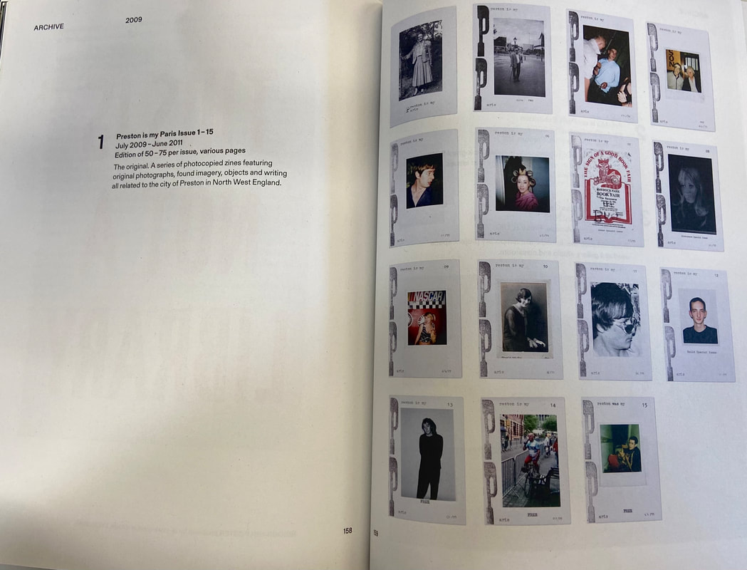
Robert Parkinson - 'Preston is my Paris'
Robert Parkinson is a photographer, who went to the Manchester school of Art in the United Kingdom. He was a co-founder of the initiative 'Preston is my Paris,' along with Adam Murray. This project began in July 2009 as a photocopied zine with the aim of promoting the discovery of Preston as a focus for artistic practise, but it has since expanded into a multi-faceted project rooted in photography. Preston is My Paris, went on to write a series of zine and newspaper publications "documenting facets of Britain in a quirky English way." The images were taken in a city called Preston in England.
‘The aim was to encourage the exploration of the city for people living there and a site for creative practice,’ says Murray.
Over 100 pictures from the archive are included in the photobook, along with high-quality copies of rare printed content. The images in Preston is my Paris, not only made work that was available to the public, but also celebrated regional identity, focusing on social and also polictical engagement. They took their small, boring hometown, Preston, and highlighted its beauty, through photography.
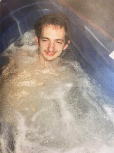
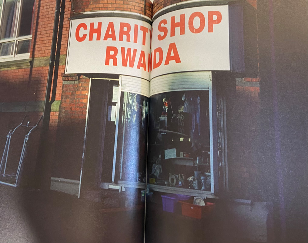
I personally do not find the images in the book are really my style, when it comes to photography. However I do like the image of a man in a hot tub.
|
|
|
This is an image of a man in what looks like a hot tub. I like this image the most because of the coloring of the image, making it look like quite a vintage picture. The man in the picture looks like he was caught in the moment, and therefore the image looks as if it were taken by chance, which I am more drawn to when it comes to photography, and therefore I am more drawn to this image. The angle of this picture is quite odd as the head of the man is not centered, but rather in the corner, leaving so much of the frame to the water, but that is another reason I am drawn to this image; the composition being quite unordinary. The spacing around the man's head just really intrigues me. I would assume this would also live in Preston, therefore the photobook includes parts of the community and represents the closeness and friendliness of the community. I think originally this was one of the 100 pictures from the archive, as it looks like more of personal memory, but including it into this set of images allows a closer tenor for the audience, to the photographer and his town.
From looking at this work, I have learnt, that sometimes images that are not taken to be shown to millions of people, but rather for personal memories, could end up being some of the best images that you can include in your work.
From looking at this work, I have learnt, that sometimes images that are not taken to be shown to millions of people, but rather for personal memories, could end up being some of the best images that you can include in your work.
What kind of photographer am i?
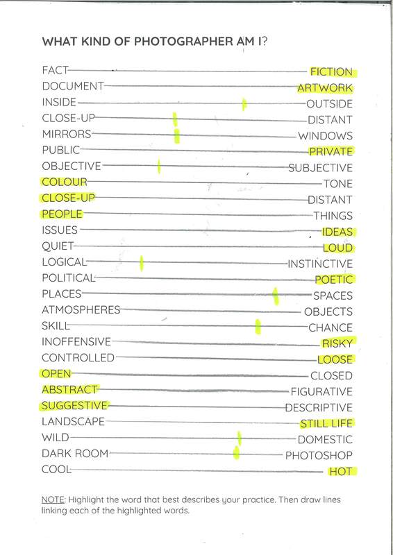
From this task, I have learnt that I am quite an extrovert photographer, I don't mind going up to random people and asking to take a photo, I can step out of my comfort area. As a photographer I am creative and outgoing in terms of may ideas, and can create abstract images out of different situations. I prefer using color and creating images that are suggestive, creating more mystery, allowing any ideas to rise from my images.
I M A G I N A T I V E research
|
|
Photobook research
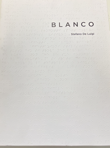
Book review- 'Blanco' by Stefano De Luigi
|
Blanco is a photobook by Stefano De Luigi, who included text written by Philippe Dagen and also G. Calvenzi, and originally published it in 2010. De Luigi started this series when he was in India in 2003. He was in India as he was working on a commission for the British charity CBM, who are a organization caring for blind people and those with other disabilities in developing countries, with no discrimination between race, sex and religion, to produce photos so they could publicize its services for the blind. After the assignment was over, he still was fascinated and therefore decided to spend the next 4 years, visiting 16 different countries to shoot hospitals ands schools for the blind.
|
|
|
I personally did like this photobook, firstly being because of the topic that the project is based off, as it is about an important and emotional topic. I like his approach for the images, as he included a lot of photos of children, making us feel more sympathetic and aware of this disheartening disability. Before looking at De Luigi's photobook, I was not as aware about how common this was in places like Asia and so it is a more serious, eye-opening project. The colours throughout the selection of images are quite dull, representing this sadness, however there are some images with more warm toned colours, which can represent the hope for some people if awareness is spread and warm tones are inviting and comforting, showing these people are all excepted. |
|
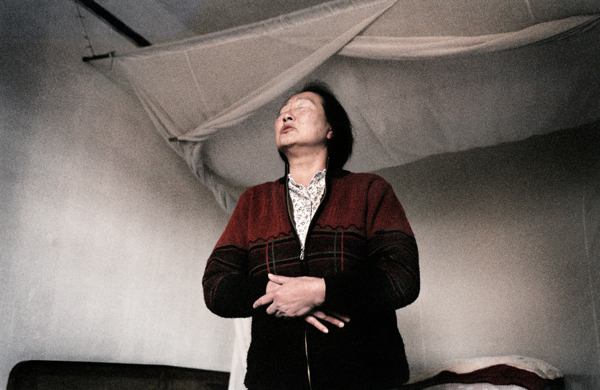
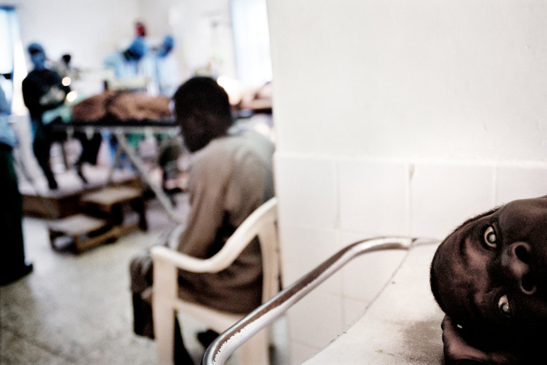
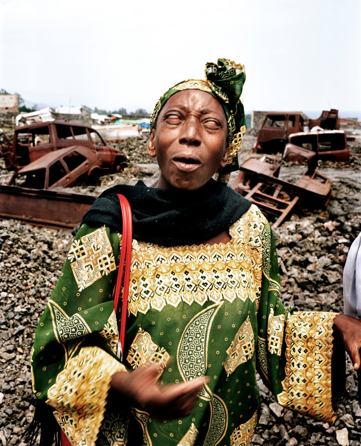
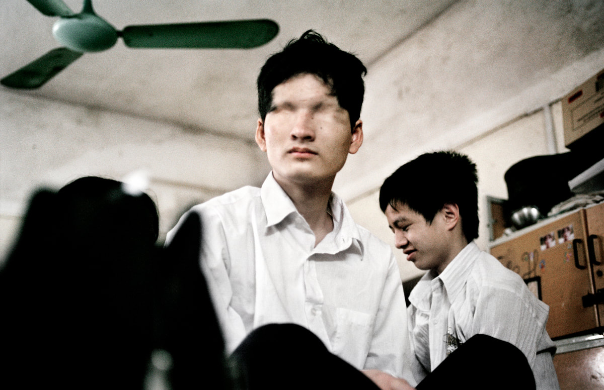
Also, the use of mostly children and the elderly throughout the book is effective as it is the most vulnerable people being affected, which makes the audience feel sympathy. I liked the attention to detail in his set of images, for example in the picture of the Black woman in traditional clothing, she is standing in front of the disaster of her town, which is really capturing all the disadvantages some people go through, by paying attention to the detail of his images.
Book review- 'New good luck' by Shirana Schahbazi
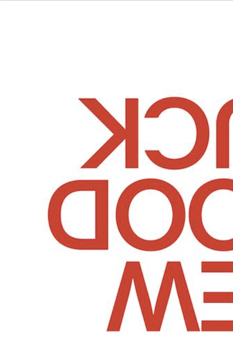
|
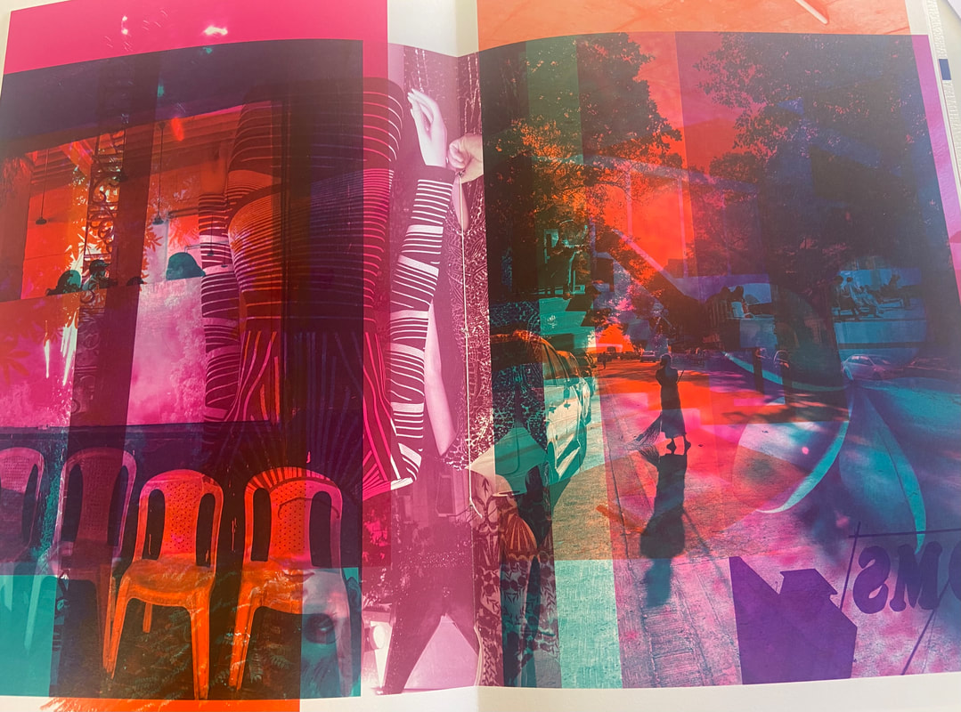
Shirana Schahbazi (born 1974) is an Iranian-born photographer, living in Switzerland. This is one of her books, called 'New good luck', which is a creation of images that she took during her 3 month trip to India. The photos in the book are mostly taken of alone people in architectonic spaces or landscape. She dissolved motifs from her journey in India and made the decision to fragment them to swerve their original narratives. She did this through re-shaping the images by using a digital collage techniques, removed original colours and used luminous, eye-catching colour that she layered on top of one another. In the book, there are areas that protrude beyond the edges of the actual scene.
|
The images in her book explore how encounters that are experienced during travel can be perceived photographically, without being determined by the visual power and cultural change of original colours.
The cover of the book is a good initial representation, from the beginning, of what the book will be like, because the title is upside down and also going off the page, just like most of the images in the book, as they overlap to other pages. I like the simplicity of the title in terms of colour as it contrasts with the images in the book being very vibrant and edited. The collection of the photos stands out mainly because of chemical colours used, which really attracts the eyes of the audience. I think the images do communicate the photographers intention of using the images of people, as she wanted to swerve the narrative, which she did successfully as the heavily edited images create a lot of frustration and confusion, making it much harder to understand the image. This leaving space for the audiences interpretation.
The cover of the book is a good initial representation, from the beginning, of what the book will be like, because the title is upside down and also going off the page, just like most of the images in the book, as they overlap to other pages. I like the simplicity of the title in terms of colour as it contrasts with the images in the book being very vibrant and edited. The collection of the photos stands out mainly because of chemical colours used, which really attracts the eyes of the audience. I think the images do communicate the photographers intention of using the images of people, as she wanted to swerve the narrative, which she did successfully as the heavily edited images create a lot of frustration and confusion, making it much harder to understand the image. This leaving space for the audiences interpretation.
|
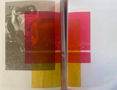
In the photobook, I understood that she had printed most images on a double page spread, and then when all the other pages were put together into a book format, it would cut of some of the images, therefore when flipping through the book, there would be some pages with images running through the gutter. I have an example of this in the image on the right.
I personally do not like this layout, as I think it looks quite messy and confusing, however I do think it accomplishes the photographers goal to swerve the original narrative of the images, as it also swerves the books narrative as things are very scattered and not in an order. I think that the placement of her images was a conscious choice, as it fits her decision of fragmenting the images, even further, for the swerving of the image's narrative. I can see a visible logic to the design of the spreads, as she probably calculated a tiny bit to make sure certain images would run along the gutter, and onto another page. |
|
In this phonebook, there is no text. I think this is a good choice as already, from the image being edited using digital collage techniques, there is a lot going on in the book, and so text would just make it too heavy and compact. I don not really like the book overall, because I think there is too much repetitive use of the chemical colours, and same collages. An idea I would give to make the book more interesting is maybe using a wider variety of collage editing techniques and also maybe including some images which are not edited as there are some i really would love to look at on their own and get frustrated that I cannot. However, I do think that part of the photographers purpose was to create this frustration for the audience. I would say these images are more on the windows scale because when looking through the colour blocks, to really try look into the image and what is going on, it sort of represents a window, when we are looking through and snooping into the public. Although on the other hand we do not actually see the world like this, and therefore it is a more abstract vision on the world.
Photobook construction review- 'Solastalgia' by Marina Vitaglione
As well thinking deeply about narratives and what images are being collected into a photobook, the construction of the actual book also has to come into consideration. With this, we think about the bind of the book, added elements, pape/ negative space, title, text, audience, size, and sequencing. These are very important features as it is highly unlikely they are chosen randomly. Usually, these elements are well thought about how they relate to the narrative, idea and images in the book.
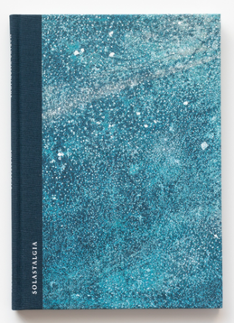
|
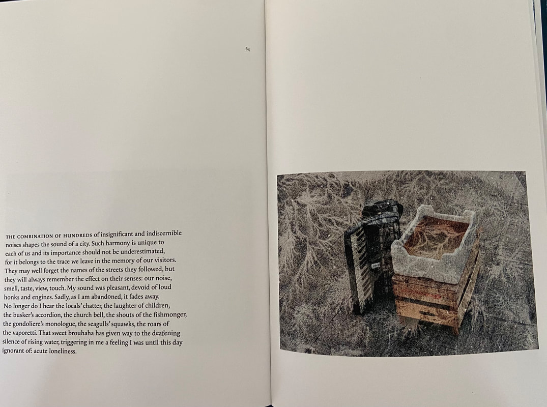
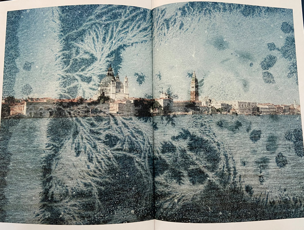
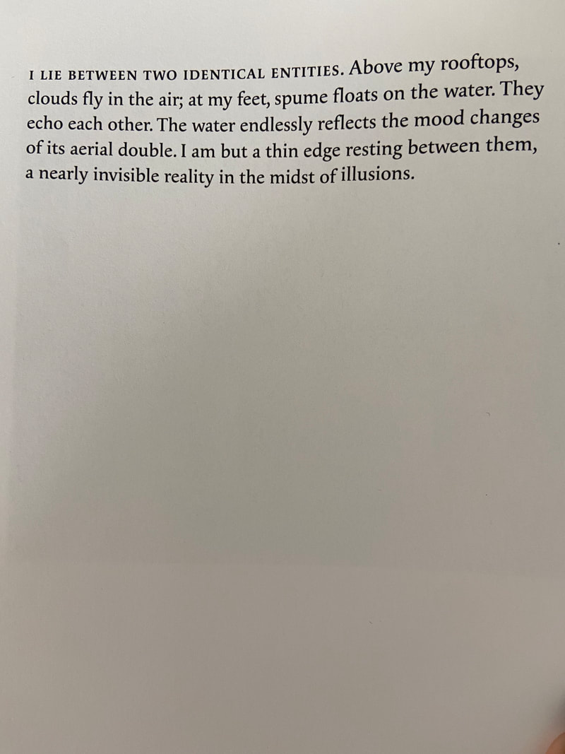
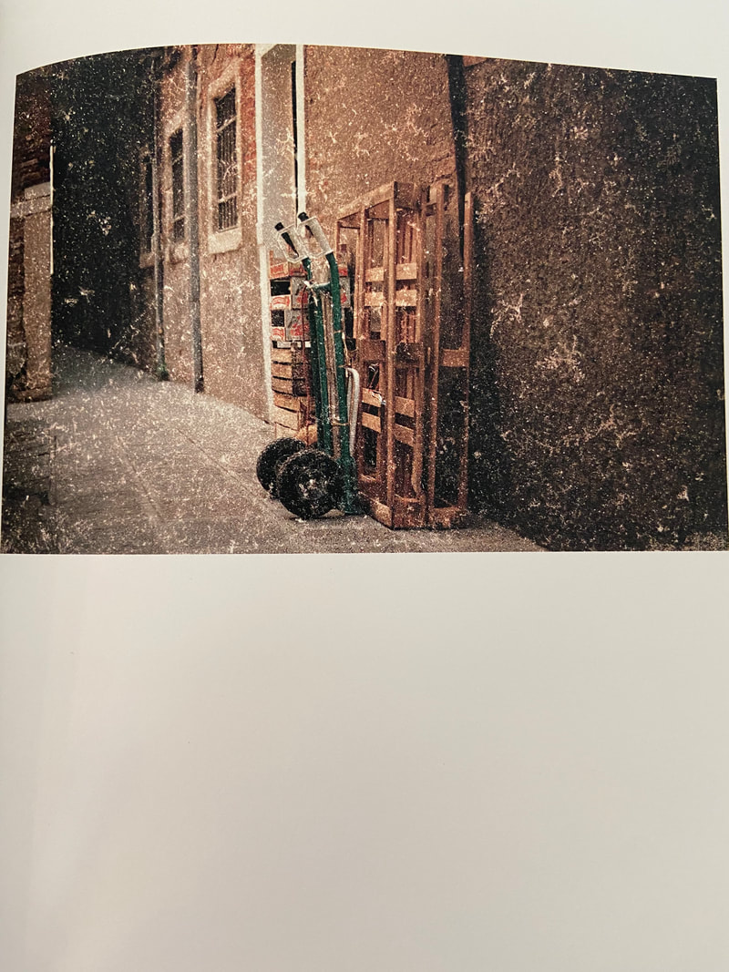
I looked at this book in lesson, called 'solastalgia' by Marina Vitaglione. This photobook is about a serious issue of climate change, especially focused on Venice. As the piece of text in the book describes, the meaning of 'Solistalgia' is : ' (Environmental change) a form of homesickness one gets when one is still at home, but the environment is changed'. This neologism was coined by Glenn Albrecht. She used her talent in photography to create a photobook to address this important issue of Venice being the most at threat country in Europe from climate change. Since 1897, the water level has risen by nearly 30cm, which is sparking concern for the community and any human on our earth, as it is slowly getting destroyed. The narrative of the photobook is based from the perspective of the city of Venice, using images of the city and also poetic diary entries from perspective of the city, as the idea of it being 10/20 years later, as to put into perspective on what climate change will do to Venice.
|
I-This photobook did have an added element of a little booklet, which had translations of all the text in the photobook into Italian. I think this is very effective as it allows a wider target audience.
-The bind of the book is hardback.
-The title of the book is on the side of the bind of the book and is quite small and neat and it is like a sort of comparison of the title to the huge space of water. The sequencing of the book, to me became more and more interesting the more i connected ideas.
-In the book, there are 3 sections of repeated images of the water, these sections each breaking up the sequence of smaller sized images of secluded Venice. I recognised that in the first section of images, the photos were more close up, enclosed and after each section of the images of water the images were more further away, as in showing places in the city from further away and then a double spread image of the whole city after the last set of images of water. In the photobook, there is a lot of negative space, empty pages and the small images only take up a small amount of space, leaving them quite lonely on the pages. The images in this photobook also have a lonely atmosphere, which connects with the placing of the images, which are quite isolated.
-The repetition of the water images, to me was reflecting that water is overtaking due to climate change.
- As mentioned, this photobook does use text, through poetic diary entry, which I do like as it creates a fictional narrative for the photobook, whilst also relating back to the topic issue of climate change.
-One thing that I found interesting about this book is after each section of the pages with the images of water, the other images started increasing in the imprint on-top of the images which looks like see coral. This is actually the print from where Vitaglione has soaked her film negatives of the photographs in the Adriatic seawater for different periods of time ranging from from a day to several weeks, then being air-dried and scanned.
-Overall, I did enjoy this photobook, especially of how well constructed it was and there were so many smart connections to the images and overall idea, which I also like as it is such an important issue. The photobook is an powerful way to address the danger of climate change as it is more effective then a repeating newspaper story which we see every day.
Moodboard inspired photoshoot
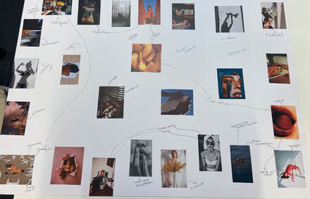
|
related to our photography theme to create a mood board. This challenge was a lot of fun for me because it helped me to look at a lot of different images and gave me some new ideas for my photography. Fashion photography, quirky photography, picture composition, vibrant colours, summer fruits, shadows, and silhouette photography were my most common searches on Pinterest. The pictures of amazing image composition and ideas drew me in the most. They were unique and random. I enjoyed close-up shots of the face because they highlighted the textures wonderfully. After that, we had to take our pictures using the mood board as inspiration. I wanted to use my friends as models for this photoshoot, but they were all busy, so I decided to ask my mum, and as the result, I preferred it because the pictures were more special because she was doing some ridiculous poses and this contrasts with her age. This is because people would feel the older you are the more mature you have to be.
|
I took a lot of these shots outside so that I could provide a clean, uncluttered backdrop for the model or key points to be the focal point of the pictures. I love the random poses that my mum had done for these photos, as it made the photos have a more clean composition whilst still being quite quirky. I used pops of bright colour as I realised when being on Pinterest, and making my mood board, that I was drawn to that. I loved asking my mum to do silly things, like putting the bag on her head, but then she started making funny positions, which went so naturally and catered to my wishes for this photoshoot well. Also, I wanted to take on a fashion-like aspect to my photographs as it is another one of my interests, which I want to try starting incorporating into my photography.
Sequencing:
l a m e n t
|
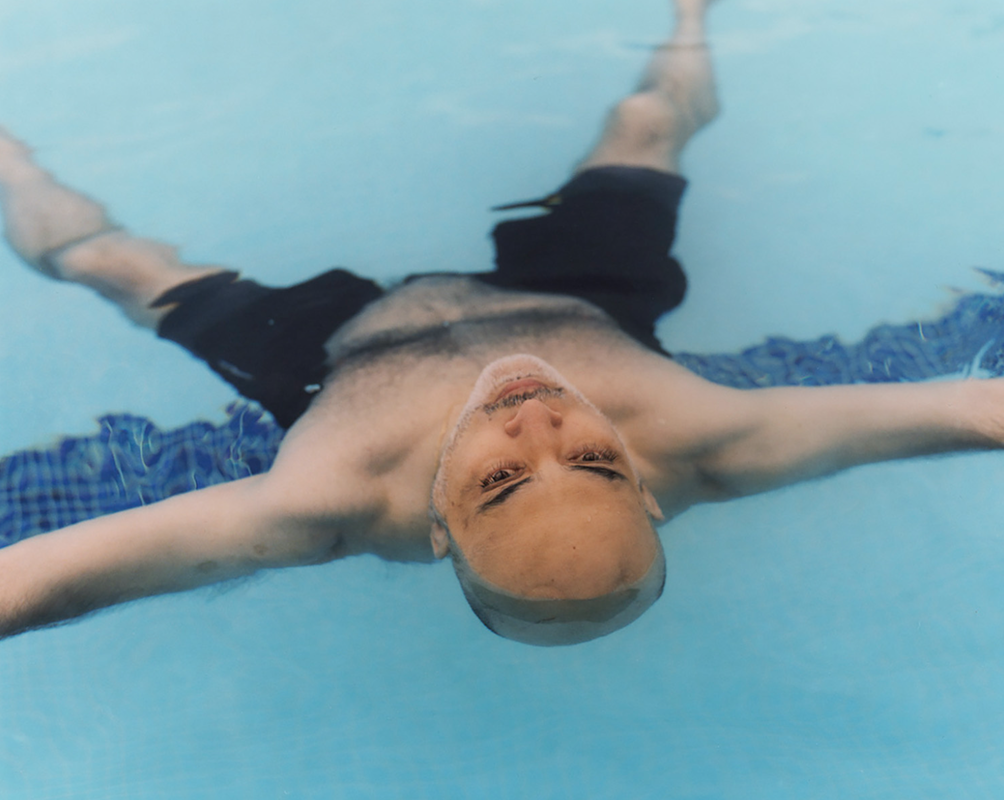
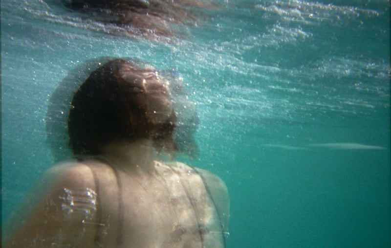
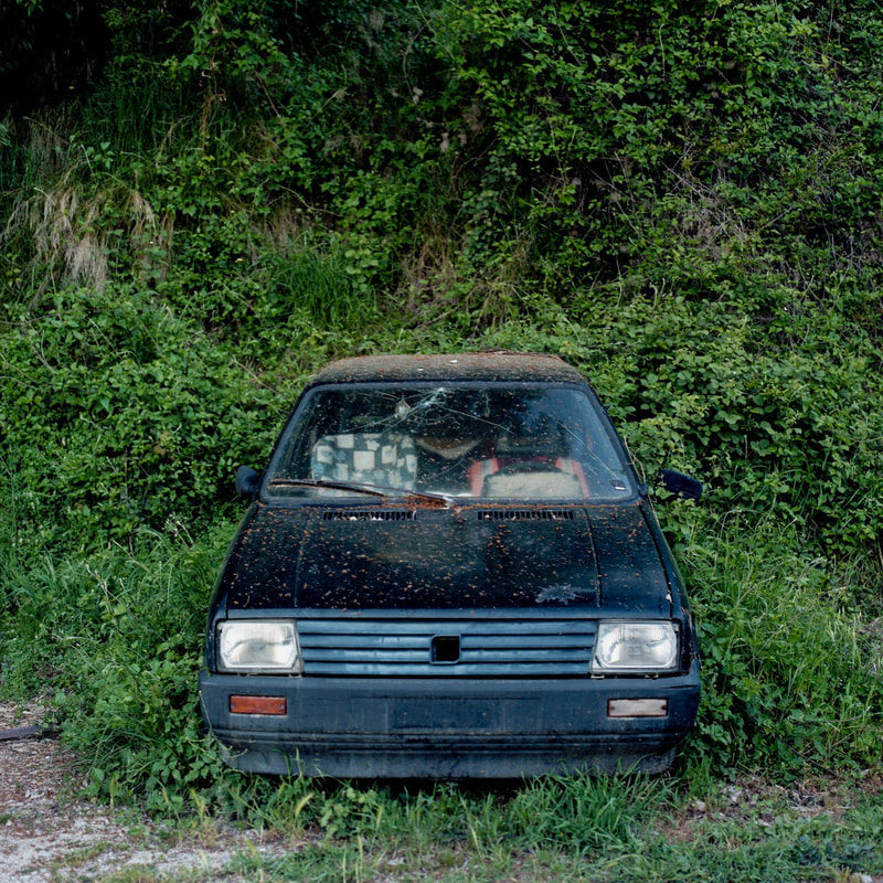
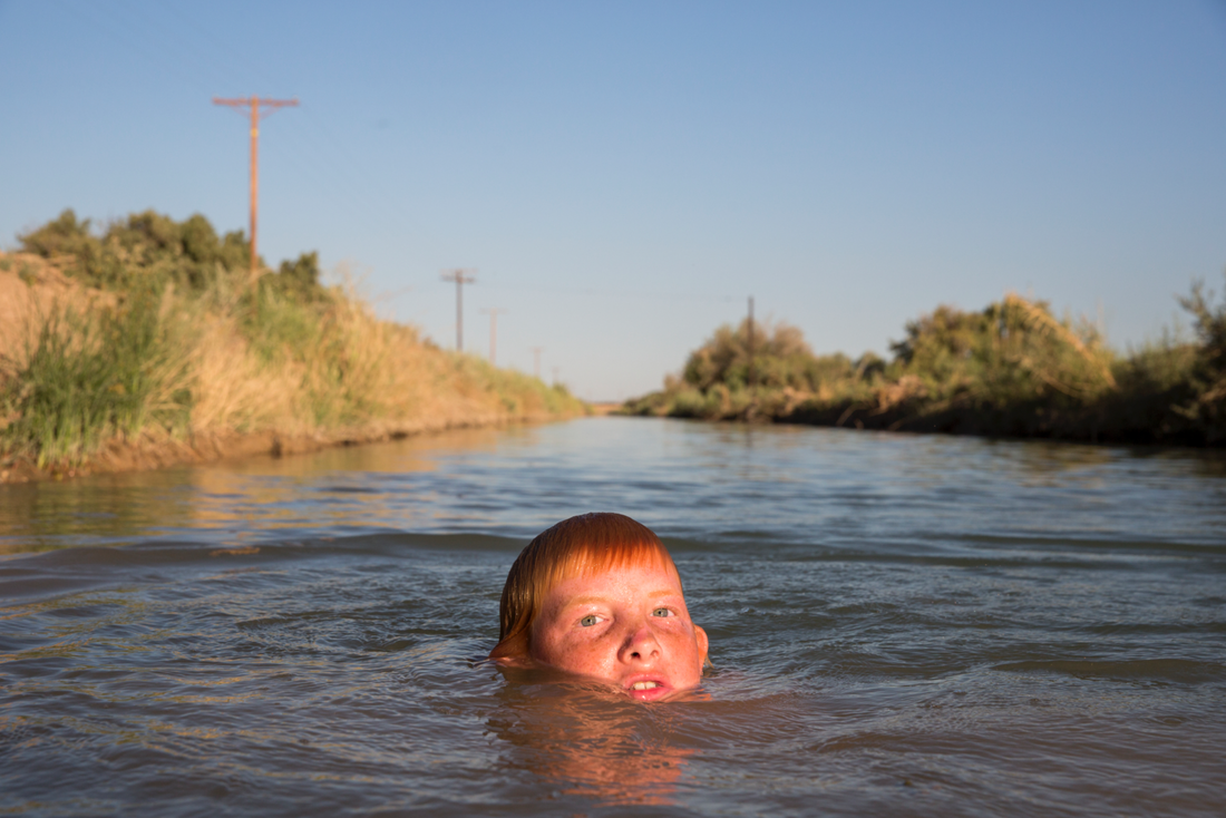
We started this task by looking at all the images we were given and as a group, chose what images grabbed our attention. We had to pick 15 images. Straight away, I was drawn to the image of the girl in the clear blue water, moving. I liked this image as it was so beautifully composed and allowed the rise of so many questions. I wanted to use this image in our sequence. After choosing the 15 pictures, as a group, we needed to think of things like are we going to have a set narrative, which picture will we start with, etc. The picture that drew us the most as a group was the image of the car, which looked to be water damaged, was surrounded by greenery, therefore we decided to use this image as the focal image for our sequence.
|
|
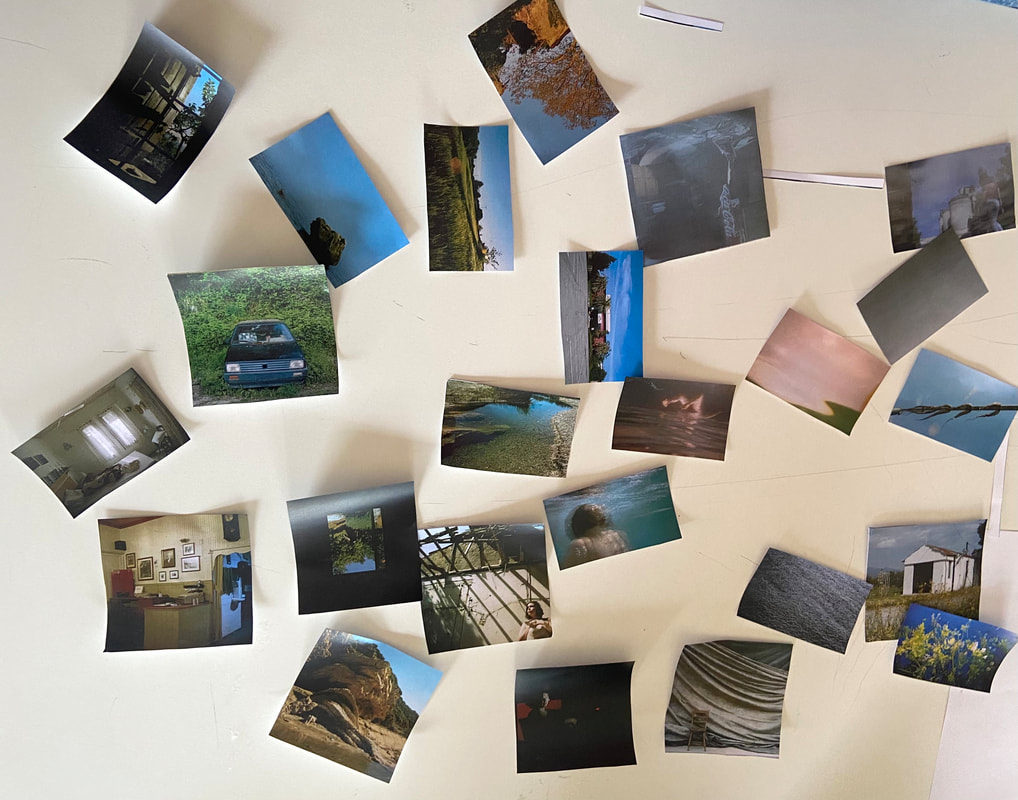

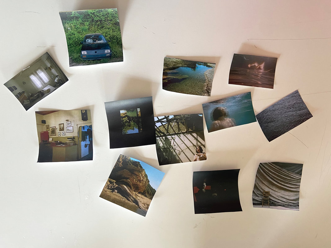
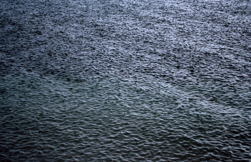
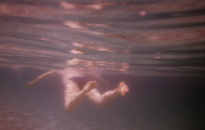
As we were starting to put images in some kind of order, we noticed how half of the images were duller coloured, and the other half more bright and vibrant. As we were looking at the images and placing them in some kind of initial order, we thought of a story and added to it as we moved to the next image. Initially, our first image was one of the women in a garden, with the shadows from the sun, and when we looked at the image of the girl in the sea, we thought it looked like two different people and so we decided to have a sort of flashback narrative. We also linked the image of the water-damaged car with the woman in the sea. Our narrative was about a girl who was reminiscing on her friend's traumatic experience, remembering all the small details of where she lived, the car, and how she died. This girl then decides to re-live what happened to her friend, herself, and go to the sea where her friend drowned in the car. The result of this was the same thing happening to her, she drowns. The transition of dull colours and dream-like atmosphere from the tones of the images to more vibrant tones the images was what drew us to have this idea of reminiscing, as we move from the past to the present. There was also an image of the water, which we decided to cut in half to use twice in the sequence, which represented this key moment of the story being what cuts from the reminiscing to the present moment. We decided on such a sad, bleak storyline, due to the atmosphere of the images being quite lonely and tense. This sequence ended with greyscale images, evoking this end for the character, the emptiness. We decided not to use text in our sequence, this was because we did not want to structure the audience's thoughts on the sequence and narrative too much, as we wanted to allow their imagination to take the time to consider the storyline. Maybe if we did this again, we could have some more time to even think of a couple of words, that is not too cliche and obvious, that could help direct the narrative, but still allow audience interpretation.
COMING UP WITH THE TITLE:
When thinking about a title, we thought about the pain of this character and her grief of her friend. Therefore, the next step we took was looking at synonyms for 'grief', and we found 'lamenting', which can be shortened to 'lament'. 'Lament' means a passionate expression of grief or sorrow.
|
THE FINAL SEQUENCE:
|
sequencing lament from Migle on Vimeo. |
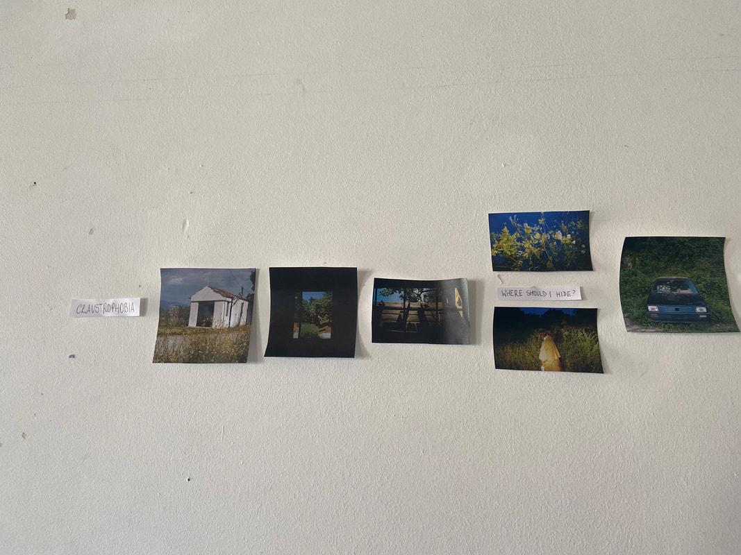
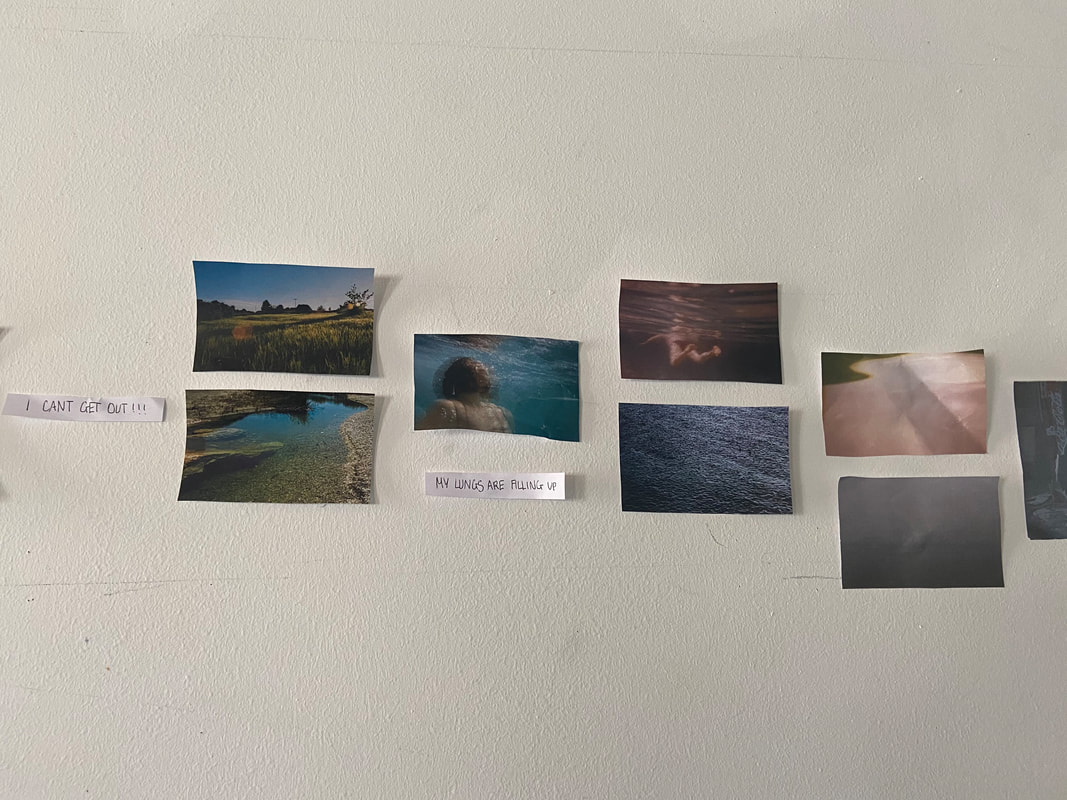
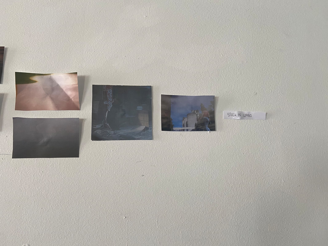
OTHER GROUPS WORK:
There was a group's sequence that I quite liked personally, it was called 'claustrophobia'. I thought it was a successful sequence because of the narrative, and their use of text carrying the narrative effectively, supporting this idea of feeling trapped. Also I liked the images contrast with the idea of claustrophobia, as usually it is the fear of confined places, however the images are quite lonely and empty, so I thought it was quite interesting as it is more claustrophobia in a situation. The images below, show this groups sequence:
There was a group's sequence that I quite liked personally, it was called 'claustrophobia'. I thought it was a successful sequence because of the narrative, and their use of text carrying the narrative effectively, supporting this idea of feeling trapped. Also I liked the images contrast with the idea of claustrophobia, as usually it is the fear of confined places, however the images are quite lonely and empty, so I thought it was quite interesting as it is more claustrophobia in a situation. The images below, show this groups sequence:
Group feedback
on first thoughts for photobook
The whole class brought in 3-6 images, that we were using as a beginning idea for our photobook. In groups we gave each other feedback and constructive criticism on each others images. I chose three images and a diptych to take.

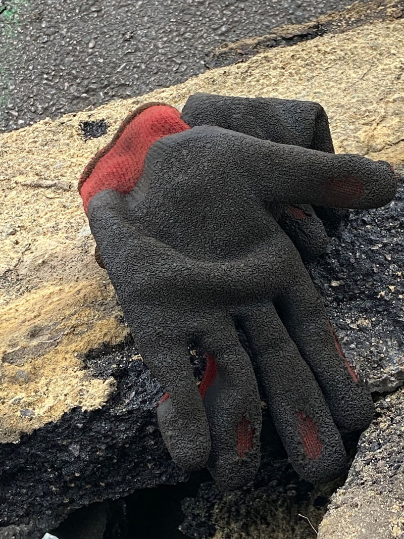
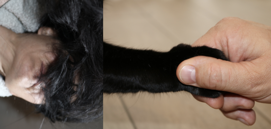
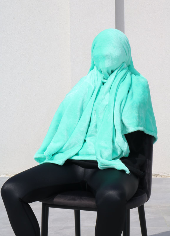
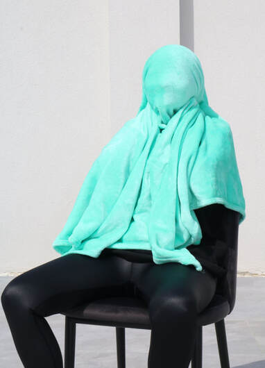
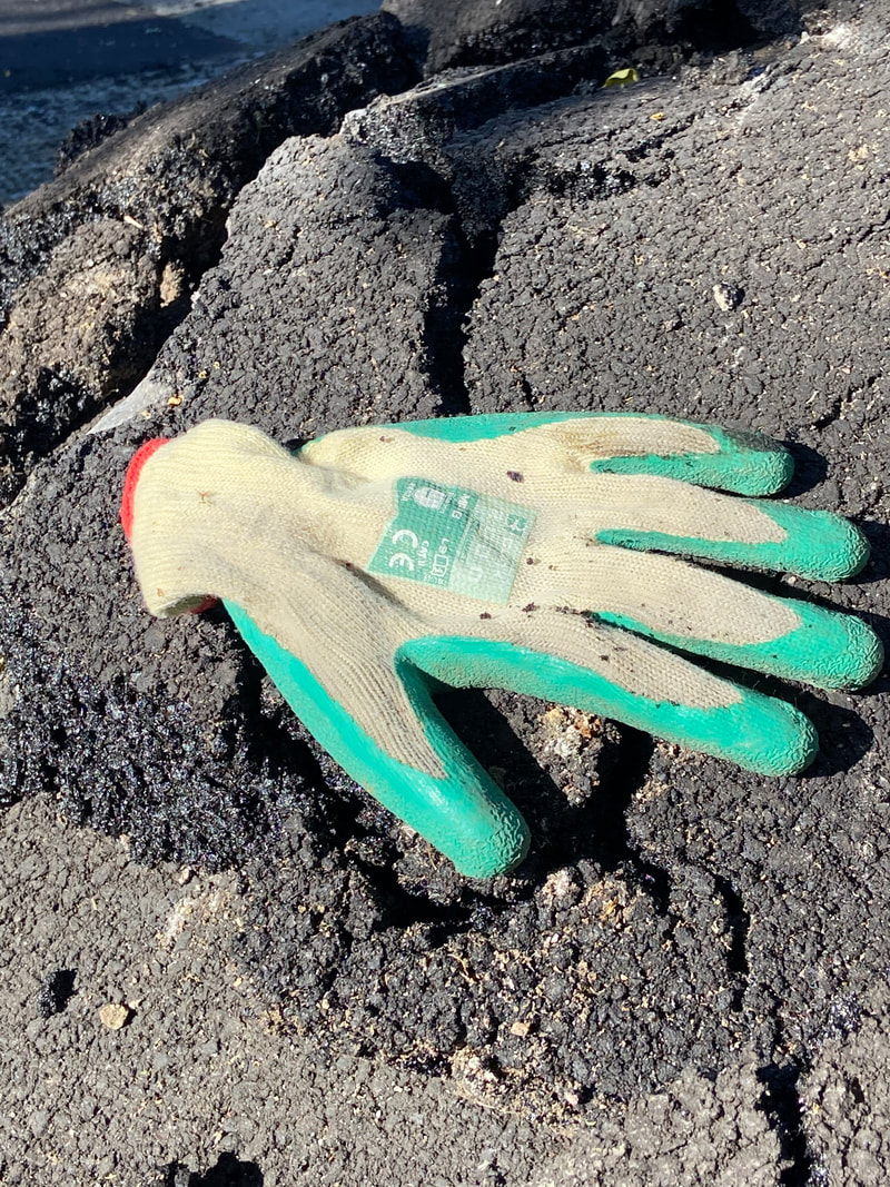
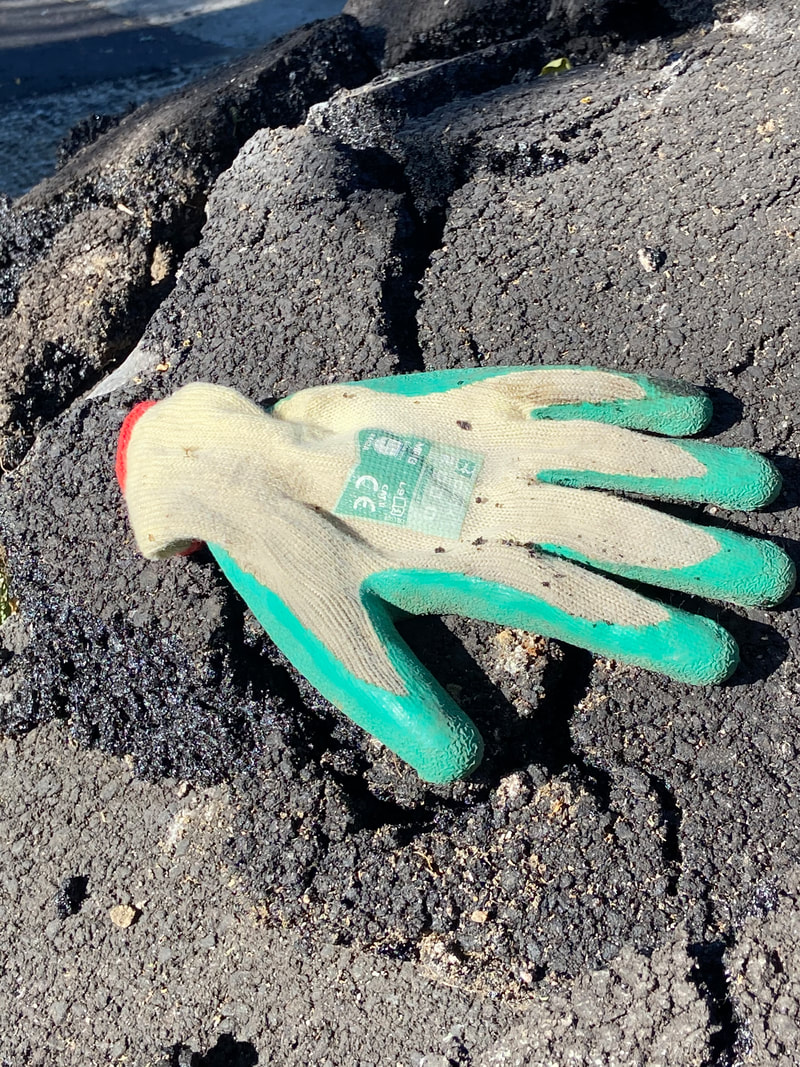
Overall, most of the feedback I got was very positive. My peers loved the 3rd image of my mum under the blanket, because it is quite mysterious, as the audience does not know what is happening in the image, who is under the blanket etc. They said the image looks professional, due to the monochrome, plain background, which looks like a studio, being contrasted with this bright pop of color. The group liked my diptych because it fits in well as my mum's hair is black and so is my cat's leg. They recognized and liked my sense of humor, which is shown through my images, as they said it makes my images very distinctive to me as a photographer. A piece of advice I received was to maybe try out making the backgrounds on the diptych the same because it would make the image flow better and stand out more. As a set of images, the group advised me to try using a camera for all images as when there are some taken on a phone, it is a different feel. This is because the image of the glove was taken by chance when I saw it on my way home, and the group thought the image had a different overall feel and was more textured. I personally really like this image because of the amount of texture, and the run-through of colour from the yellow stripe of the concrete. I found the glove placed exactly like this and so it made the image funnier.
Everyone recommended me to carry on taking chance images, as they recognised my images are all mostly taken by chance and do not have specific narratives, which suits me as a photographer. They agreed that the images I brought did link in together especially the pink image, one of my mum with the blanket, and the image of the glove, as they all are mysterious, allowing questions as it is not clear who is in the image or why, and there is a pattern of the body. I shared with them the idea I have had about my photobook, which is calling it 'For the junk draw' and having the photobook full of quite random pictures, not having a linking narrative. It would be called that because a junk draw is usually full of random things just chucked in there without thought, however, there is some kind of reason why a certain pattern of things are in there (eg, lighters, notes, pens), and this would reflect of why it is mostly the humorous, weird images that I will choose to use, taken by chance, as my group said to carry on with chance as with my projects I will know that from a set of chance of images, 1 is bound to be used. The odd things you find in your junk draw would be reflected by the odd images.
Artist research based off from group feedback- MATT STUART
After the group feedback, I was given a few photographers i should look at with similar characteristics to me, in photography. One of them was Matt Stuart, who is a British street photographer, who also works as an advertising photographer. He has been taken pictures out in the streets for 24 years now, and has some amazing pieces that i am personally very drawn to. His interest into street photography started with his nosiness, as he was interested in how people lived their lives. He mostly uses a film camera to take his images, and is very reliant on patience and also optimism, as his images mostly look as though taken by chance and that requires a lot of time and patience. He does not manipulate his work digitally, and his art is all in the great amount of time that he spends walking around the streets, waiting to capture something. When Stuart takes his images, he rarely informs of what he is doing to the public as he is rarely stopped and asked, and if he is, he politely tries to move on quickly. His advice for another photographer is to carry a camera around all the time and be patient. He has a few series, two are called 'Into the fire' and another is 'All that life'.
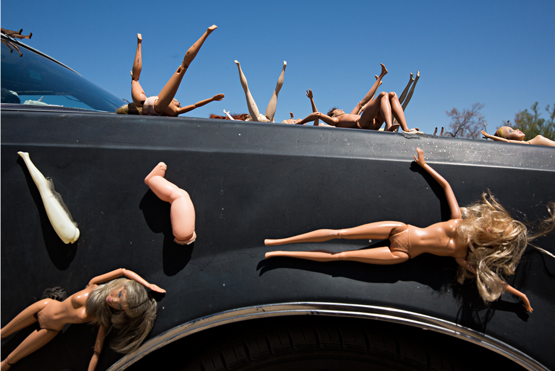
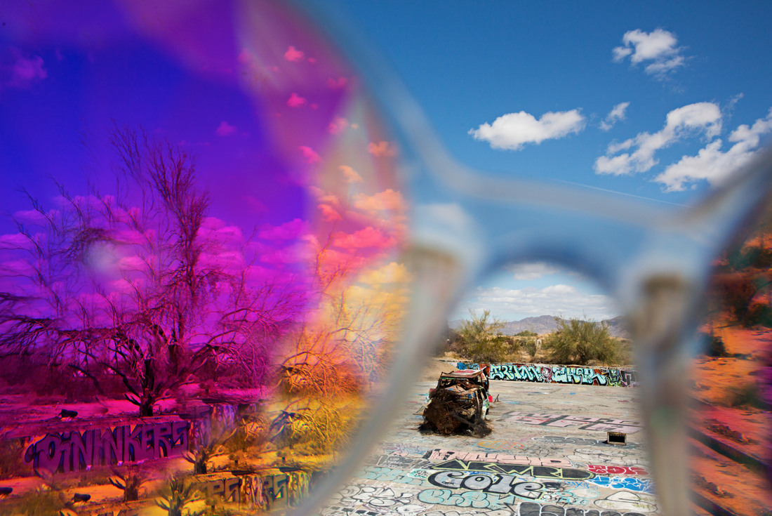
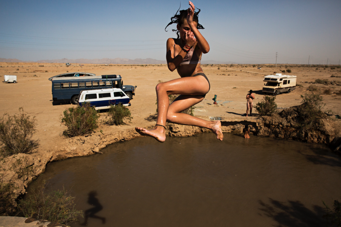
This series is called 'Into the fire', and he took these images in Slab city, where he borrowed a camper van and went off towards Salton sea, so he could get an interesting project in America. He went a total of 5 times to this place. When he got there he went to Salvation Mountain and also Ponderosa, met lots of different people, and even found out often people changed their names so they were not found for things they had done. 'Slab city' is an unincorporated, off-grip, squatter community. Its name came from the slabs that remained thereafter WW2 Marine Corps Camp Dunlap training camp was torn down. It mostly attracts people who want to live outside of mainstream society. What drew me to images in this series, was that the images looked a lot like memories/ personal images, however just caught them at a good moment, making them more unique and humorous. I think he must take a lot of reps of the same image so that he can find the best one. For example, the image of the car with all the dolls looks like something you would see, take a picture of to show someone, and that is it. However, Stuart would have taken a couple of shots, from different angles, and then from all the images, picked the one which looked most unique and interesting. I love the composition of all his images and the fact that it is all created by chance, as that is also what draws me in when it comes to photography. I think it is so interesting how he can go to such an isolated, different place and still get images fitting into his style, proving photography can be made anywhere you just need to be patient and take the opportunities you have.
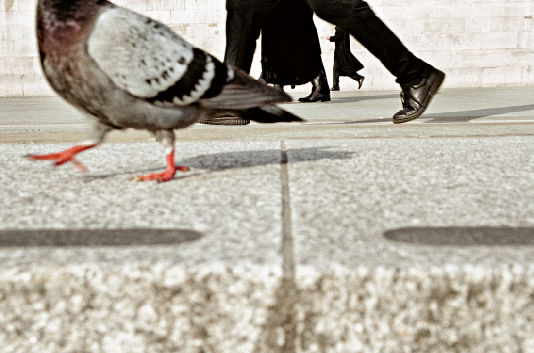
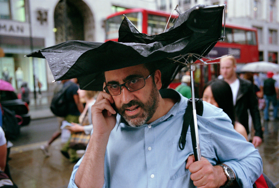
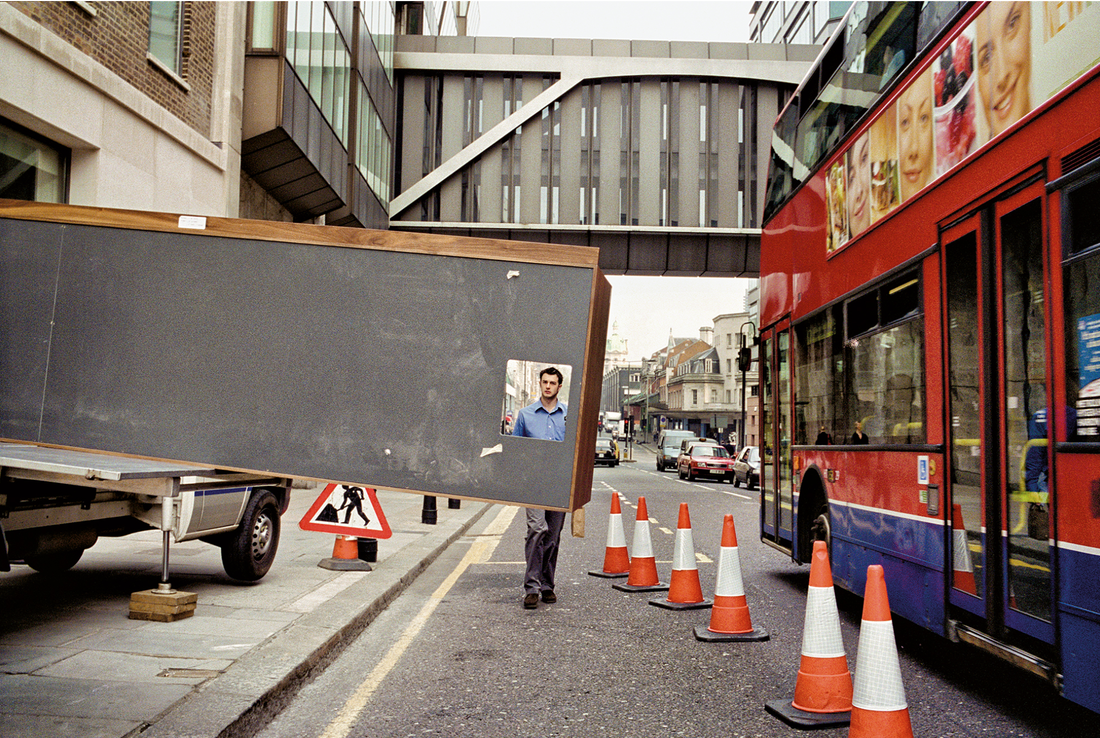
Another series he has is called 'All that life'. This set of images was all taken around London, and he spends a lot of time, waiting for the perfect opportunity to take a good image. When I looked at his work, I automatically loved all his images because of the humour of his worK. My favourite thing about them is that they are caught in natural settings, during people's everyday lives, yet when looking at the images initially, you would consider if this was digitally manipulated because you would not expect to see this going on yourself. This showing how much time and effort he puts into his photography, to come out perfectly. I also really like the colours of his images, being quite bright, a lot like what I aim for with my images. Another thing that also really connected me with Stuart's work is that his images do not have a narrative or a concept, as they are taken by chance, they sort of flow in terms of style, but not one specific story, all randomised, which is kind of like the ideas I have been having for my photobook.
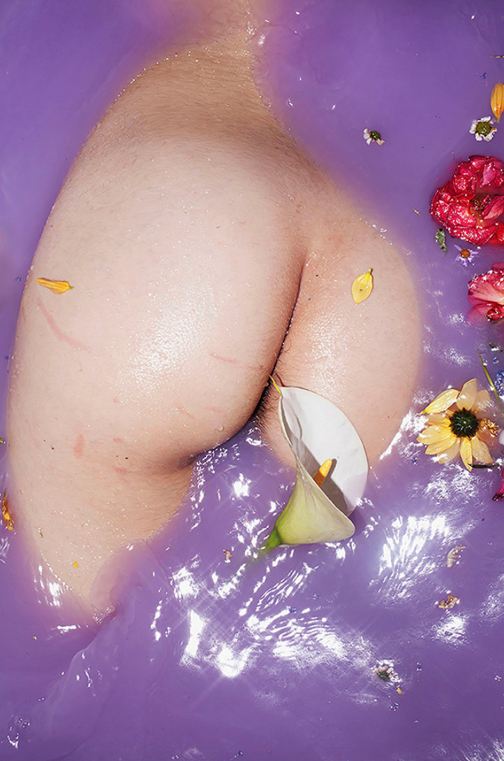
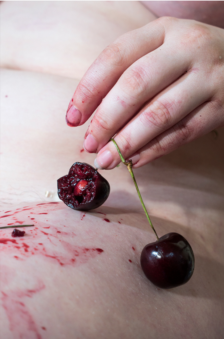
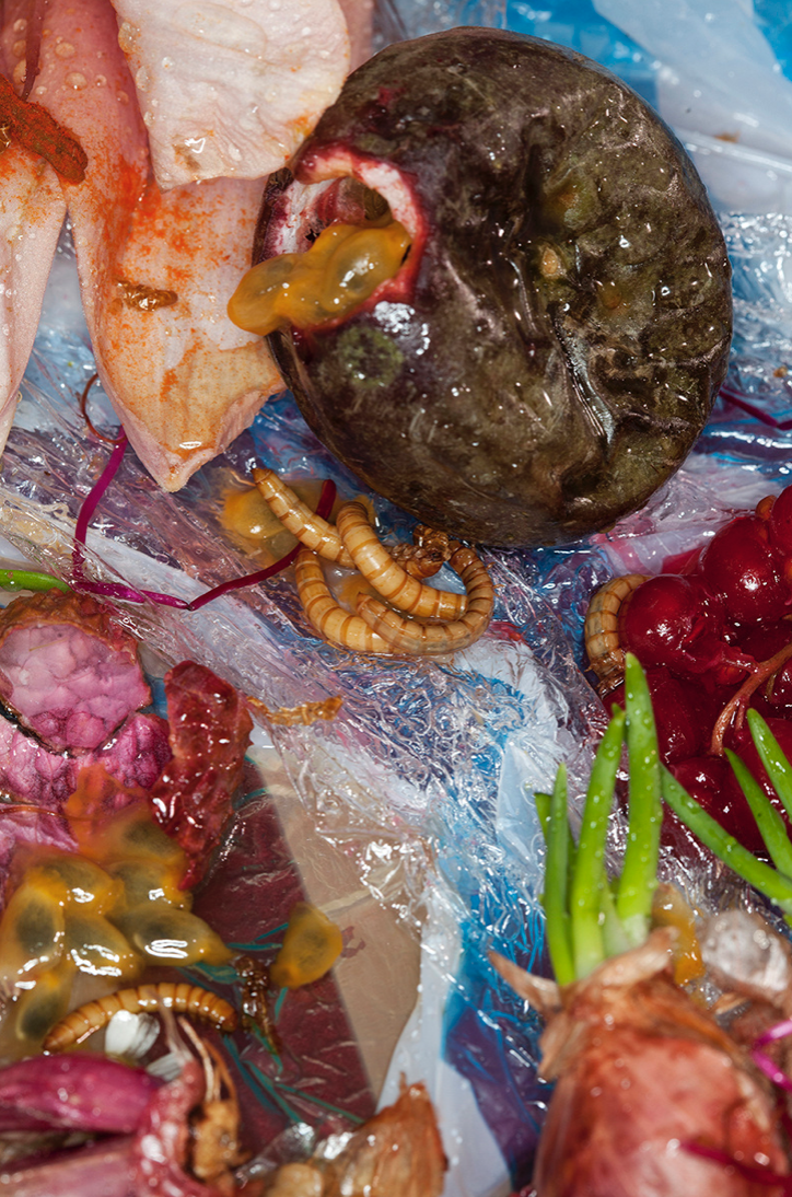
Maisie cousins
Another photographer i was told to look at was Maisie Cousins. Cousins is a Photographer based in London. When taking her images, her approach is to make them extravagant, exploring topics such as sensuality, indulgence and body image. Through her work she wants to present femininity and sexuality in a positive way.
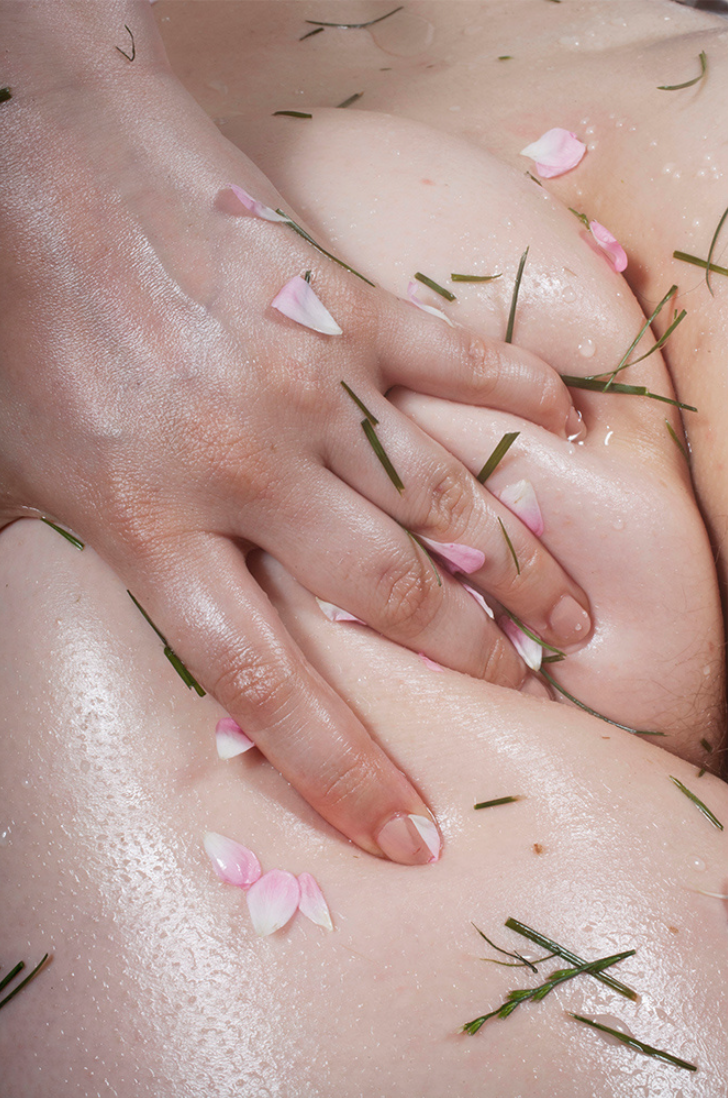
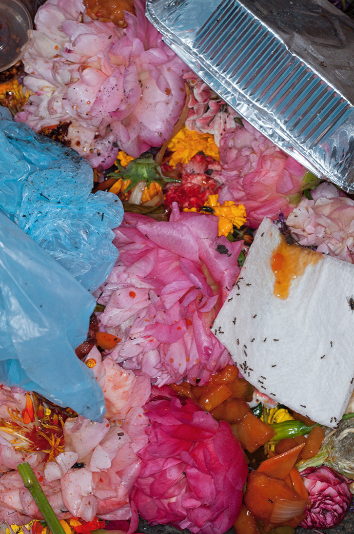
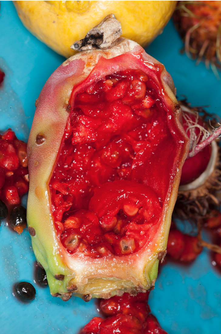
Her images take the glossy perfection like fashion magazines, and then blend it with a sticky mess, like seafood platters, glitter, and other kinds of goo and food. The work reflects cousin's extension of herself, in addition also her playful interactions with the world around her. Even since her early age, Cousins has had a superficial interaction with the camera, as she used to take pictures of things like barbies in bushes. One of my favourite things about her work is the use of colour in all the images she takes. She chooses very bold colours and also textures, making the pictures very vivid, dream, and also realistic. One of my favourite images is the one of the body, and the hand touching it, I think it is so open and unique, as she doesn't hold back much, which shows her great stream of confidence with her photography. I like how she also included small bits of plants, adding naturalistic pieces into the image, proving our bodies are natural and nothing to be ashamed of. I think her work does inspire me with mine as I also like to use bright, bolder colours to allow my work to stand out a bit more. Also, I like how her images take a more unique approach, like how she uses rubbish and sort of romanticise it with the finish of her images, making it more adventurous.
'Photography is easy, photography difficult' - Paul Graham article
“It’s so difficult because it’s everywhere, every place, all the time, even right now." - Paul Graham in his article
Paul Graham values the chance in photography, the opportunities we walk by every day. He speaks about how photography is everywhere, and we can take images of anything that falls in front of us, and so therefore it wouldn't be so valuable if it is everywhere and so easy, however to Graham it is the chance and mistakes that are most valuable as they are caught on such a whim and they turn out to be great, unique images. Graham opens our eyes to us being so spoilt for choice of what we can photograph, but we should not let this wide range of choices stop us or scare us. Graham says we will what to photograph as there is something everywhere, but to start the search, just start anywhere. He says that before starting to take our photos, we should plan it as least as possible, because the more preplanned taking photos is, the less room we leave for surprise, for the ideas to find us, and less room for opportunity. Graham says that when something real, that did not exist before you as a photographer made it exist, is what is beautiful about photography. When something un-noticed is brought to light.
Lens culture
|
MARCELLO COSLOVI- ITALY
I think this image was one of the editor's choices because of the composition and subject in the image. I like it because of the use of the chance of the poles found in that shape, and humorously using them. I have never seen an image like this before, however, I have seen images that take advantage of situations in a humorous style of photography. I love the colours in the image as well, as the bright yellow of the poles is the eye-catching colour in this image, which is contrasting the more dull colours. I found the man stepping through the square like it were a smaller version of a door interesting as the right amount of space he is presenting, contrasts with the composition of the large space in the rest of the image's frame. I think the idea behind this image was genuinely a chance of finding this place with the poles, and the photographer thinking of cool ways to use the space for an image. This is a constructed image. |
|
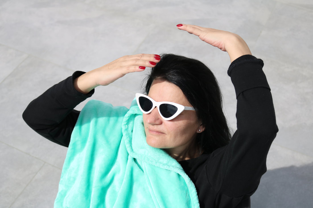
If I were to enter this composition, I would choose this image as my entry. I would choose this image because it is one of my favourite photographs as it is well composed and is quite mysterious. I like that the audience does not know who is under the blanket, leaving them questioning. I feel with this image, it is harder to decide if it was a chance image or set up, and so leave the audience questioning the narrative and creating their assumptions. I am also more drawn to the images with mostly monotone and dull background colours, to allow a more vibrant colour to take over the image, and this image accomplishes that. It is a great image to represent my style as a photographer and would be a good international image for an audience. Finally, the image's lighting and background are so clean and perfect, that it looks as if it were taken in a studio, when in reality it is not, therefore proving photography is so unpredictable and interesting. |
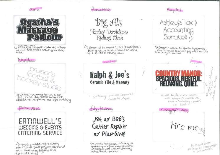
P L A Y I N G with TYpEfaCe
|
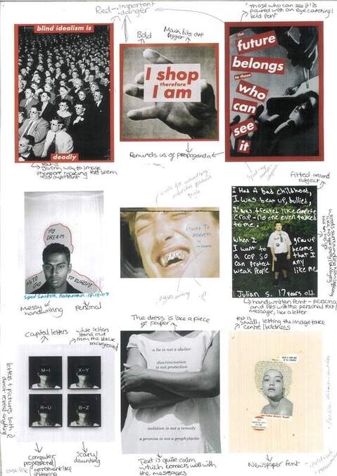
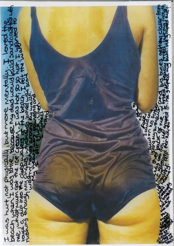
We started the lesson by looking at different fonts as shown in the image above. We gave each one a characteristic and also wrote if we thought the font did or did not suit the company/ situation being written about. One that I thought worked quite well was the 'Ralph & Joe's..' one, because of the slight wear on the letters, looking a bit like old ceramic, which fits well as the company is based on that. We then looked at different text + image combinations, made by artists, and thought about how well the shape, colours, size, spacing, and fonts of the text went with the image. I thought the ones on the top row were quite interesting as, as soon as I looked at them, I thought of propaganda. However, this fits well with the images and also what the text was saying. I also thought the bottom right one, was effective because of the words surrounding her head like she is reclaiming, as the text is actually about racism, making this piece quite powerful.
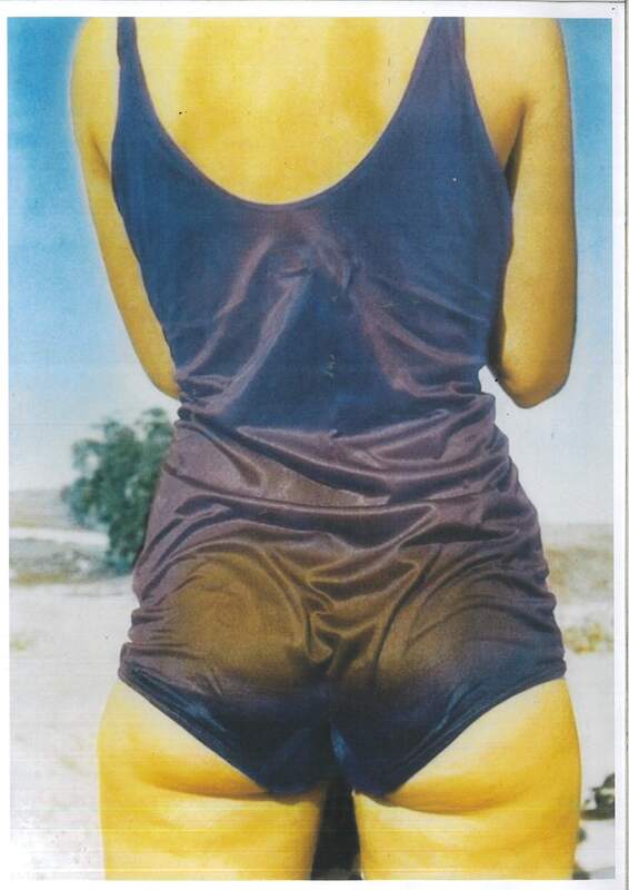
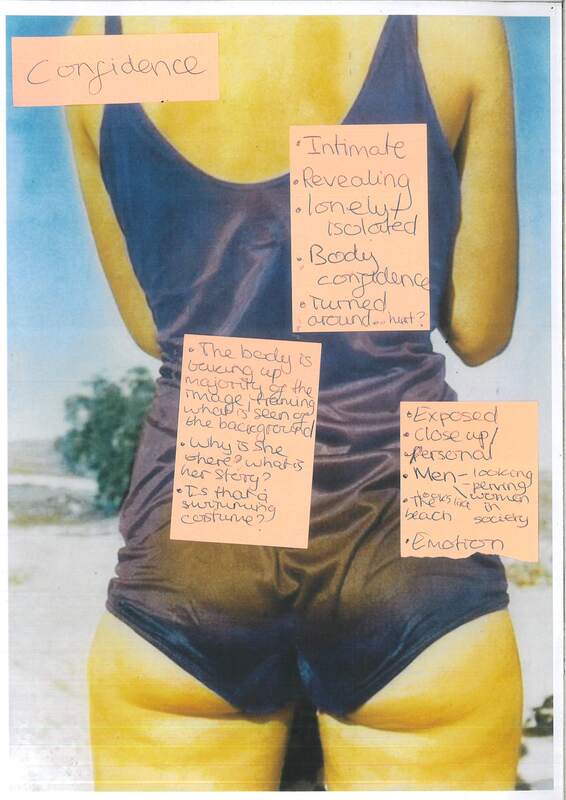
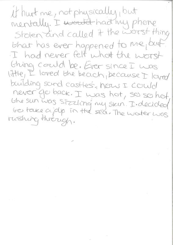
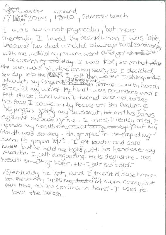
For the next task, we chose an image, from the set of printed images, and had to analyse it from our first glance perspective. Then we had to choose fonts, and sizes, if we were handwriting it with a marker, or cutting it out from a newspaper, and what we were going to write for our text with this image. I chose the image of the woman, in what looked like a swimming costume, quite close up, because as soon as I saw it, it seemed like my style of image because it is quite different. When looking at the image I initially thought about how intimate, close and personal this image is, getting this sense of confidence, and then I thought about a male gaze, looking at this image. I used post-it notes to write down all the initial ideas I was getting: |
|
|
|
|
I then decided to make the text about rape, I wanted the narrative of this image to be about this women's rape story. I just felt so much scary emotion from this image as she was turned around. As this looks like the beach, I based the setting of the story she was telling, on the beach. I was debating if the text should be a police report or a diary, or just her thoughts and like she is telling the story. I decided to write the text around the woman in the image because she would be feeling so strapped and suffocated when it happened and so the text is almost doing the same. Also, the text gets smaller, as I move down the text, and more squashed, which reflects well with an idea of a notebook, and when it gets more rushed in the worst bits of the story, therefore the writing reflects her emotions. I liked, my outcome, I thought it is quite emotive and powerful. It was also a lot more personal as I used handwriting, marking it could be the character's own. If I could do it again I would practice the writing around the body so it could be a bit neater, but I ran out of time, this time.
|
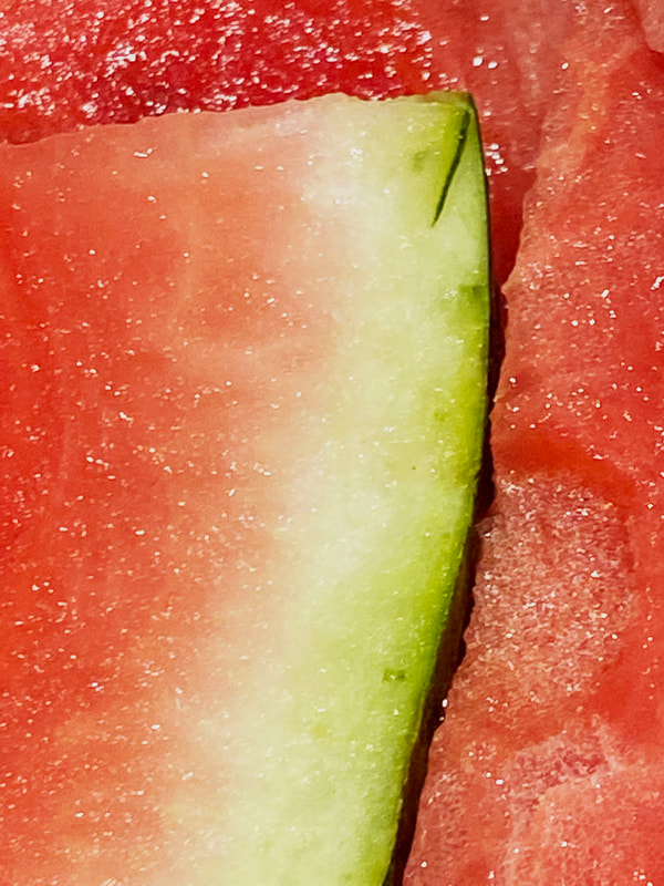
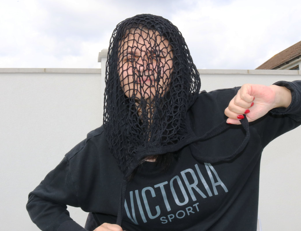
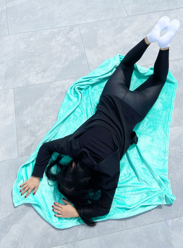
Half term photoshoot-
I took a variety of different images during my half term, with ideas in my head of what i am apiering for my photobook. I mostly took images by chance, and focused on what i saw through the lens that was interesting and unique.
To see the process of making my photobook for personal investigation: Part 1, click here!
